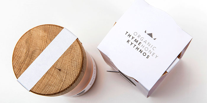
Gonidis is a beekeeping family-business based in Greek island Kythnos, focusing on harvesting organic honey. Following 14 years of experience and a number of awards, they finally decided to create their very own brand. Together with Gonidis family we decided that our suggested name “Pure Mother Bee” is the perfect match for their honey. Pure Mother Bee is the ancient Greek word for the queen of the hive. Moreover the name encompasses the notion of purity, given that it is a 100% organic honey. Plus the concept of affection is conveyed through the powerful word “mother”.
We then proceeded to logo design. Right from the beginning we were determined not to follow the norm of including a bee in the honey logo. So, Pure Mother Bee logo results from the combination of the B letter (from Bee word), a bee’s figure from the side and the queen’s crown.
The packaging had to go in line with both the name and the logo. So, for the 410g packaging destined for organic and delicatessen stores, we picked a tall and elegant bottle to match the honey’s elegant taste and a wooden cap to imply the honey’s 100% organic origin. Yet, the key design element is the wing laser die-cut, which further builds up the logo.
Designed by: S & Team, Greece.
Featured on Package Inspiration