Design by: Professional Creative Union
Brand packaging design
Recent product is a product with a higher protein content, including protein snacks. They are also present in the UAE, and the domestic market for such products in the UAE is just beginning to take shape. The local manufacturer needed a design for their new chips, 20% Protein. This should be noticeable by consumers and accepted without massive advertising support.
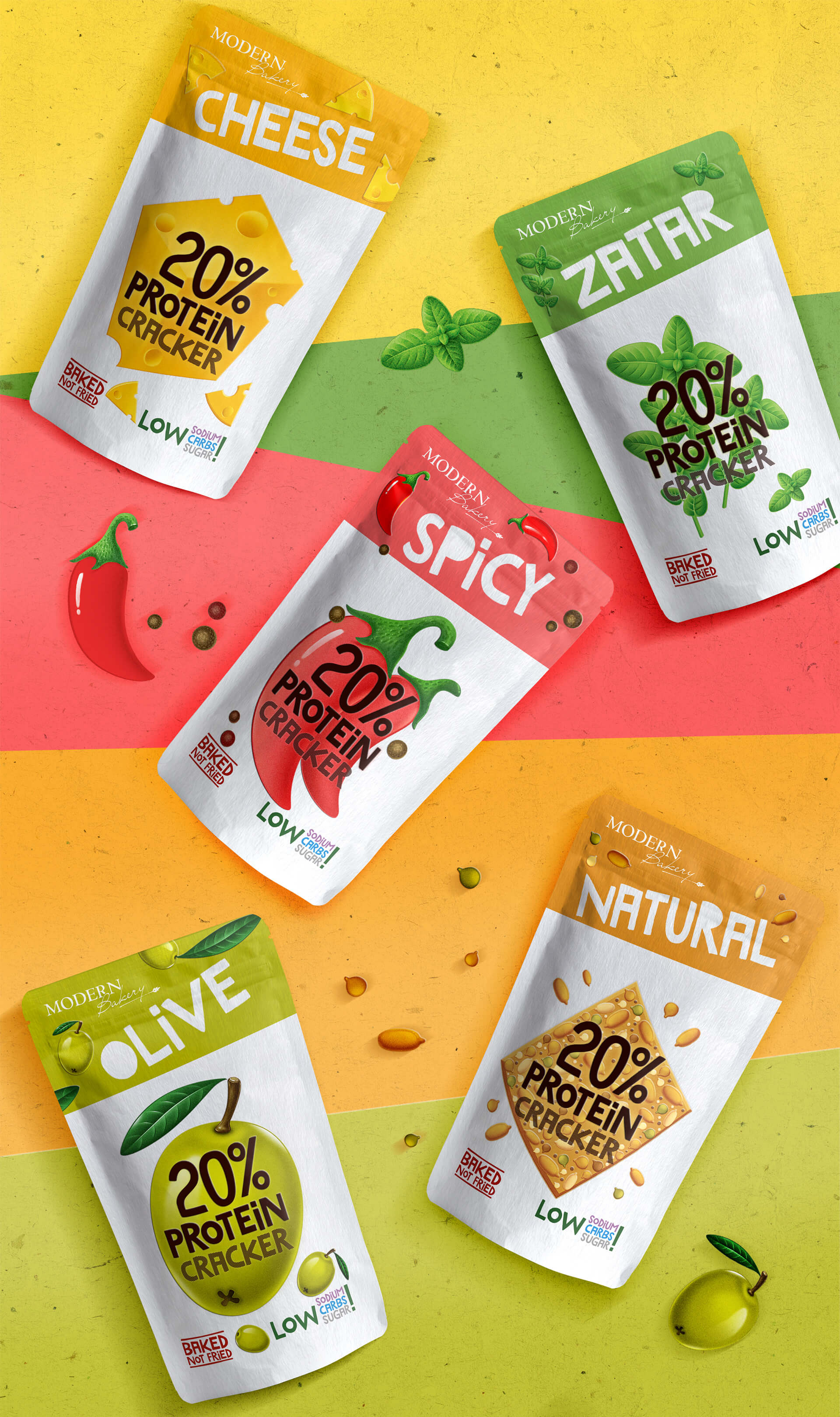
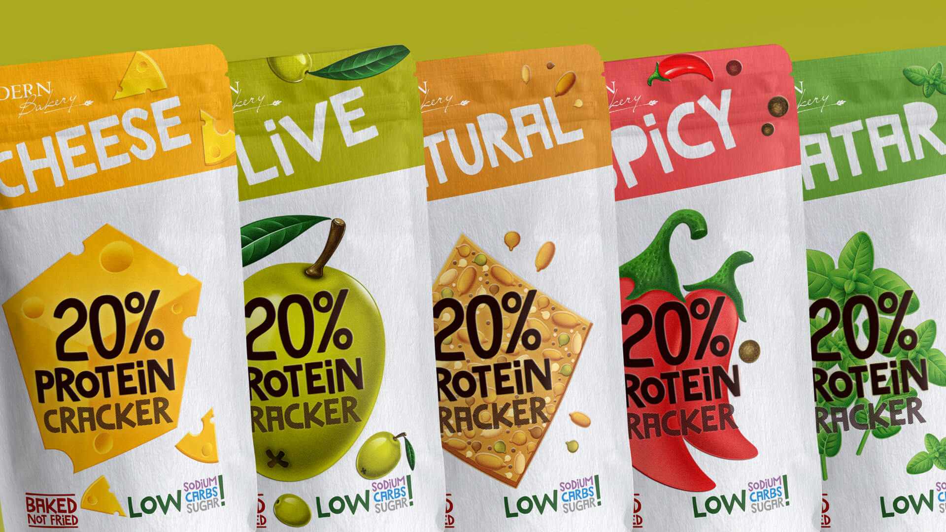
In case of products that form a new niche, the packaging should be as “talking” as possible. However, it should not be overloaded with small details and superfluous information. Therefore, there is an easily readable semantic center in the proposed visualization. This is a large food zone with the image of natural ingredients. Such approach helps to convey the idea of naturalness, and also facilitates easy navigation within the product line. The design layout of different product lines is simplified by a background color that matches the taste of the product.