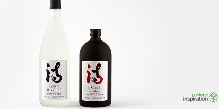
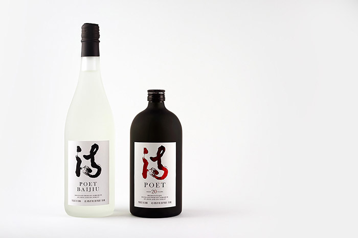
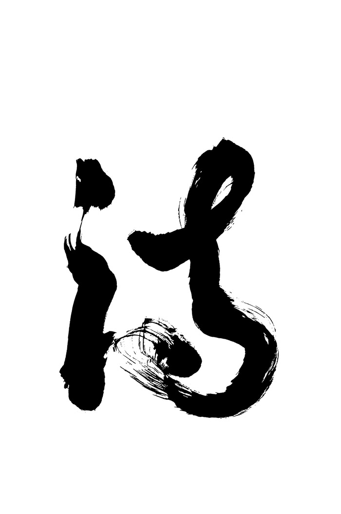
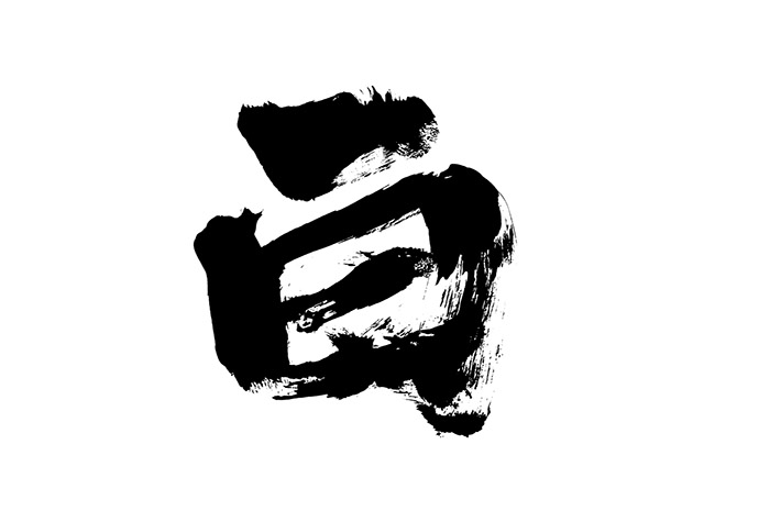
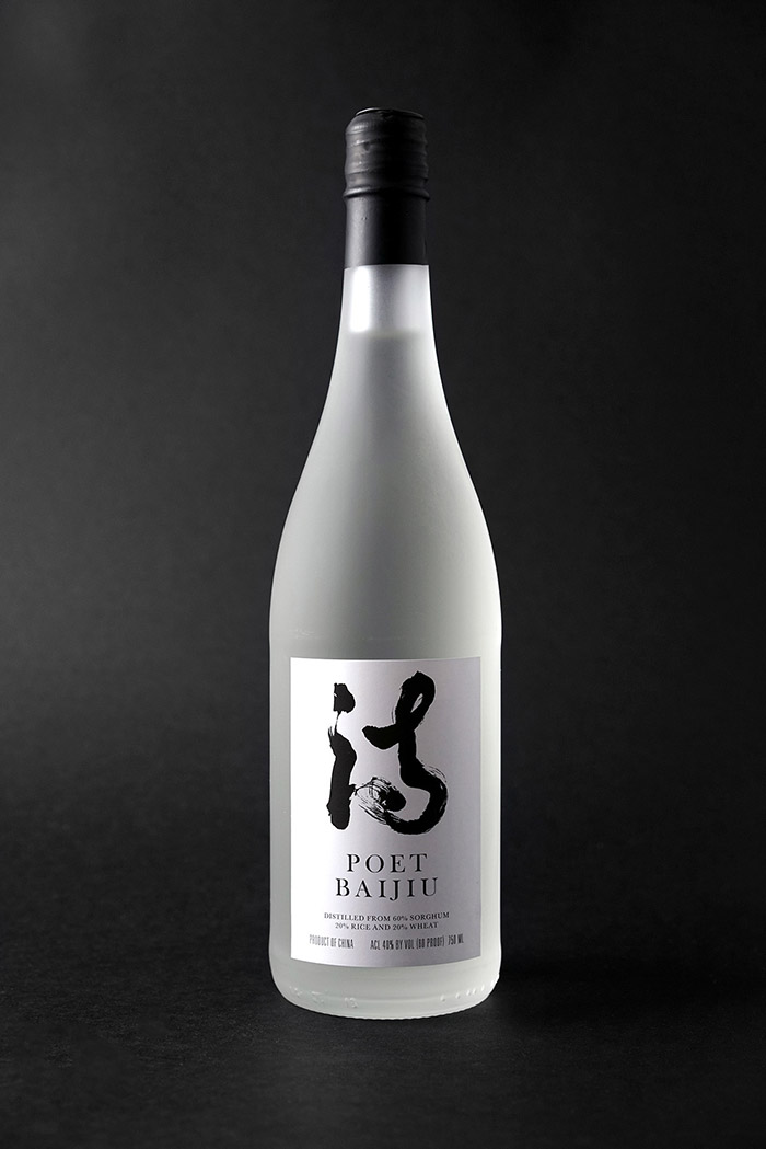
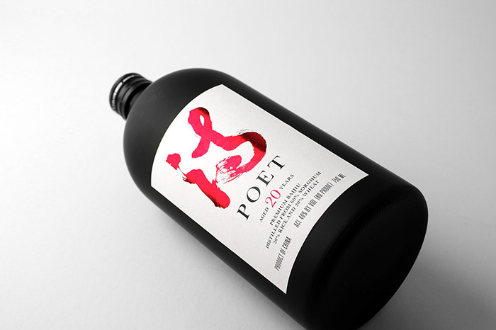
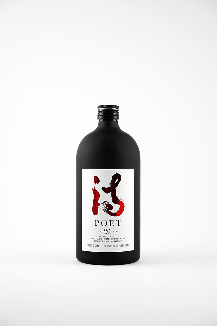
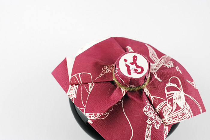
Certain liquors contain an air of mystery about them that is undeniably alluring, and the design for Poet Baijiu Liquor has that dangerous-yet-alluring look to it. The concept, created by Felix Longyang Wang, is for two separate drinks, Poet Baijiu and Poet 20. Both have been created to stand side by side, yet the differences among them create a subtle distinction between the two. “Poet Baijiu uses the frosted glass bottles as the packaging, and the black and white design of spirit label to reflect the elegance and uniqueness of Poet Baijiu. The Logo uses the original Chinese calligraphy with English Baskerville serif font and looks very harmonious.” Poet 20, on the other hand, is in a black matte container that is shorter and stockier than a wine bottle. With blood red metallic calligraphy and the same serif typeface, it sets a slightly different mood while clearly belonging to the same family. “Poet 20 years is a collection of vintage Baijiu, suitable for elite business banquets, private clubs, collectors’ collection and the professional liquor tasting experts. It is the best choice for the successful people. Poet 20 years will overthrow your understanding of spirits, and make your taste up a level. Poet 20’s packaging with the frosted all black round glass bottle, embodies the feeling of calm and elegance. The spirit label’s logo and year use the red foil stamping process, highlighting the differences of the vintage collection level of the spirit. In addition, this spirit package also includes an exalted box, with further highlights the unique and collection value of this spirit.”
Designed by: Felix Wang, USA.


Featured on Package Inspiration
We are young team which works to inspire packaging designers every day! Our team select the best packaging of today and shares with you.

