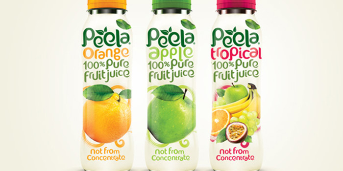
Design Happy has created the new Packaging range for Peela Fruit Juice.
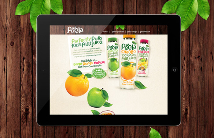
The redesign for Peela includes a new Brand Identity, Packaging Range, Website and Point of Sale which is aimed at the RTD market. Peela has featured primarily on airlines due to its unique smaller sized bottles and has since gone onto be listed in U.K stores nationwide with the new design.
The juice has been completely overhauled by Design Happy to compete within a growing sector of pressed and squeezed fruit drinks, with the core challenge to convey the refreshing high quality 100% pure fruit juice content to the more health conscious shopper. It was important with the Peela rebrand to create a bold, natural and confident brand with instant recognition to compete with the likes of Innocent Juices.
The more down-to-earth personality was achieved by a quirky brand marque and matching typeface, which breaks the conventional rules when implementing the brand with a flavour descriptor together. The usage of the same font was intentional and integral to the pack so that it had instant brand and messaging recognition due to the small bottle size. The fruit was made more bold and confident to lift taste and refreshment cues, as well as helping communicate the 100% whole fruit content.
The supporting Website and Point of Sale injects more layers of fun and engagement into the design, combined with more earthy cues and tongue twisting back of pack. The off pack personality is intentionally focused on the more random and juicy side of life.
The new refreshing range includes Orange, Apple and Tropical and are now available in stores nationwide with
The Peela Brand owned and distributed by Navson.
Designed by: Design Happy UK, United Kingdom.


Featured on Package Inspiration