
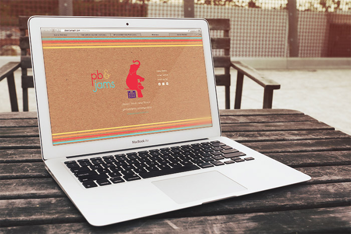
Branding system created during my time interning at SEDSO Design (sedsodesign.com). With creative direction from the heads of SEDSO, I worked on the logos and color system which then translated into packaging labels, business cards and a splash web page.
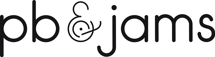
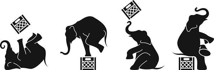
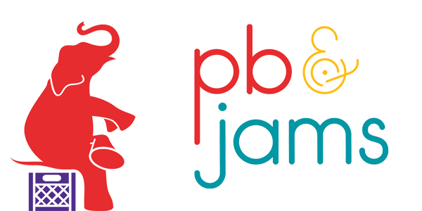
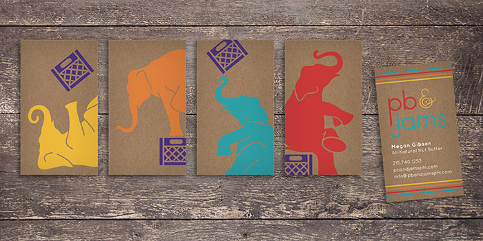
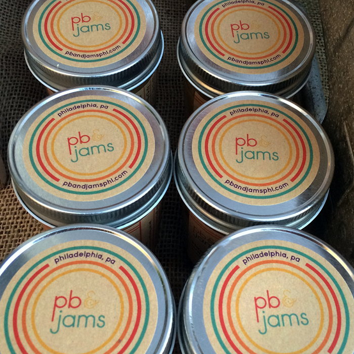
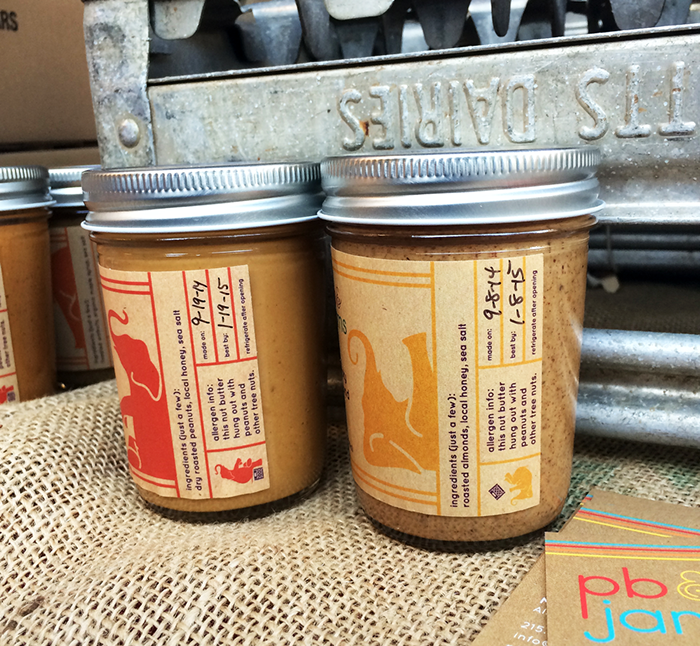
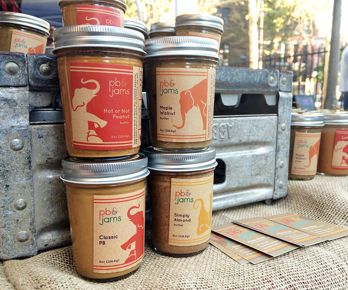
The typographic logo is geometric and rounded, remeniscient of 70s style design. The owner of the company is also the DJ so the ampersand represents a record on a turntable. In order to create a modern, playful and versatile brand, I created an elephant in 4 different poses (to represent the 4 nut betters the client offers) and had it interact with a milk crate, to further accentuate the idea of vinyl records and DJs.
The pops of color were, again, inspired by the 70s and its tones paired well with craft paper and the natural elements that were brought into the brand extension.
Designed by: Luis E. Quevedo, USA.

Featured on Package Inspiration
We are young team which works to inspire packaging designers every day! Our team select the best packaging of today and shares with you.

. With creative direction from the heads of SEDSO, I worked on the logos and color system which then translated into p&p[url]=https://packageinspiration.com/pb-jams/&p[images[0]=https://packageinspiration.com/wp-content/uploads/2014/09/PB-JamsMAIN.jpg)
. With creative direction from the heads of SEDSO, I worked on the logos and color system which then translated into p)