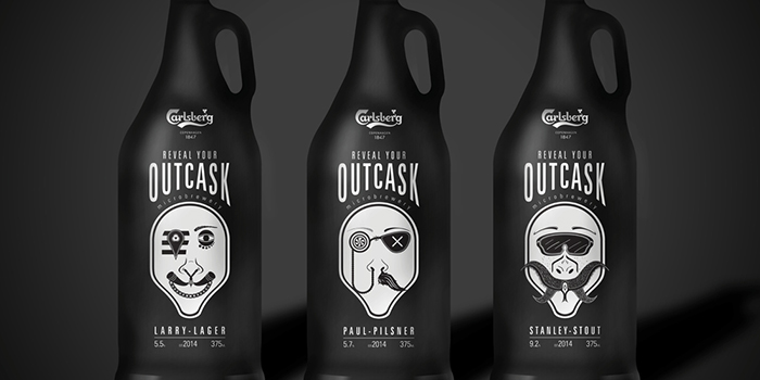
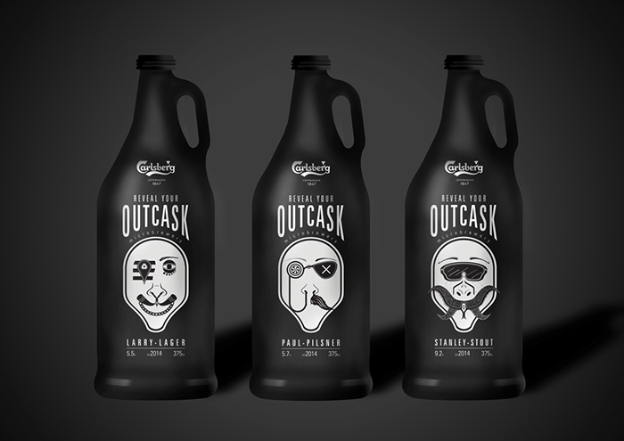
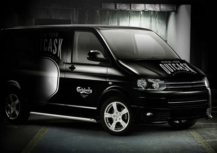
The brief set by Taxi Studio in Bristol and Carlsberg, was to create a brand identity and package a range of beers for Carlsberg’s new microbrewery. The target audience is mainly males aged 20-25 who are ‘explorers’. Student Ross Linton created a design concept that explore the possibility of these bottles.
“As the range of beers that the microbrewery offer are mature types of alcohol such as pilsner, stout & pale ale, I felt that these were different to the typical drinks that consumers of this age group would drink, therefore it would be the case of them exploring into a different range of alcohol.
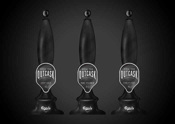
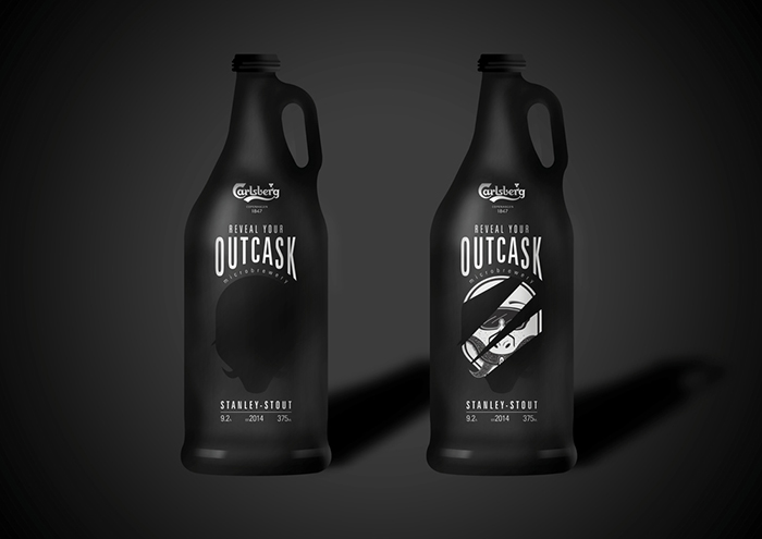
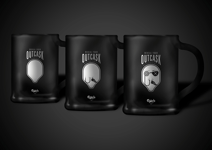
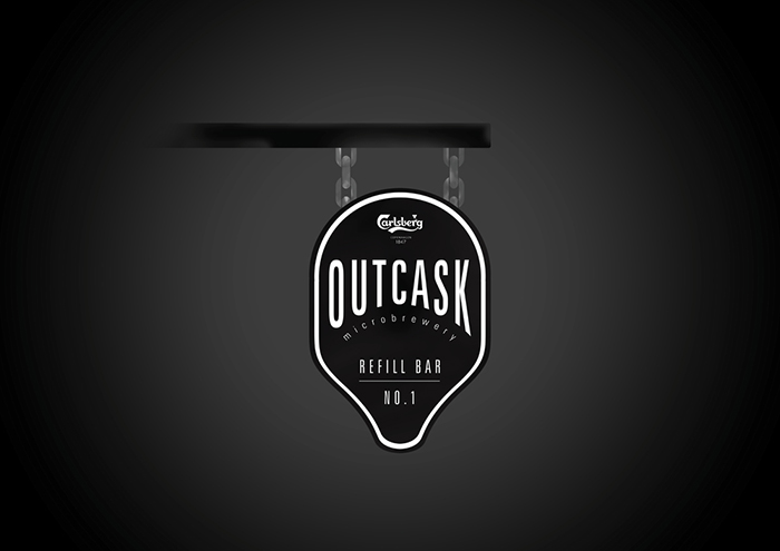
Outcask is an interactive brand thats holds onto traditional features, but shows its idea’s in a modern way. Use of the black content represents the consumers dark side, waiting for you to reveal your Outcask side. It’s all about being the daring one from the group and trying something new, proving that you have the maturity for quality alcohol, rather than the cheap and cheerful.By the range being black, it seem’s dull and boring, it’s the opposite. The black represents your darker side, whilst allowing the brand to stand out against competitors. The brand takes you on a journey as an explorer, therefore only revealing your Outcask side at consumption. On the journey your presented with the traditional features of the bottle and glass, the growler bottle allows users to refill their bottles with their favourite alcohol amongst their fellow Outcasker’s. However the brand isn’t all traditional, due to the user of its modern features that are used within the bottle packaging and glass.”
Designed by: Ross Linton

Featured on Package Inspiration