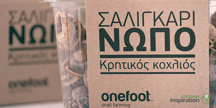
After our flawless collaboration with Lambros, he also requested me to take on the packaging design of his products.
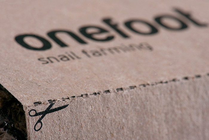
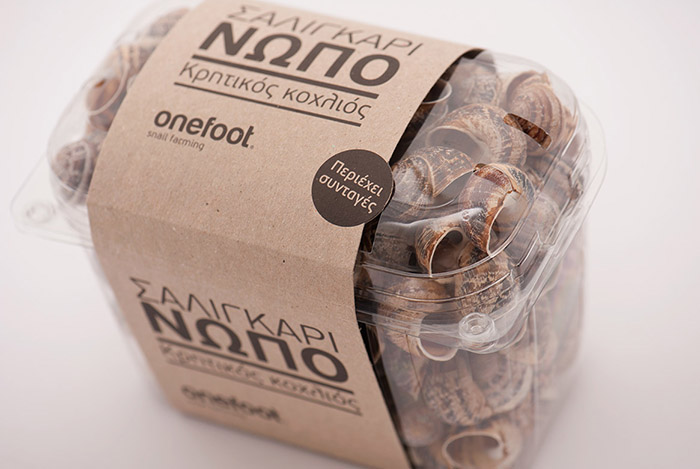
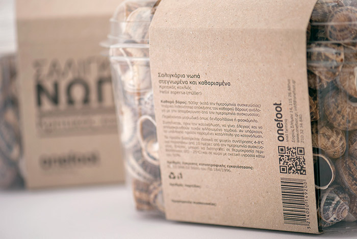
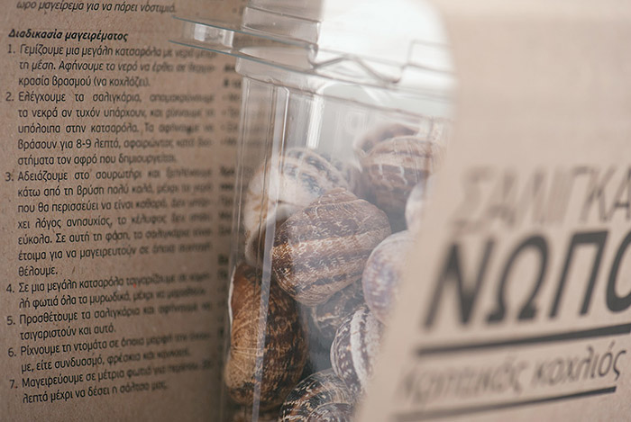
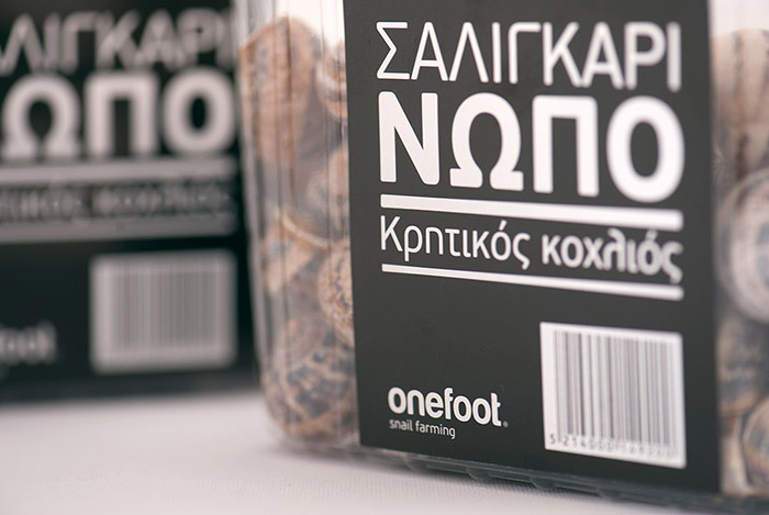
I designed a case that actually consisted of a 50cm-width paper webbing/stripe, which covered most of the top of the see-through box. For this packaging, recycled paper was used, the same that was also used on other applications of onefoot, e.g. on the leaflets. Because of its coloring, this paper was a direct reference to the sense of the soil, and well as to the natural element that its closely connected to onefoot products. Moreover, due to its low cost, it decreased the general cost significantly. On side a’ of the case, the essential information on the product was included, while on side b’, two cooking recipes.
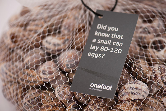
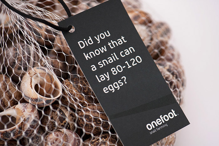
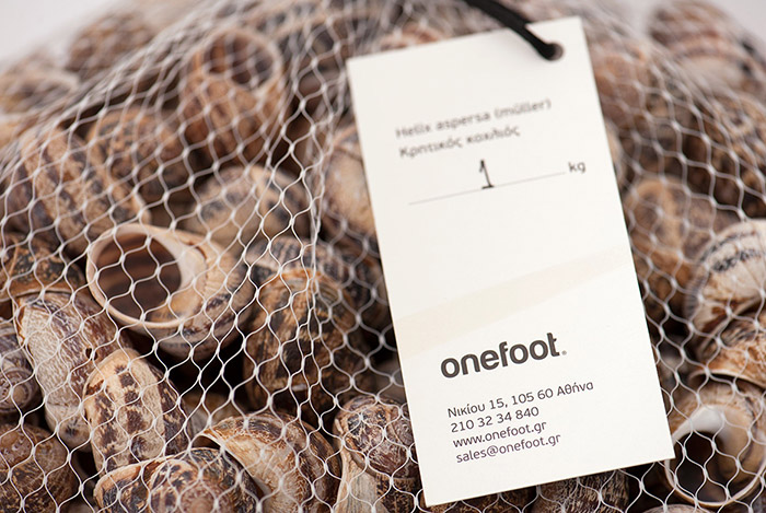
Also, I designed a black and white label, so as to be attached with black cord on the onefoot 1 and 5 kilo little sacks. On this application as well, the snail “trail”/saliva was adopted, which was also used on the corporate design. Furthermore, the color that was chosen for the little sack for the product was white, so as to match with the design of the onefoot corporate identity.
Designed by: Aeraki Design, Greece.
www.onefoot.gr


Featured on Package Inspiration