
Agency: Holy
–
Description:
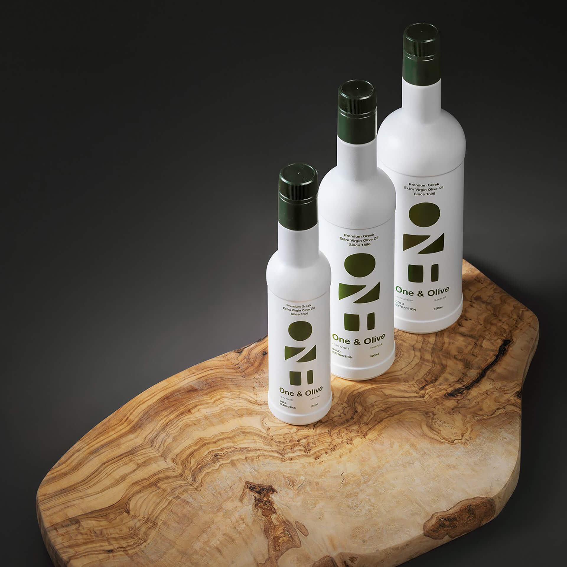
Looking at the bottle we see a farmer, inspired by Cycladic Art. The farmer with the crossed hands is a notion of the feeling of completion that one has after a hard day of work in the fields. Nature-inspired with colors of the Greek countryside.
Respecting the history, authenticity, and innovative quality of One & Olive’s premium product, we designed a dual logotype, serving both the brand name’s visibility and the brand’s main beneficial factor; the caring and kind-hearted farmer, as he peeks out of the word’s “ONE” negative forms. The color palette, consisting of both bright and earthy tones, is on a mission to embrace this discreet figure, the same way the farmer’s natural environment is embraced by the warm sunlight and delicate olive trees’ fruits. To build a cool and protective packaging, guaranteeing the premium products’ quality and preservation, we designed a series of vibrant bottles and a traditional tin can, without of course omitting the brand’s essential human and natural essence.


Featured on Package Inspiration
We are young team which works to inspire packaging designers every day! Our team select the best packaging of today and shares with you.


