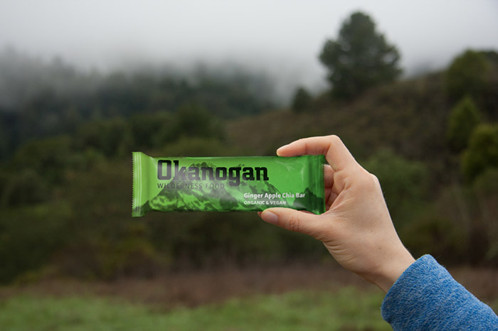
Catching Eyes with More Than a Name
Named after the land of the North Cascades (the last in the lower 48 to be discovered by Europeans), I rebuilt a sturdy, Bauhaus-era typeface and combined it with vibrant colors to reflect the rugged land of the products’ namesake, the quality of the ingredients and the energetic lifestyle of the users.
Since the identity was created from a modernist, German typeface, I wanted to utilize techniques from that era in the packaging with the use of posterized photos and strong grid lines. I chose the bright colors partly as a contrast to this solidity and structure, but also to imply the energy contained within each package.
Designed by: Mark Johnson, USA.


Featured on Package Inspiration