
NOSHU literally means ‘No Sugar’. They are a young and energetic startup who understand the importance of creating something meaningful and who pride themselves on presenting the best possible product in an extremely competitive market space.
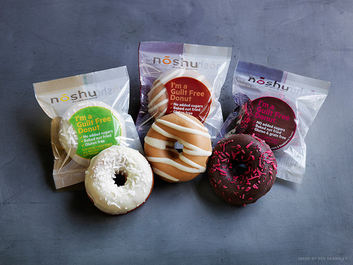
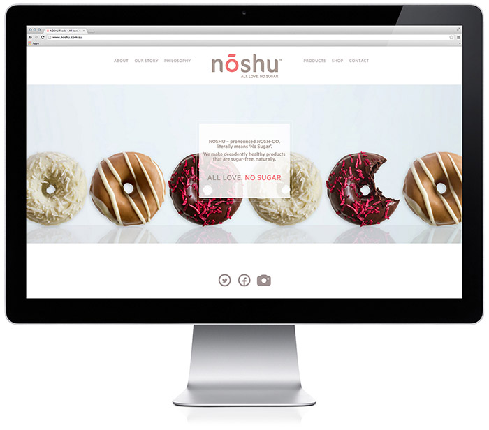
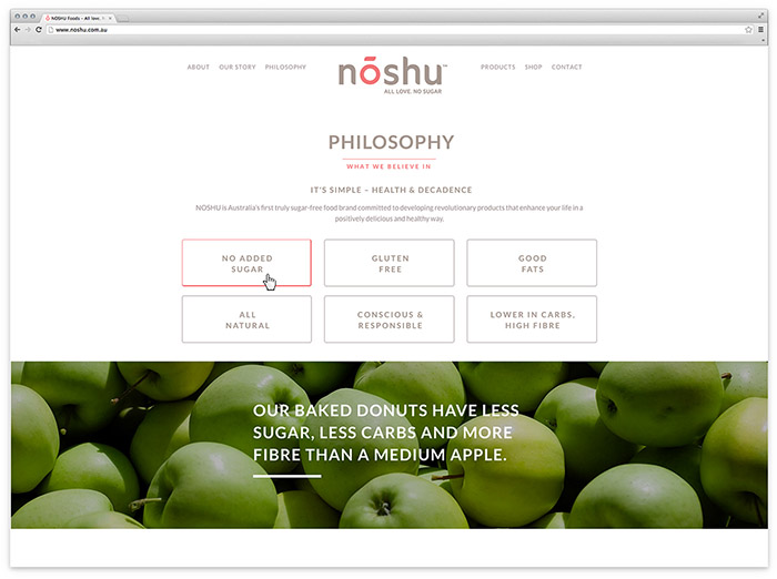
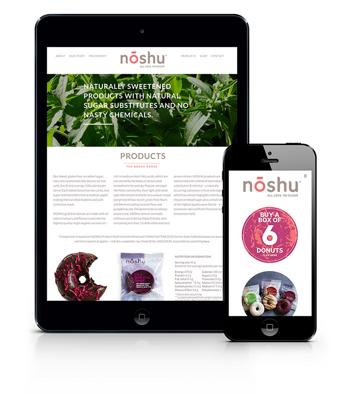
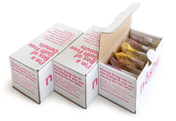
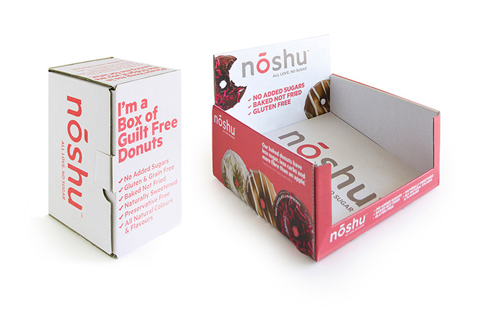
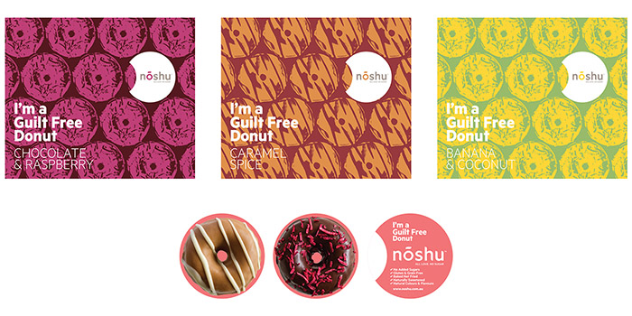
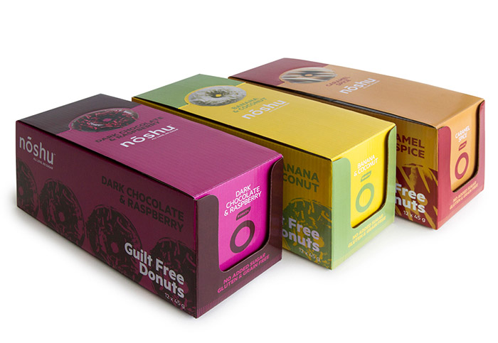
I was asked to develop the identity and brand positioning for NOSHU as a challenger brand in the healthfood retail space that also had broader appeal in the greater consumer market. We decided to keep the overall look and feel of the brand fresh and clean by allowing the visual emphasis to remain on the products. Brand language, bold typeography and strong block colouring brings NOSHU into a fresher, comtemporary healthfood market compared to other green, organic product ranges. The brand DNA was then applied to all marketing collateral, web and digital platforms, product packaging and POS materials.
Designed by: Reuben Crossman, Australia.



Featured on Package Inspiration