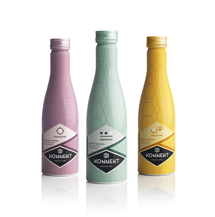
Designed by: PROUDdesign, Netherlands.
Konnekt is a functional soft drink brand that helps you to live a smarter life. This is possible thanks to a unique formulation based on the daily requirement for essential amino acids, each with a unique function: relaxation, focus or endurance.
Unlike other products, Konnekt works via the brain thanks to its functional ingredients. It provides the body with the necessary essential amino acids that are naturally present in the body. 3 units per day are sufficient and possible surpluses are of course separated. Konnekt Smartdrinks is characterized by the absence of harmful ingredients such as caffeine and unnatural sweeteners thanks to Stevia and Isomaltulose. Konnekt is a unique smart drink developed from food technology (DSM). The challenge was to clarify the function of the product in a modern, but above all progressive way.
The aluminum bottle fits exactly with the progressive character of the brand and product. It is unique and technically a masterpiece to make this form. It fits well with the graphic design that represents the scientific expertise, the specific functions per variant and a suggestion of the expected taste. In this identity the characteristic shape of the amino acids is central, the hexagon. This has been used in the logo. For each variant we have the effect with and in it.
The category of smart drinks still hardly exists. This makes it a new product in a new market. Compared to the functional drinks, Konnekt distinguishes itself by its progressive and modern-technical appearance that is not based on one or more ingredients but on a technical innovation. The bottle shape is unique, the design is progressive graphic-technical and the brand name intrigues. The naming of the individual variants is very concrete and efficient. A premium drink for a premium audience. The bottle is printed in metallic colors to enhance the technical and premium aspect. The information on the back is neatly divided into relevant pieces thanks to a strong graphic layout.
About PROUDdesign:
PROUDdesign, headquartered in Amsterdam, is known for its food packaging designs. We understand the beauty of seduction and the strength of confirmation in design. That’s why we’ve worked with brands ranging form global giants like Quaker and Arla to the likes of challengers such as Lovechock and Fairtrade Original. No matter what brand we’re working on, we always take our name to heart. It helps us to aim for the highest level of creativity within a commercial brief. We’re in it for the quality, not the quantity!


Featured on Package Inspiration