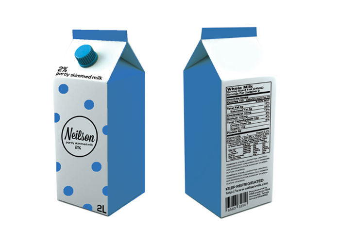
This is a re-design for Nielson Milk. I decided to update their logo from a Black letter to a Script font because it is much more friendlier and represents the smoothness of milk better. The design was kept very clean and simple, I used the polka-dot as a simplified cow spot. I kept the same colour scheme so they are still recognizable on the shelf and the consumer would easily know what they are buying.
Designed by: Ivana Musutova, Canada.


Featured on Package Inspiration