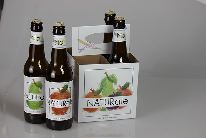
I am very interested in packaging and creating interesting packaging that you would see on a store shelf. I came up with the concept for NATURale while I was working at Young Sign Company for my internship. The graphic designer at Young Sign Co. had created packaging for a local brew in Leavenworth that I found very inspirational.
I started off this project with a plethora of sketches and notes to myself about concepts that I could use in the piece. After I came up with the main concept and name I began to create the elements for the packaging.
I created all of the fruit illustrations myself. I started off with a guash underpainting of the fruits that I then scanned into the computer. Once all four of the fruits were scanned in, I took the images into Photoshop and edited them by bumping up the colors and cutting out the background. I then took the edited photos into Illustrator to add more paint strokes. After the fruits and other elements of the design were complete, I brought everything into InDesign.
I created the outlines in InDesign, these being the fold and cut lines. After laying out the whole design on top of the outlines I printed the piece on a large format printed and used a plotter to cut out and lay in the fold and cut lines. For the labels on the bottles I printed on a xerox printer onto label paper. This includes the front, back and neck labels on the bottles. The corks used in place of the bottle caps in the bottles were hand burned by me, using a wood burner. I burned the Na logo on them for a personalized touch.
Designed by: Haily Ayres, USA.

Featured on Package Inspiration