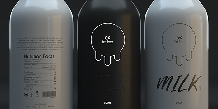
The start of this project is contrast between the product and the packaging, Between In and Out. I also wanted to make a common product more stronger and get it out of his classical white cold. So as the milk is withe, fresh and sweet, it’s seen by customer as a fragile product, healthy and baby domains. Let put this milk into the wild.
Designed by: Edouard Molinari, France.
Featured on Package Inspiration