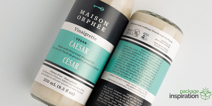
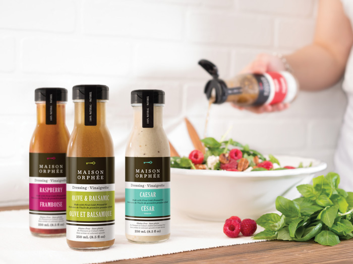
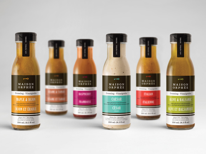
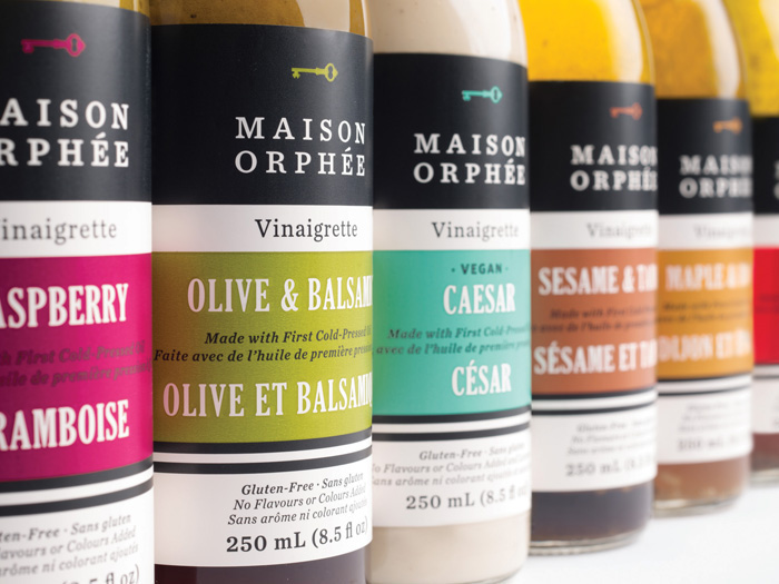
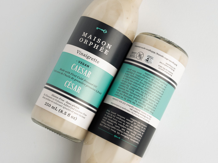
Maison Orphée recently launched a new line of 100% natural vinaigrettes whose quality few competitors can match. The look of the new packaging falls within Maison Orphée’s now well-established identity. The colour black evokes the premium side of the product and its ingredients while horizontal bands clearly structure the information. Each product has its own colour for easy identification on shelves. Every aspect of the design was thought out to allow consumers to quickly recognize this new category product line.
Designed by: lg2boutique, Canada.


Featured on Package Inspiration