Agency: Mora Pardo
–
Description:
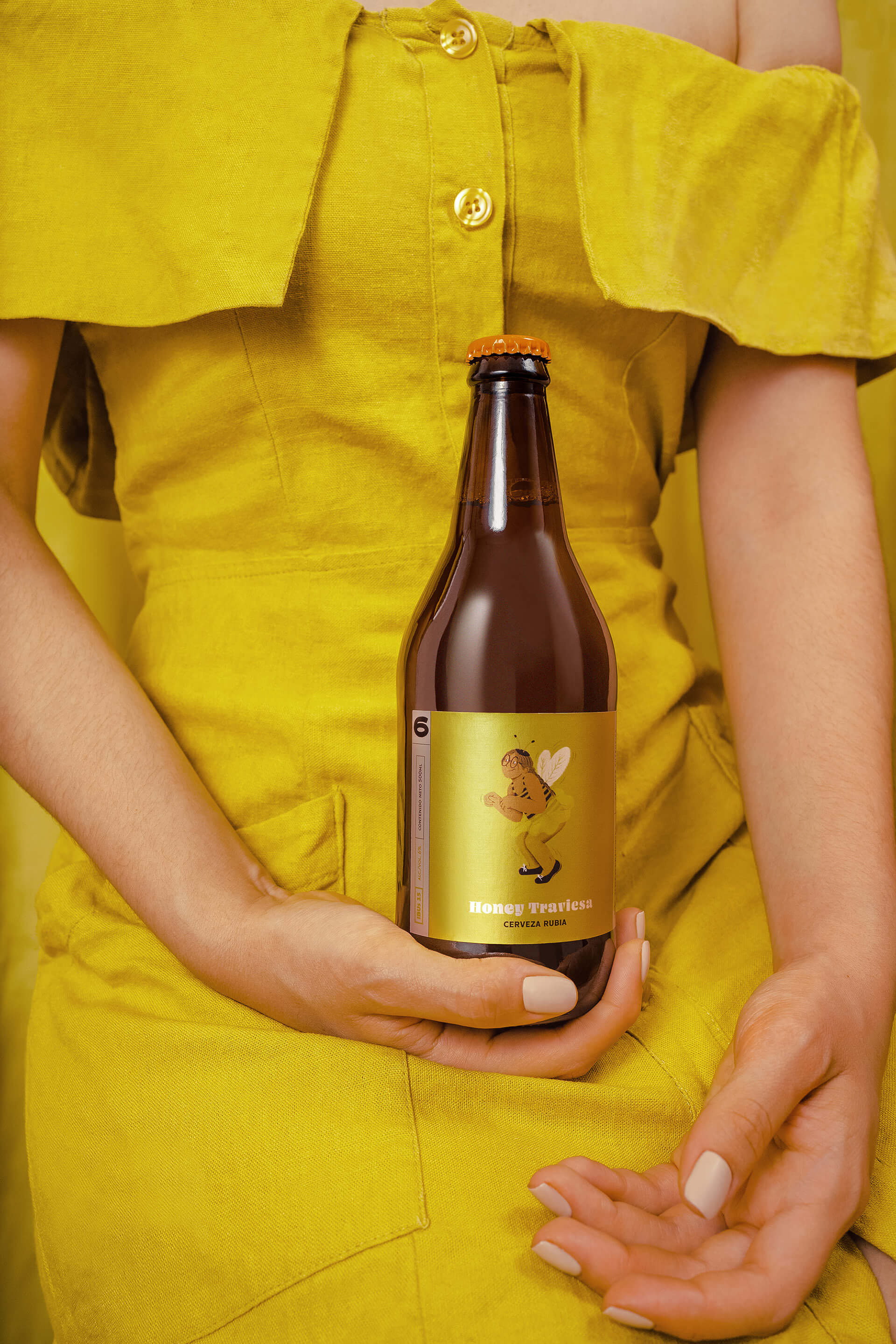
Libertadores is a brewery located in Mendoza, Argentina. With such an evocative name and the concept of “authentic beer”, the process of developing the packaging for their first bottles started.
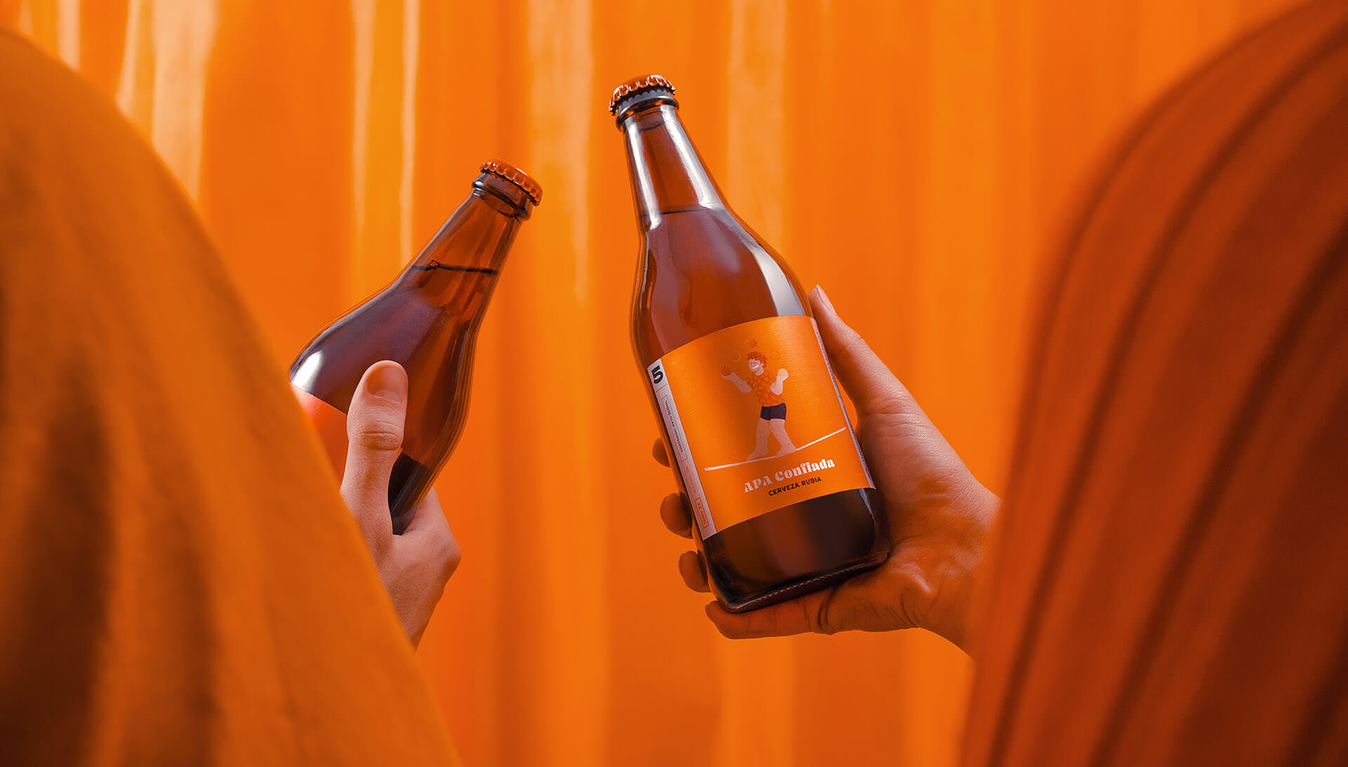
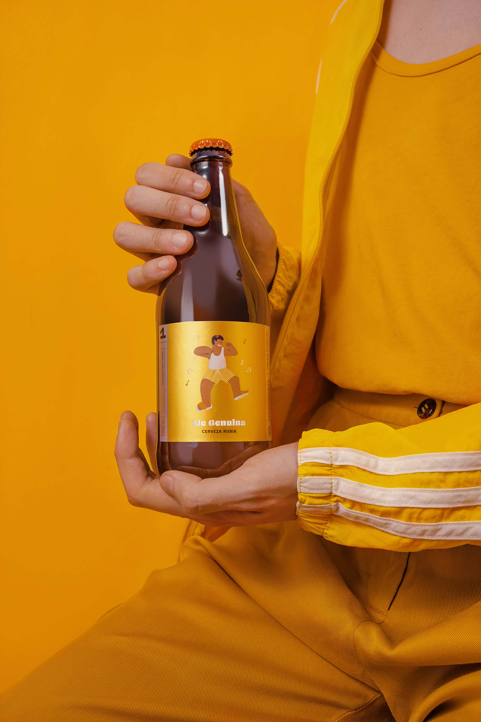
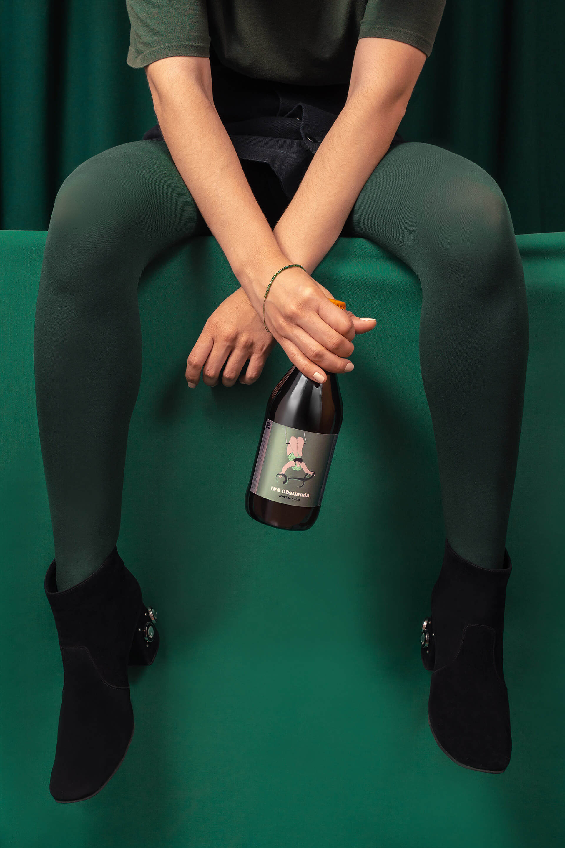
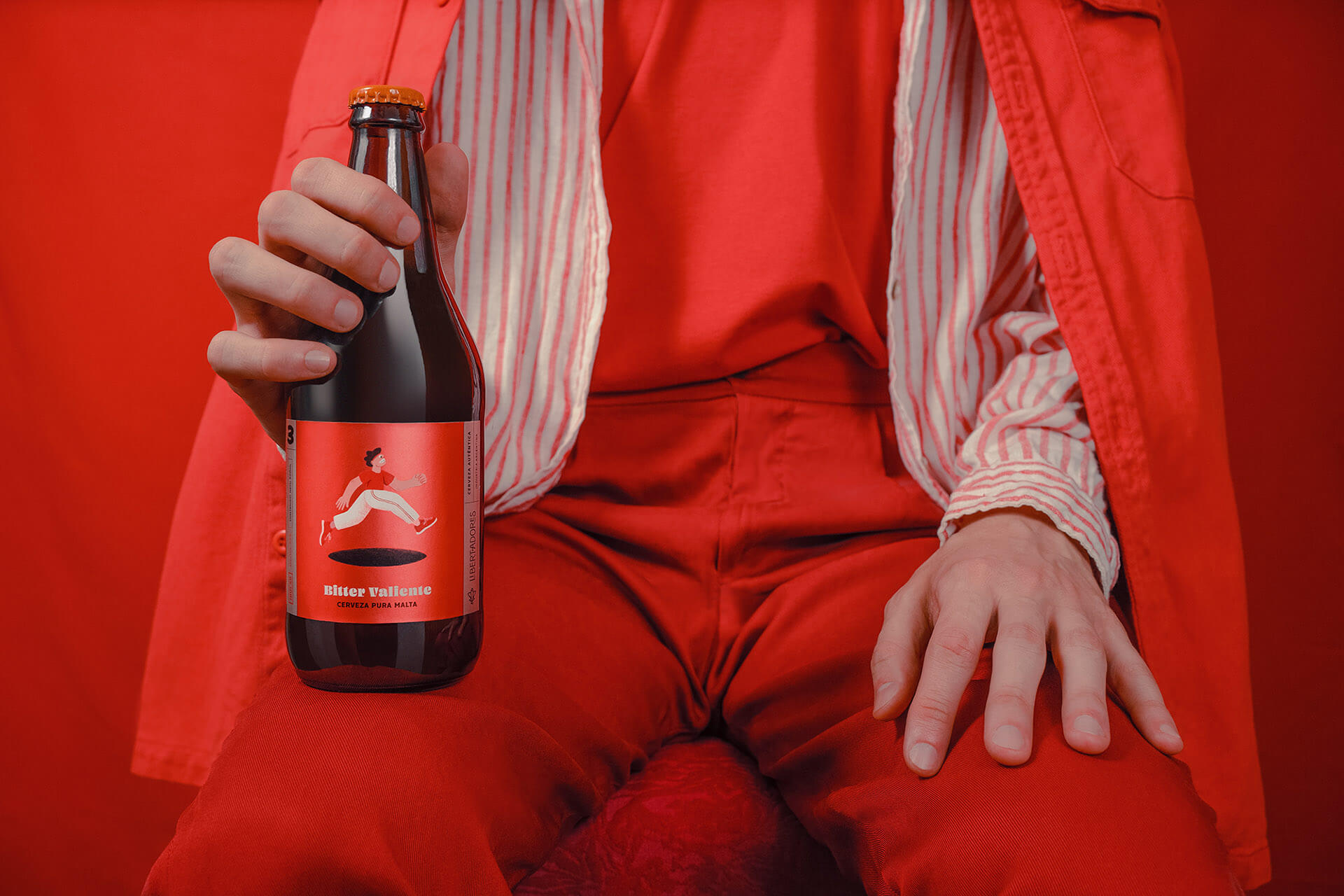
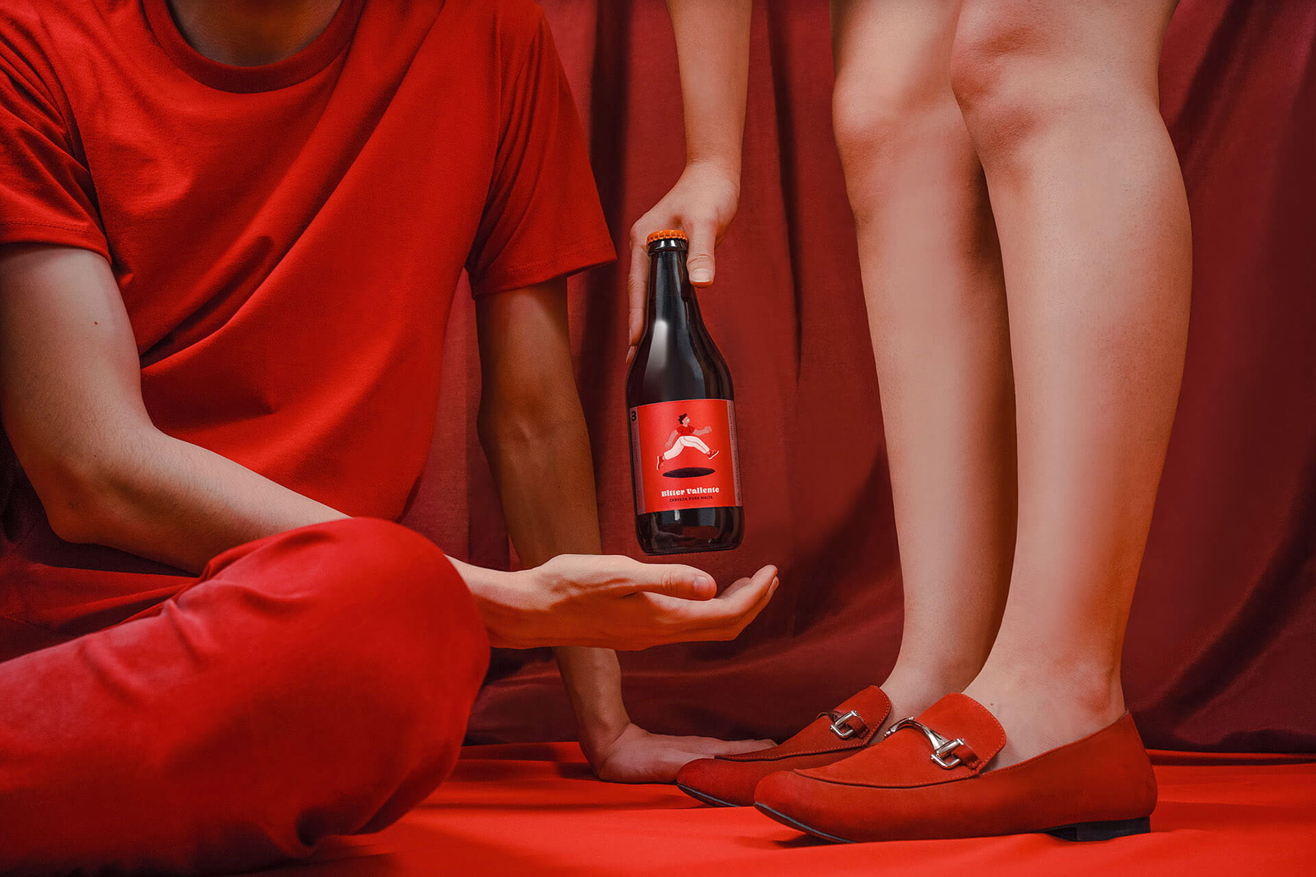
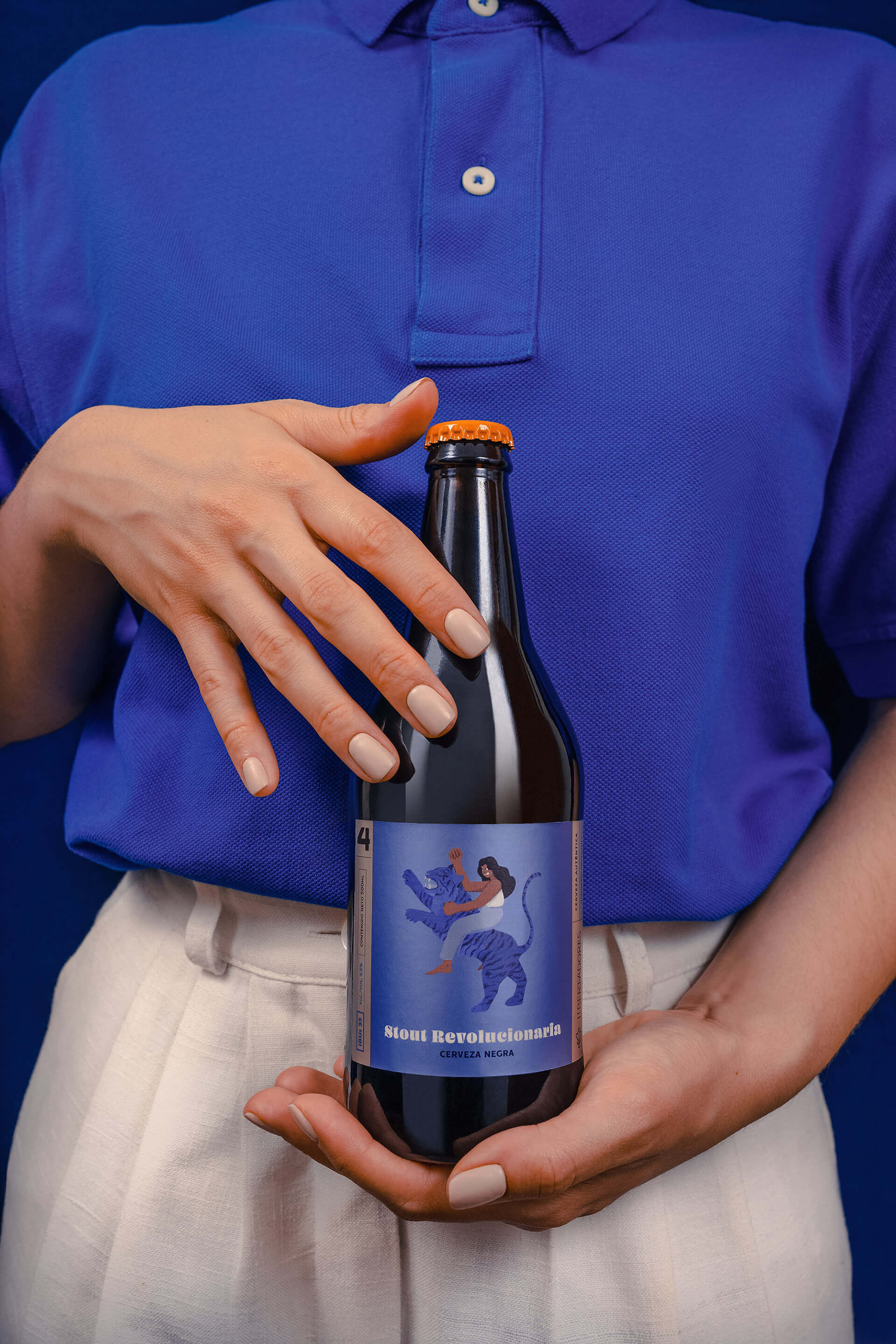
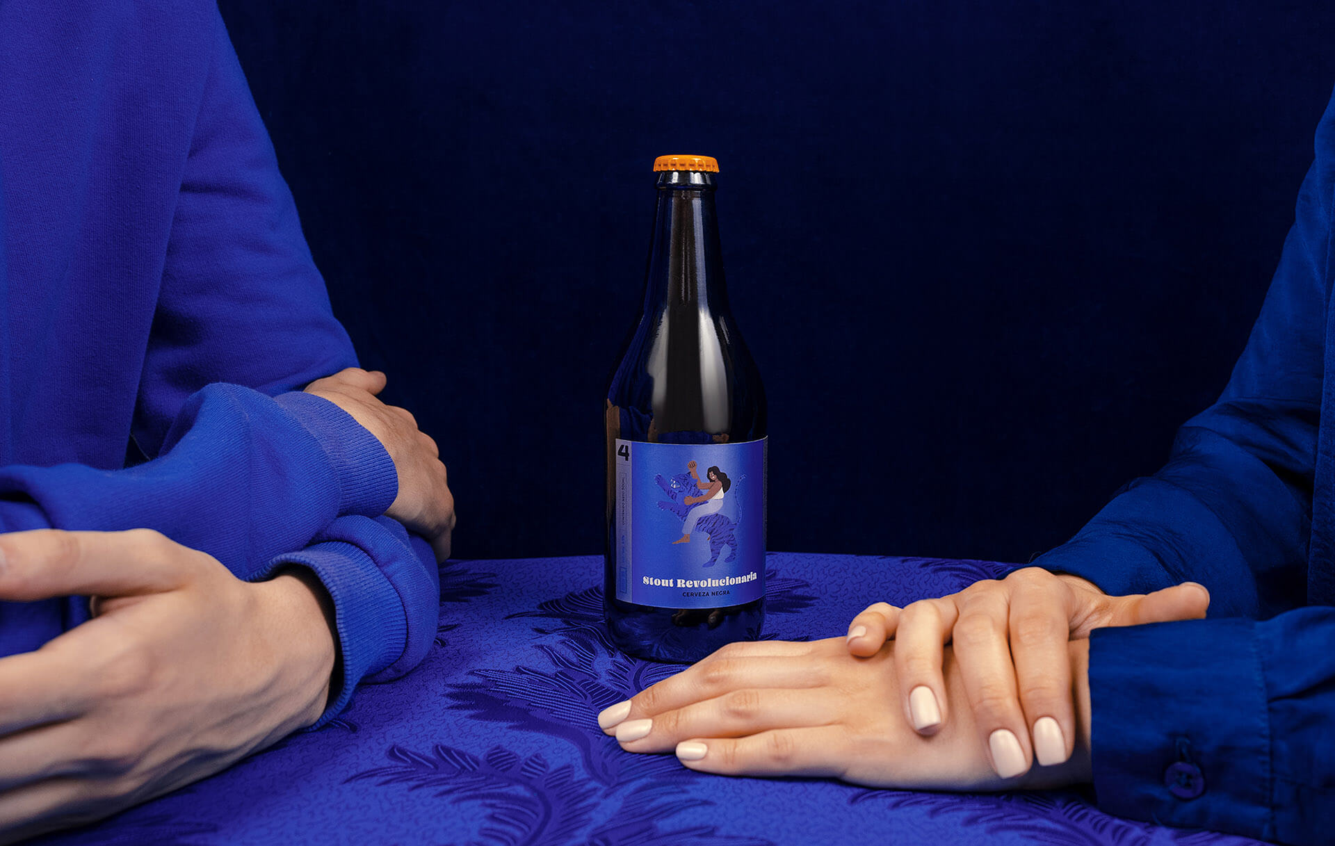
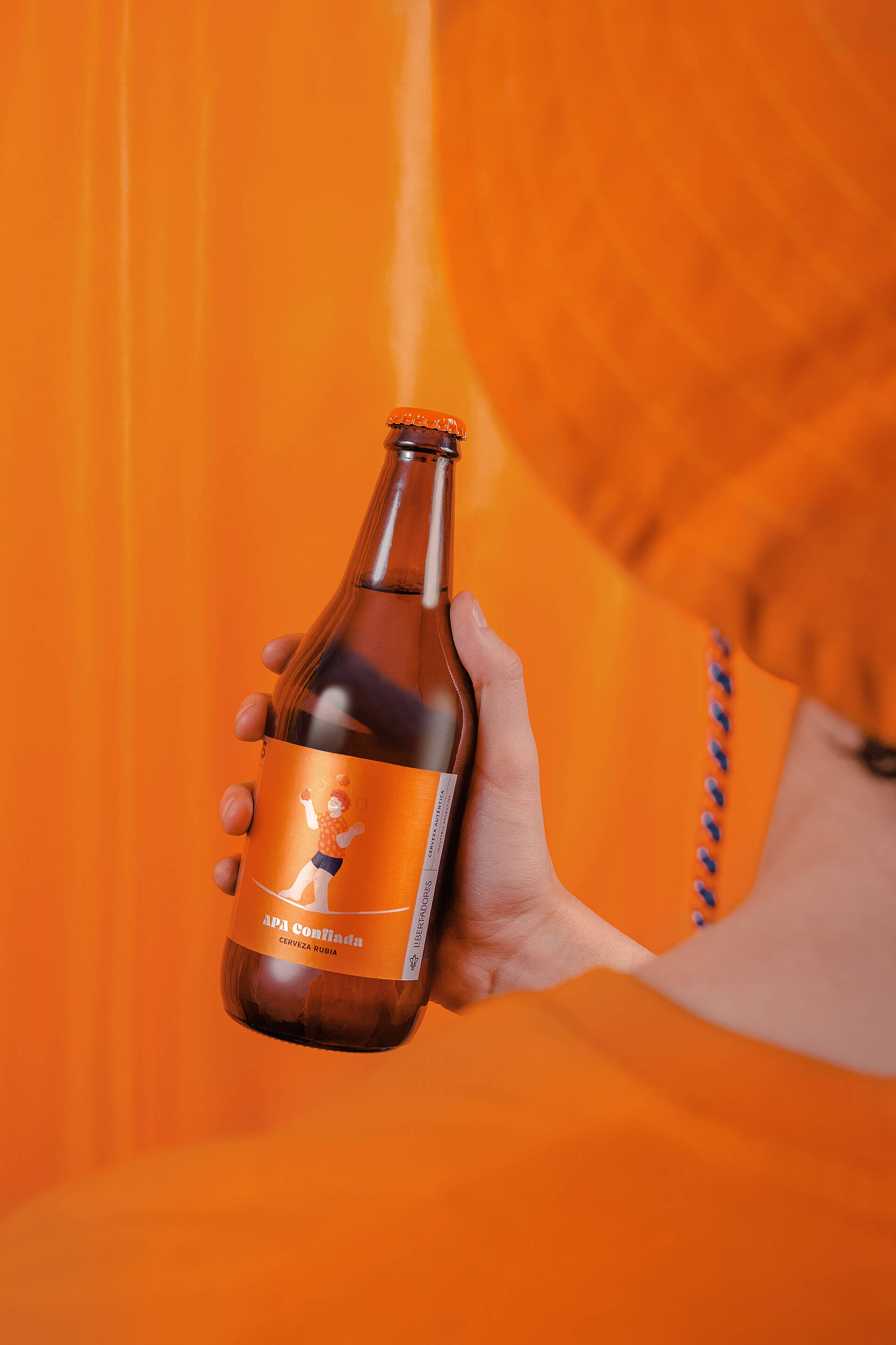
For this series of labels, we wanted to honor diversity and give the concept of “Libertadores” a more everyday life approach —the word is usually associated with something historical and masculine—. Each one of its six styles reflects it in a particular way. They have their own character and way of existing in this world. They don’t compromise, they don’t go halfway, they know who they are and treasure it.
People who cherish freedom. People who are not afraid of being themselves, of fighting for a better society, of being authentic and bold.
The decision was to move away from the traditional German and Belge beer aesthetics and innovate with more bold and colorful graphics. Each style has an adjective of quality assigned —Genuine Ale, Stubborn IPA, Brave Bitter, etc.— that defines a concept. With this in mind, each one of them has a specific character and color that illustrates this concept.
In America, we call “Libertadores” —Liberators— to the people who fought for our countries and freed us from colonialism. It’s a symbol of resilience and autonomy.


Featured on Package Inspiration
We are young team which works to inspire packaging designers every day! Our team select the best packaging of today and shares with you.


