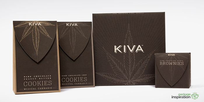
Kiva Packaging Concept
NOTE – This project was strictly for a school assignment and was not used or initiated by Kiva.
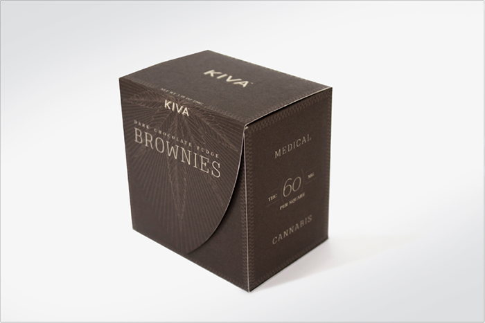
Kiva is a gourmet bakery in San Francisco that specializes in medicinal, high-end, all natural artisanal cannabis infused chocolates, cookies, and brownies.
Marijuana is generally thought of as something to be smoked, and historically a lot of campy, cliched imagery is associated with the iconic leaf. Marijuana is legal now in Colorado and Washington and there is a strong “grassroots” push for legalization to spread nationally. If the trend holds, a hot and highly profitable new market will be created for all things gunja and Kiva will be ready. The goal of the design concept was to elevate marijuana to a higher status of prestige/respect and was intended to mirror confection brands you might find in stores like Williams-Sonoma.
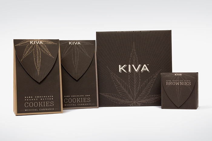
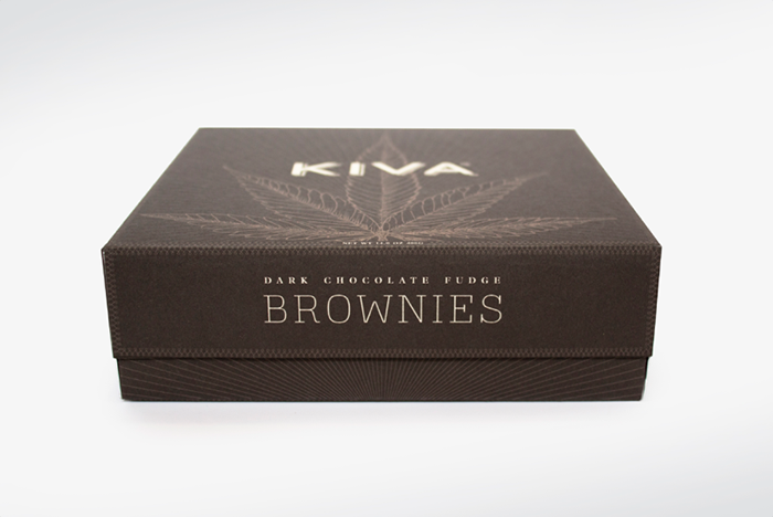
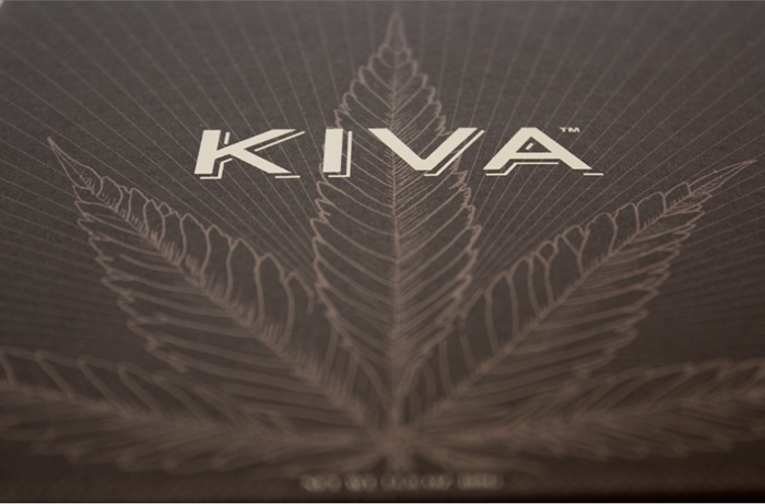
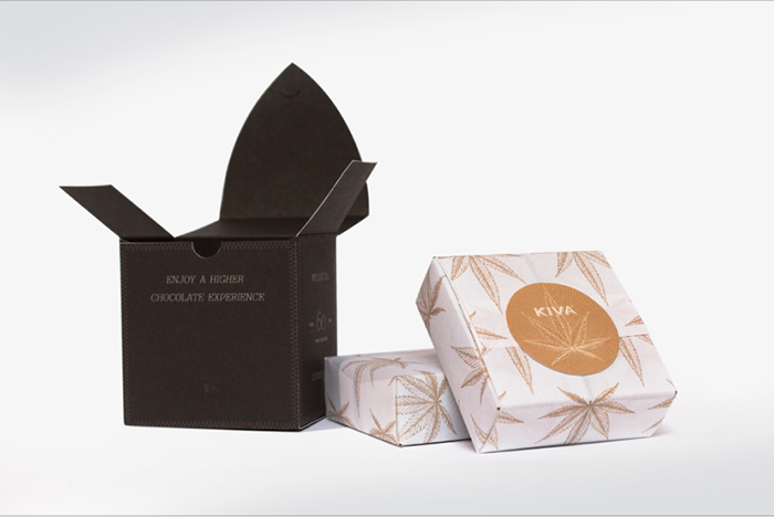
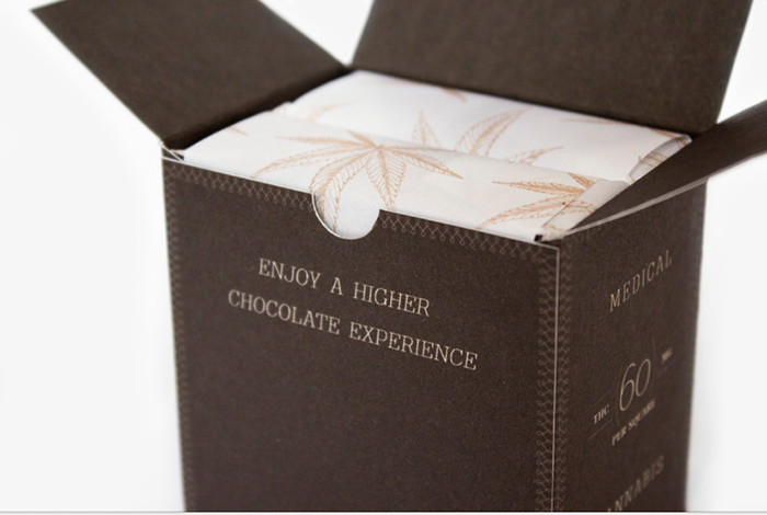
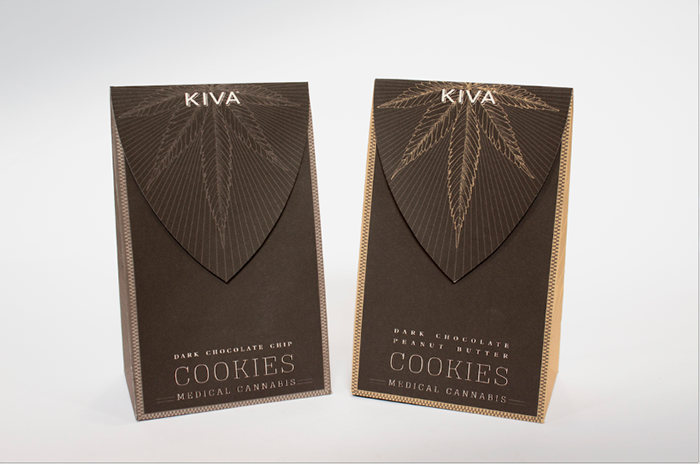
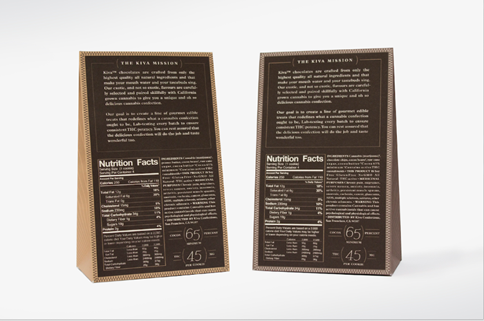
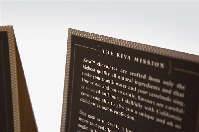
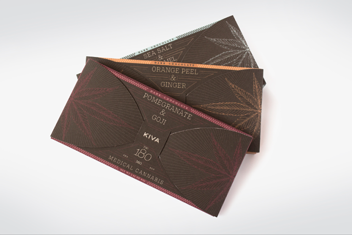
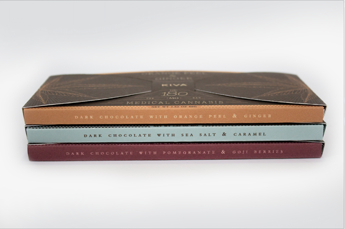
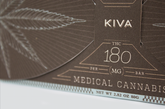
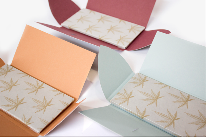
The concept for the packaging was to bring sophistication to edible cannabis confections. The variety of lush, rich, dark brown hues employed by the brand emphasize the richness of the artisanal chocolate. Classic serif typography is paired with a modern thin slab serif that complements the intricate border detail, engraved marijuana leaf, and radiating lines to create a package that feels both modern and vintage with subtle references to 1920’s packaging trends.
Class / Packaging Design
Professor / Karen Dorff
University of North Texas
Spring 2014
Copyright 2014 Garret Steider
Designed by: Garret Steider, USA.







Featured on Package Inspiration