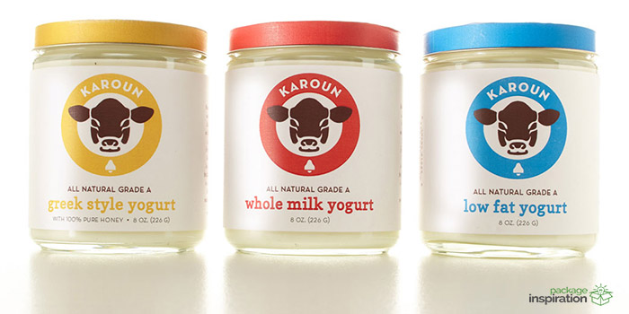
Tasked with the mission to find some existing packaging in the ‘real’ world that needed a little bit of TLC, I chose to redesign the packaging for the underrated, tasty line of Karoun yogurt that has the sad misfortune of being confined to unnoticeable, squat, little plastic tubs in the vast sea of probiotic goodness.
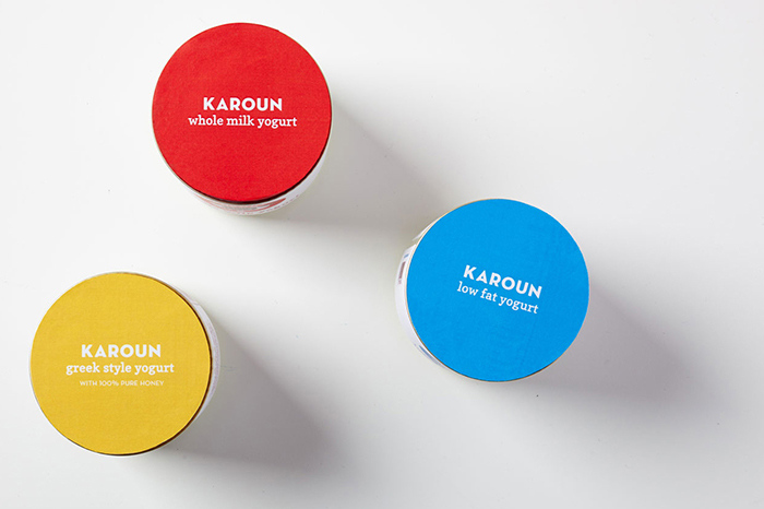
The redesign aims to be minimal, fresh, and clean with a touch of playfulness through the use of bright primary colors drawn from industry color conventions for milk fat percentages. The container itself was upgraded to an elegant glass jar with a twist off lid and a textured linen paper was chosen for the labels to add a subtle premium feel.
Designed by: Christina Jirachachavalwong, USA.


Featured on Package Inspiration