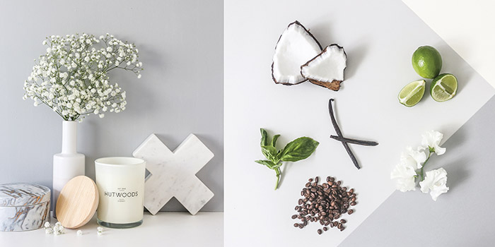
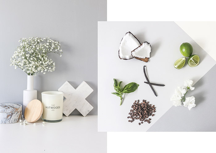
The boutique candle company Hutwoods came to me looking to be rebranded and repackaged. They wanted to be taken from a place of craft to a place of refinement, whilst still retaining their heritage of being handmade in Sydney.
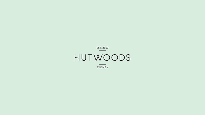
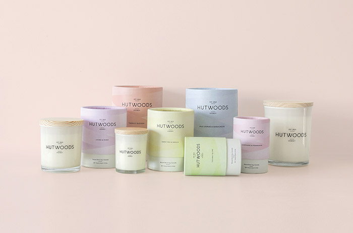
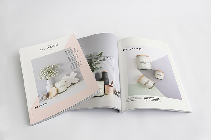
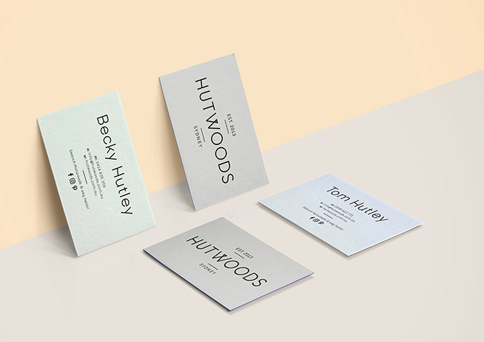
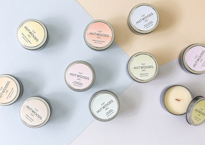
I worked closely and directly with the client to develop a brand identity that is classic yet contemporary, a font has been re drawn to create unique qwirks reminiscent of the wood wicks used in the Hutwoods’ candles — creating a modern logo whilst retaining a classic feel. The packaging was inspired by the fragments of light given off by the candles, but also needed to reflect each fragrance, the result became geometric shards of colour that wrap around the tube packaging. The geometric forms and pastel palette continue on sticker labelling as well in the brand launch booklet.
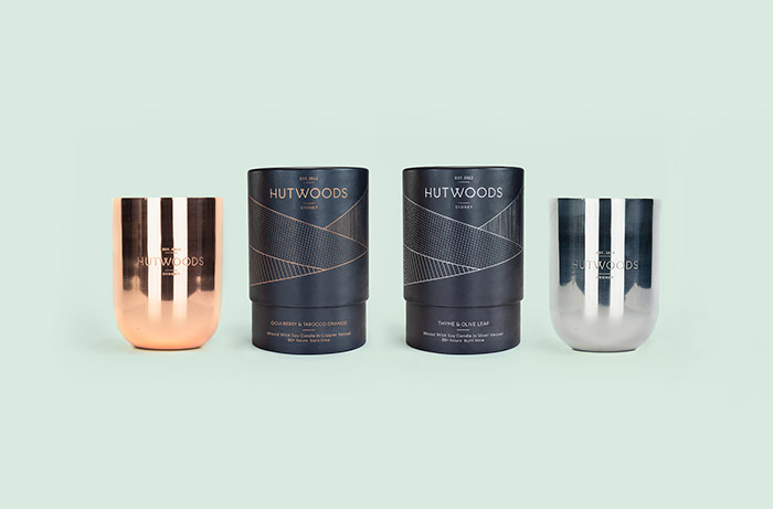
A premium range of copper and silver candles follow the same inspiration but this time printed in silver and copper foils with each shape containing fragmented lines in matching foils. This fine detail on the rich charcoal creates a premium feel that still pays homage to the mother brand.
Designed by: Emma Morton, Australia.
Featured on Package Inspiration
We are young team which works to inspire packaging designers every day! Our team select the best packaging of today and shares with you.
