
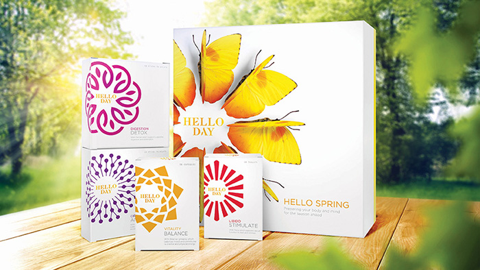
Hello Day is a unique range of healthcare and wellbeing supplements available as a seasonal box, supported by a lifestyle app, and with name, brand identity, and packaging design by DewGibbons + Partners. The very first Spring Box is now available in the UK, with plans to expand to France, Spain, and Italy. It contains four food supplements formulated to help balance vitality, reduce fatigue, activate circulation, and aid digestion.
Each seasonal box contains supplements designed specifically to help people prepare for and meet the challenges and changes each season brings for mind, body, and soul. This is what inspired Hello Day’s approach to healthcare – and it’s visual and verbal language.
DewGibbons + Partners worked on the brand positioning and designed a future-proofed visual and verbal language to easily communicate the brand and product benefits to the core customer base of 30-50 year old urban dwelling women across all communication and media touchpoints.
Sebastian Rumpler, founder of Hello Day, said: “DewGibbons + Partners has given Hello Day a visual style that’s in tune with seasons and nature, focuses on end benefits, balances science and nature, and that is bright, light and optimistic. The brand and its packaging really stand out from the crowd ¬– and what’s all the more impressive is they helped us bring Hello Day to market in just six months.”
The design captures the brand idea that Hello Day helps people ‘roll through the seasons’, and dials nature and science cues up and down depending on the communication. Key elements of the brand’s design, which will eventually span 20 products over eight categories, include:
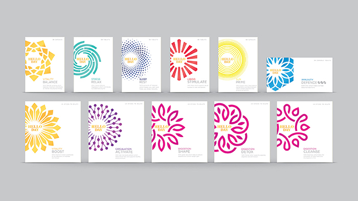
• The Nature’s Pattern is the core visual equity. It is the binding element that connects everything and that changes according to use.
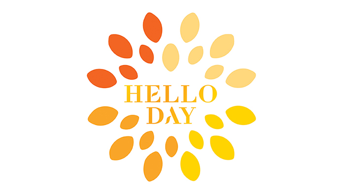
• The logo borrows cues from the beauty sector and combines a customised typeface based on Didot with Nature’s Pattern in gradient orange to signify a new day.
• Eight product category colours ensure strong differentiation across the entire portfolio, represent product attributes, and acknowledge category codes to help consumers navigate. Product categories are further differentiated by using individual Nature’s Patterns.
• The use of white provides clarity and a sense of calm, representing the science and expertise within the product.
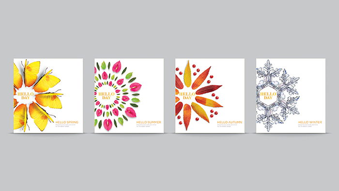
• The outer packaging for each seasonal box reconfigures Nature’s Patterns in a way that’s unique and relevant for that particular season – with a focus on the nature element of the brand with butterflies for Spring, flowers for Summer, Autumnal leaves, and Wintry ice crystals. The inner product packaging uses graphical vector-based illustrations to elicit a feeling of scientific efficacy.
• A series of guidelines for secondary and tertiary photography and moving images that retain the brand’s look and feel.
• The tag line “Roll through the seasons” is used to underpin Hello Day’s Seasonal proposition – it gives the brand momentum, optimism, and acts as a call to action to the brand’s consumers.
Nick Vaus, partner and creative director at DewGibbons + Partners, said: “Seasons, Nature and Efficacy are the three key parts that make up Hello Day’s big idea. These elements, along with the brand mark, are dialled up and down in the visual and verbal language throughout the customer journey, dependent on how important they are to the brand and the consumer’s need state.”
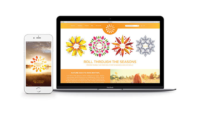
And it doesn’t stop there. Hello Day’s website and free app accompany customers in the process of feeling, looking and flowing better with step-by-step programmes for each product, seasonal advice, assessment cards, controlling product intake, ordering again, and much more. DewGibbons + Partners devised Hello Day’s website and app templates based around the visual and verbal identity, then worked closely with Make It Rain who built the website, and Interaction Healthcare who created the app.
Designed by: DewGibbons + Partners, United Kingdom.


Featured on Package Inspiration