H
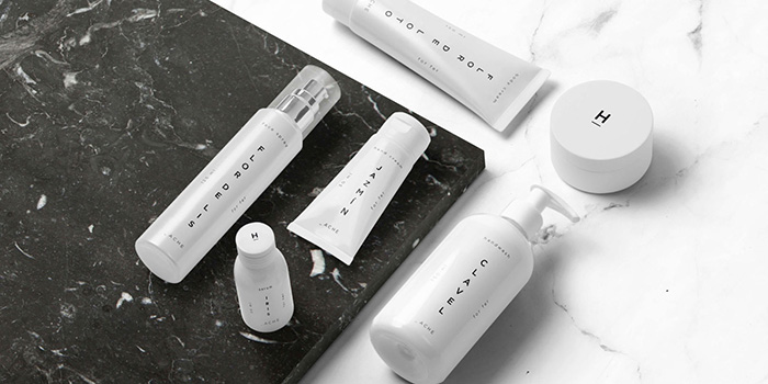
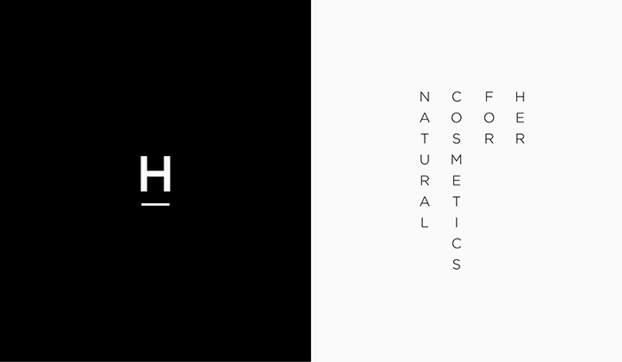
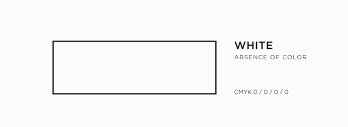
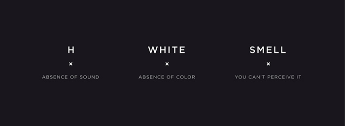
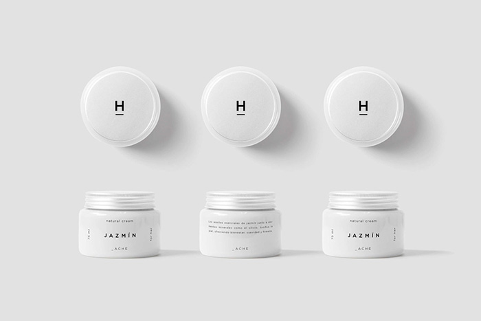
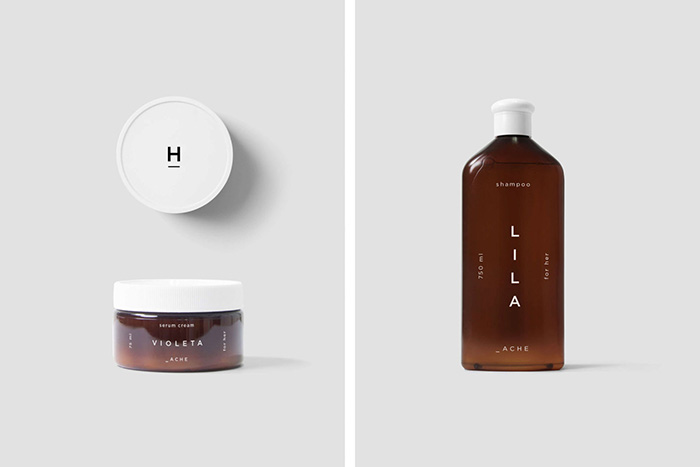
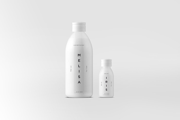
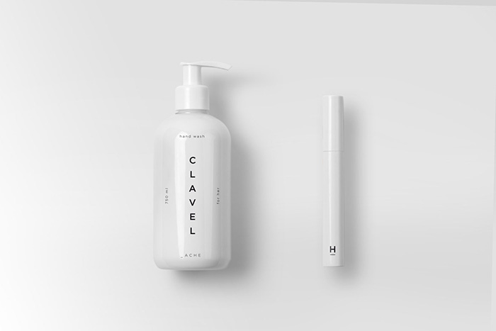
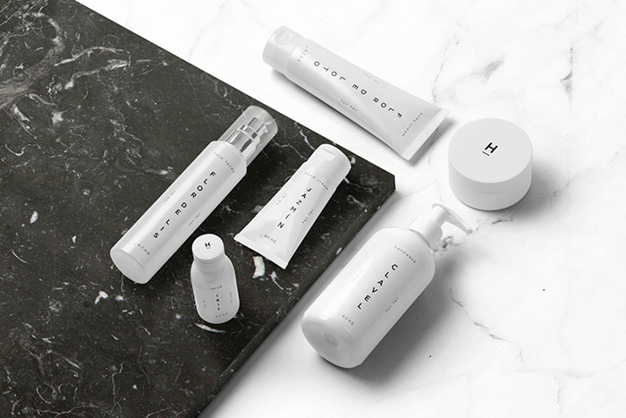
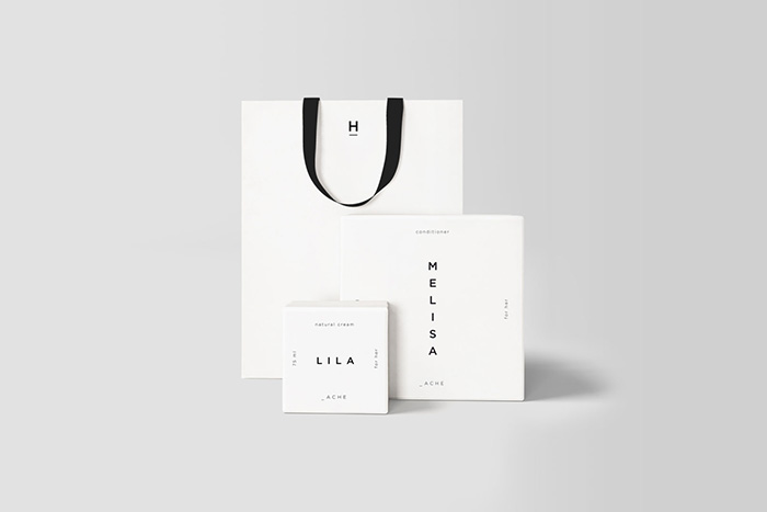
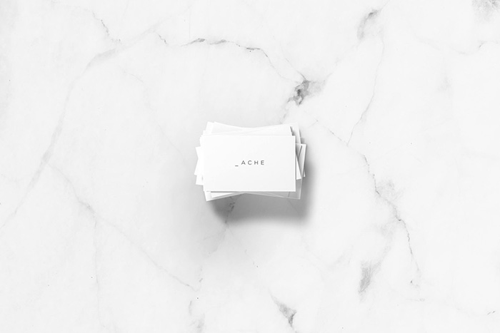
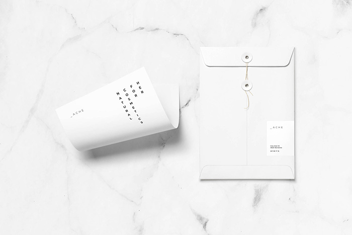
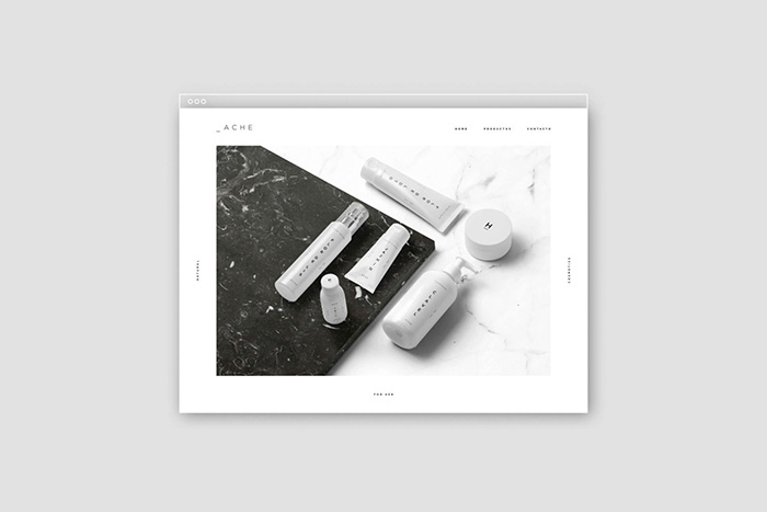
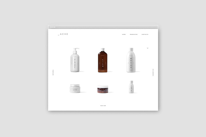
“H” produces natural cosmetic products made up of floral ingredients and essential oils typical of the Mediterranean culture. It is an organic, transparent and simple brand. Far from any pretension. Graphic design remains true to these basic principles. In Spanish, the “H” is the only grapheme that does not represent any phoneme, it is mute (absence of sound). The main color of the graphics is white (no color). And each of its products, carries the name of a flower (its smell, we can neither see).
Designed by: Sandra Llopart, Canada.
Featured on Package Inspiration