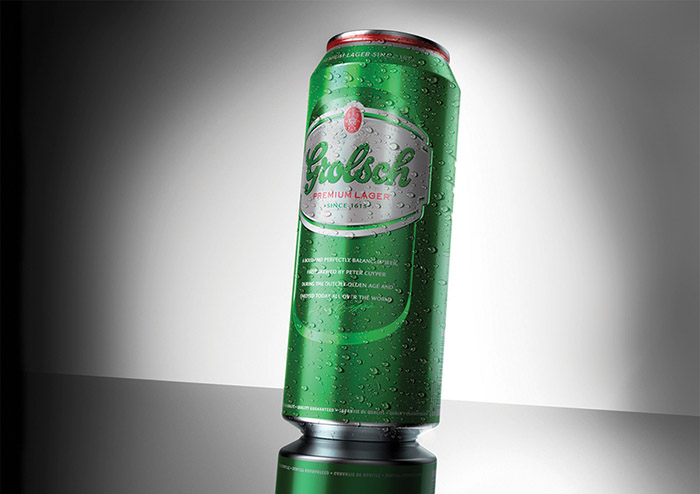
“Above all, Grolsch has a rich heritage and we believe the new packaging shows off the brand’s story of quality, attention to detail and pride in standing out from the crowd. In addition, we revitalised Grolsch to increase stand-out on the beer shelf.”
Ronald van Amerongen, Global Brand Director Grolsch
BACKGROUND
The Grolsch brewery was founded in 1615, and recently became part of the SABMiller group, which saw the potential of a global player in this brand. However, to achieve this, the brand presentation must be that of a global player too.
CHALLENGE
The new brand presentation needed to focus on the clear coherent message of the brand as well as increasing freshness and standout factor. Also the international variants and Dutch variant had to become more coherent so that one clear Grolsch message is delivered worldwide.
SOLUTION
The key solution was the development of the reinforced image carrier, the ‘Grolsch brand badge’. CARTILS explains: “After winning the pitch we translated the brand strategy into a coherent design strategy, resulting in creative solutions that serve a strong international brand. The new image carrier reinforces the Grolsch brand values. It provides a more fresh, robust and dynamic look.” The ‘brand badge’, with the rejuvenated logo, embodies the values the iconic Grolsch brand stands for: independence, craftsmanship, authenticity and a premium feel. But more importantly, it shows a brand world that revolves around beer with character. To emphasise this world, the packaging consistently uses a vivid green background, in which the characteristic ‘G’ prominently stands out.
Designed by: Cartlis, United Kingdom, Nederlands.

Featured on Package Inspiration