
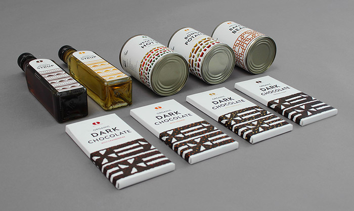
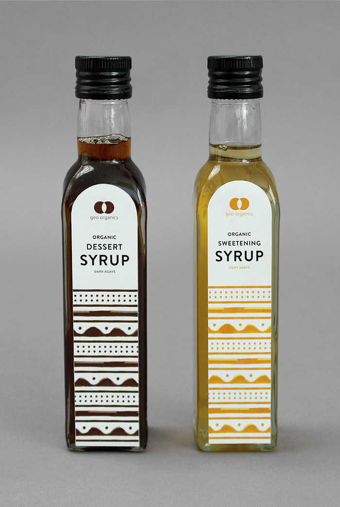
The food market is very competitive and if your packaging doesn’t grab the consumer’s attention then they will never buy it. I have updated the identity with an emphasis on the brands history in Fairtrade and organic food.
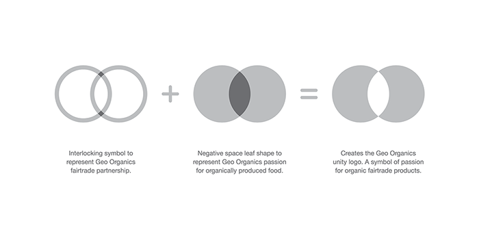
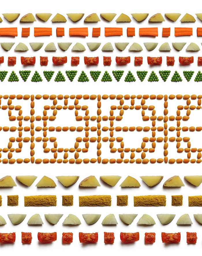
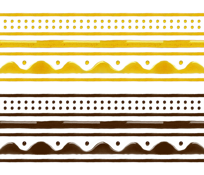
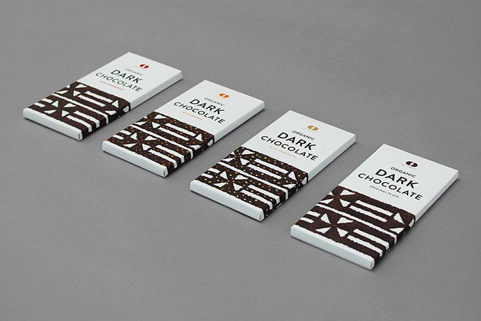
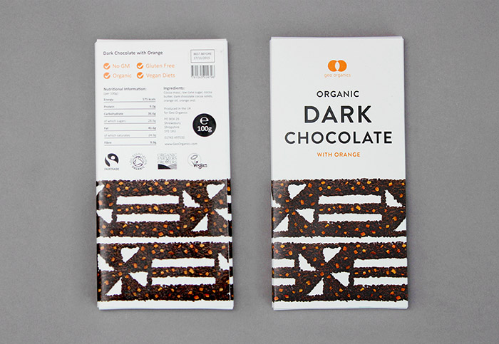
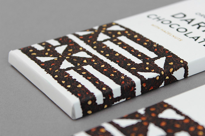
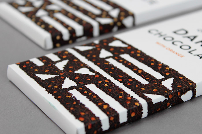
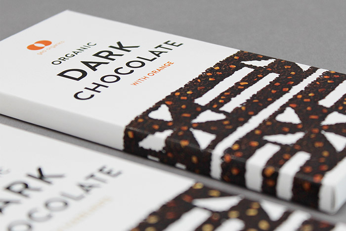
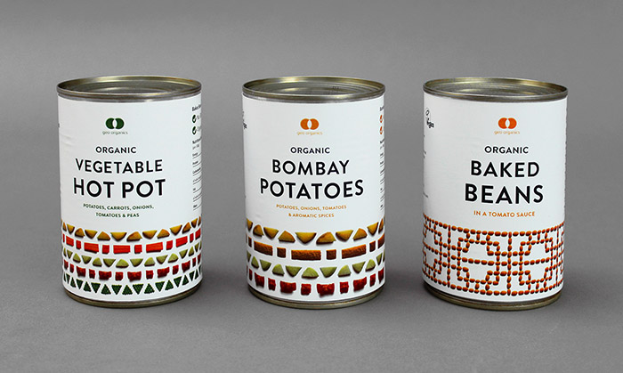
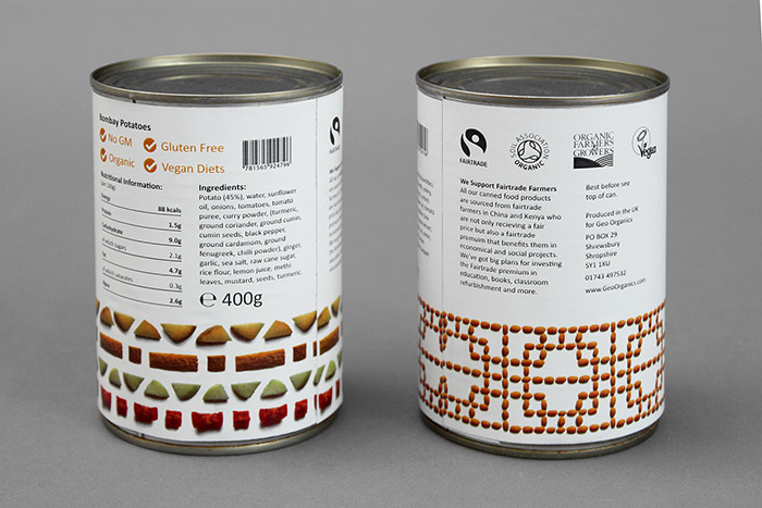
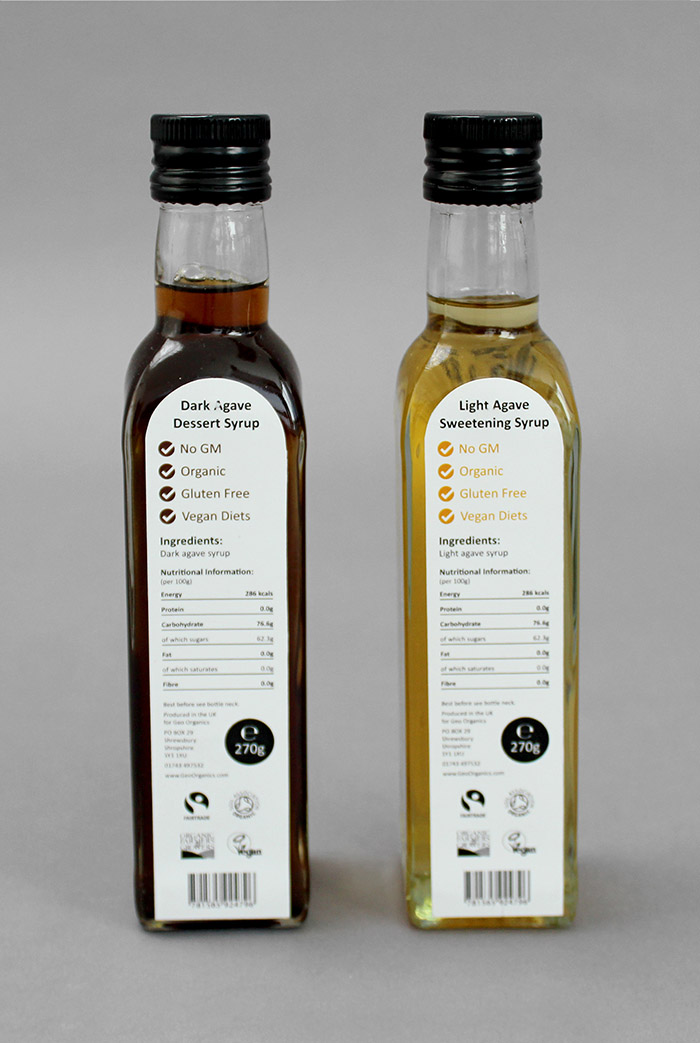
The logo is a direct representation of their brand values with the use of connecting circles and a negative space leaf. The food packaging adds another dimension to the brand by conceptual showing the origin of each product through use of patterns native to the country where it is farmed.
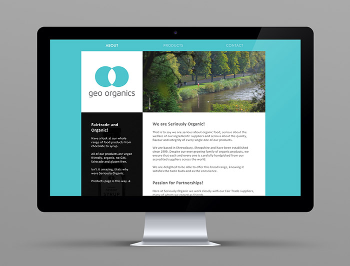
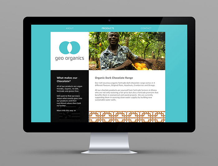
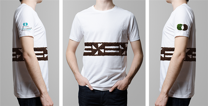
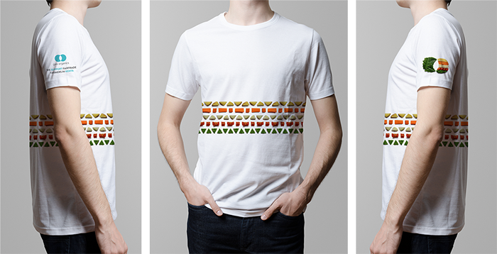
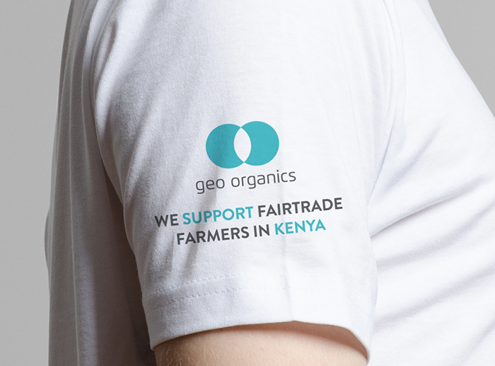
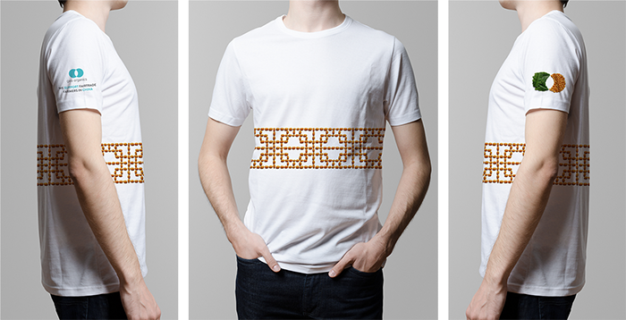
The alternative photography logo’s were made for the website and t-shirt design, they work on their own or with the Geo Organics name. The functionality of the website is very simple, when you roll over the photos or logo they change to tell a story or fit the design of the current page.
Designed by: Jonny Aldrich, United Kingdom.












Featured on Package Inspiration