A new packaging line for Gamma
Paint is a vital segment for any DIY chain. It’s the most differentiated product segment in these stores, dominated by international companies like AkzoNobel and PPG with an extended brand portfolio. As #1 DIY-chain in the NL, GAMMA wanted to challenge this and strengthen its own position in the premium segment. The paint department is vital in attracting a wide target audience including women and young couples.
Besides the basic private label paint ranges, where GAMMA already has a strong position (same quality-lower price), GAMMA wanted a specialty range focused on style and colour. The range needed to help customers find their own style (and matching colours) more easily by addressing the major interior style groups and give them the confidence to change their interior and keep it up to date.
The GAMMA brand is not solely focused on decorative paint therefore it needed a strong packaging concept to position this specialty range as serious competitor for the leading A-brands.
The packaging of decorative paint should not show impressions of interiors as this limits the imagination of the consumer to see a specific colour in their own environment. It may even be a reason for not buying the product because the shown interior does not fit the consumer’s own style. In addition, a cost effective packaging production cannot keep up with the speed of interior style changes. This project was more than developing packaging for paint packaging. It needed a clear product proposition in communication, presentation and packaging, introducing a multi-step decision making process with the main goal of quickly finding the right colour.
Within the challenging environment of a DIY store we wanted a daring and disruptive concept. The new range needed to distinct itself clearly from all a brand specialty ranges.
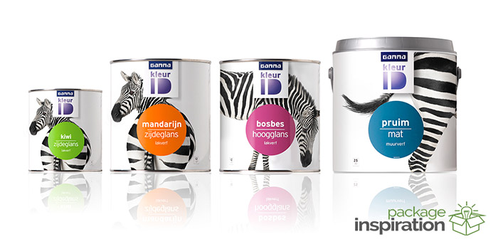
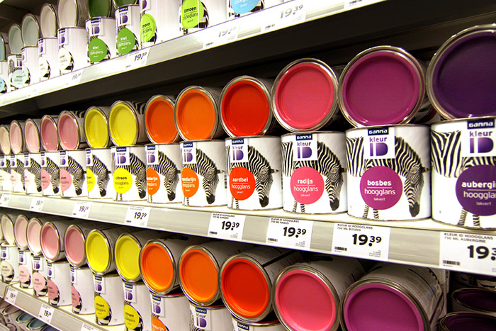
The zebra is the hero of the concept, a distinctive and timeless style icon. It is a quirky and stubborn symbol on one hand, adorable and recognisable on the other. Its black-and-white stripes allow it to combine nicely with all of the colours in the range. The zebra is the connecting link between store presentations, communication tools and product offering on shelf. The concept offers simplicity and focus, making it easy for customers to choose the right colour for them. The colour indicators have been applied through a sticker. This makes it possible for GAMMA to keep the colour range up-to-date in a cost effective way without losing the recognisability of the pack. Nothing is black & white.
Designed by: VBAT REFRESHING, Netherlands.

Featured on Package Inspiration