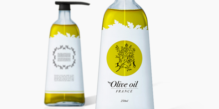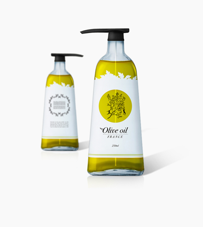
DESIGN PROCESS OLIVE OIL: I have designed an olive oil with a pump so you do not mess up in the kitchen. The idea was keep the bottle functional but also look stylish and inviting. I wanted to keep the the label clean to add more focus on the shape of the bottle and therefore I only used black and white, also because it follows in the graphic profile. I wanted to take advantage of the contents of the bottle so I highlighted that with a punching and a illustration.
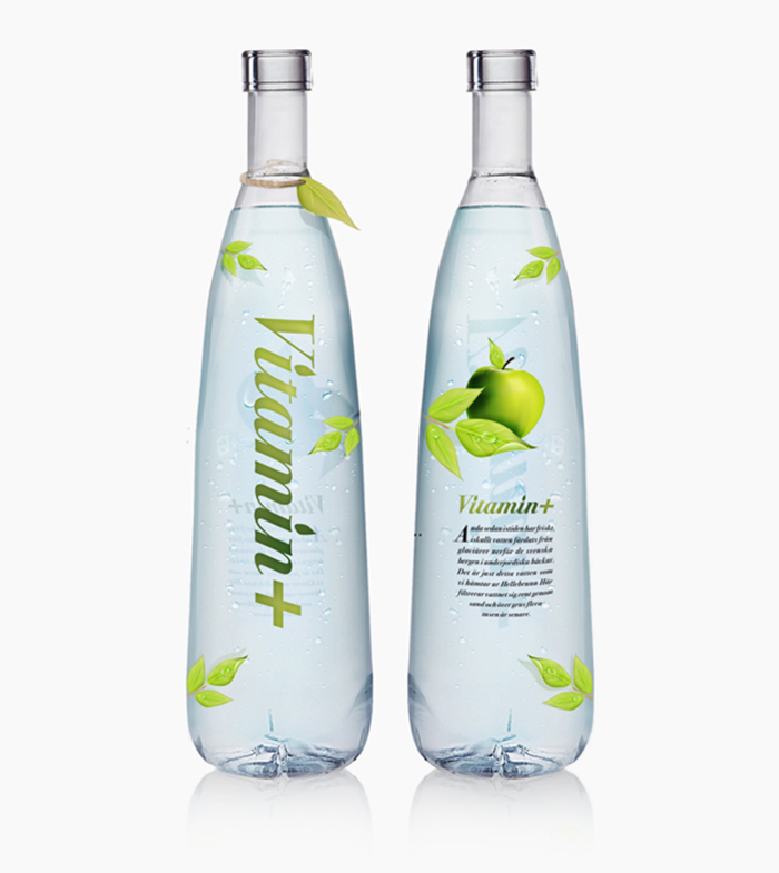
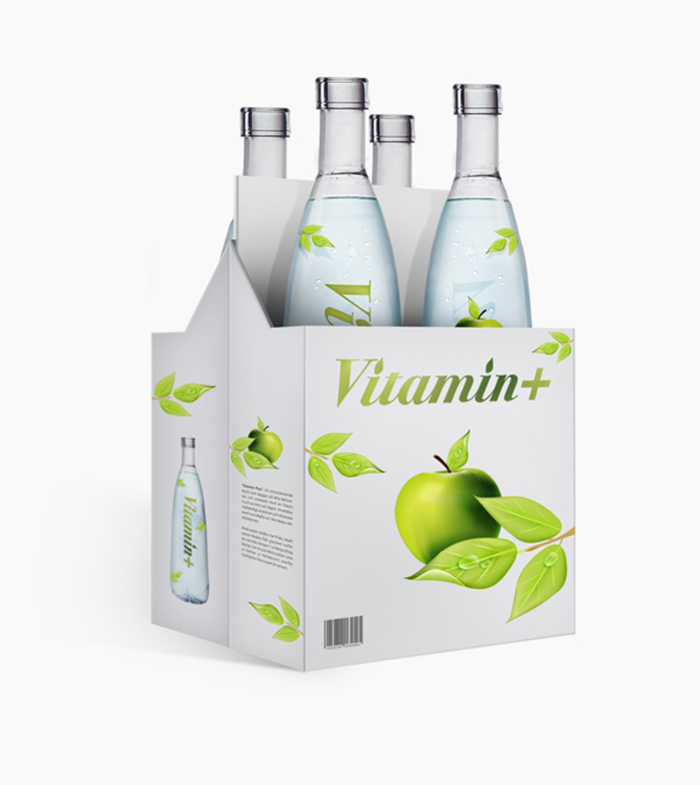
DESIGN PROCESS » VITAMIN + : I wanted to create a bottle that gave an exclusive appearance, but also looked fresh and modern. then I took out a design for a pack of four that will be easy take-away. The same modern feel I wanted to keep on the label of the bottle. I created an illustration of an apple with a number of leaves to symbolize the taste of the drink.
Designed by: Joakim Agild, Sweden.


Featured on Package Inspiration