
FORCE | FLEX
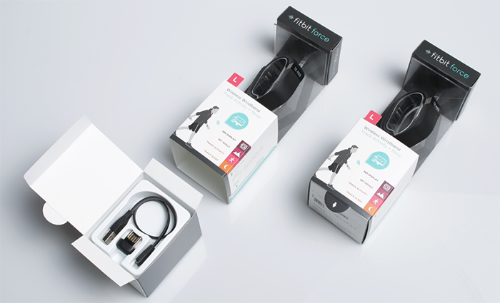
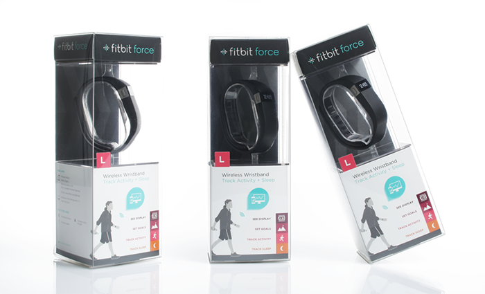
The FitBit Flex is all about lifestyle. To showcase this slim, stylish device, we needed a package that familied with the other FitBit products and sleekly showcased the unique wristband form factor.
FEEL THE FLEX
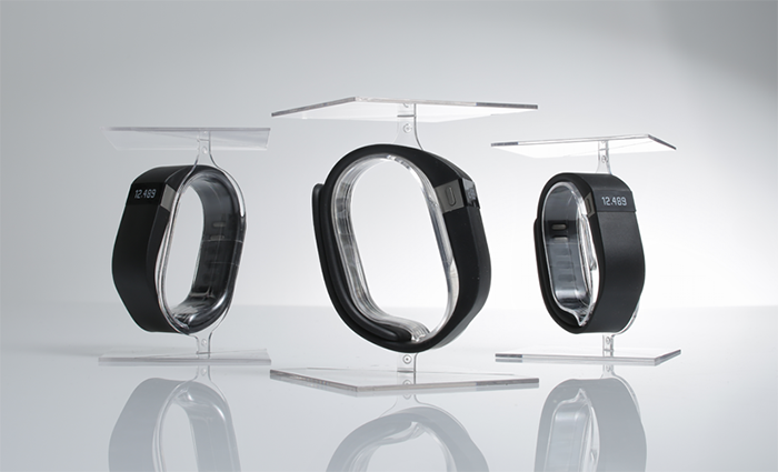
The Flex package immediately stands out with its unique 360° view of the product. The graphics, overall shape, and look and feel of the design follow the FitBit line. Using a molded polycarbonate on the interior of the package, the FitBit Flex presents the devices as if it’s floating on an invisible wrist, so the consumer can see it from all angles.
The FitBit Flex package takes optimal use of space to a new level. An accessory box is nested below the platform that holds the wristband, giving the box form and the perfect space to present its branding.
ZIP | ONE
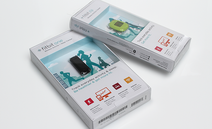
For the FitBit products, we needed a package that was as simple and small as the devices themselves. As a product family, we wanted the FitBit Zip and FitBit One packages to feel aligned, while letting the distinctive elements of each product stand out.
BIG IMPACT IN A SMALL PACKAGE.
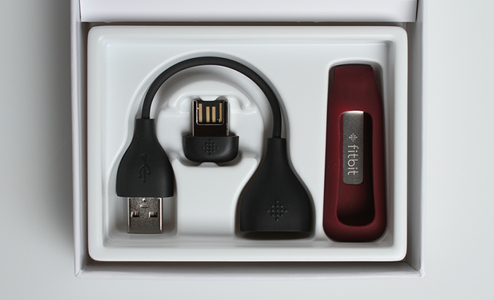
By using a clear, easily recyclable PET box, these packages show off the FitBit devices and giving consumers a great sense of how small they really are and how easily it can fit into their life. The FitBit is held in place by a clear, injection-molded polycarbonate clip that makes it appear like it’s floating. When the consumer opens the box, a door at the bottom of the package lifts to reveal the Quick-start Guide and the accessories that fit snugly in a thermo-formed plastic tray.
To differentiate the premium FitBit One product, Uneka made the package slightly larger and gave consumers an almost 360-degree view of the device. With this design, we’ve kept a consistent feel across the line, while conveying the additional value this product offers.
These packages offer the perfect fit for each product and the family feel FitBit felt was so important.
Designed by: Uneka Concepts, USA.


Featured on Package Inspiration
 Bath products, Beauty
Craft Packaging Concept for Masstige Pure Balance Cosmetics by Moloko Creative