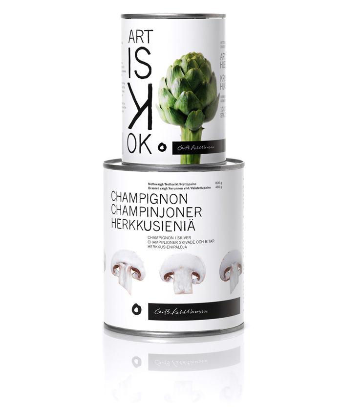
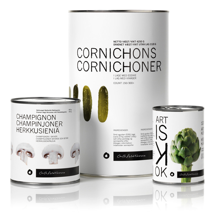
“We used the name of the company founder to form the new logotype. We framed the existing handwritten version of this and balanced it with a small irregular hole-like sign next to it. Referencing a small food bite, a liquid spot or an ink drop this sign is becoming part of a larger packaging alphabet we designed for the assignment. As we had to predict different uses for small and large quantities, we assembled a group of original, recognizable and flexible visual tools: We invested in a new letter type, a custom made, hand over-painted, organic looking version of ‘News Gothic MT’. We opted for clear images of canned food units avoiding shadows and depth graphics. We designed the logotype as a constant underlining visual reminder. Essential, well preserved cooking ingredients come forward as basic food grammar for all.”


