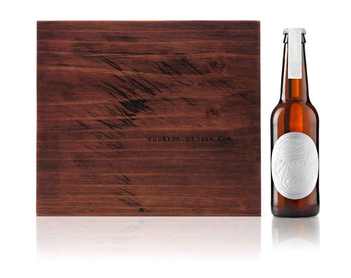
“In the run up to the summer (in Australia), Equator Design’s beer was a small production run of home brew style Pale Ale which we brewed ourselves in our Sydney Office to distribute to our clients.”
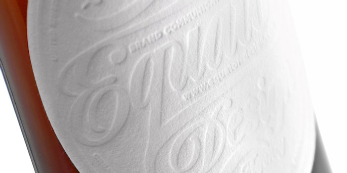
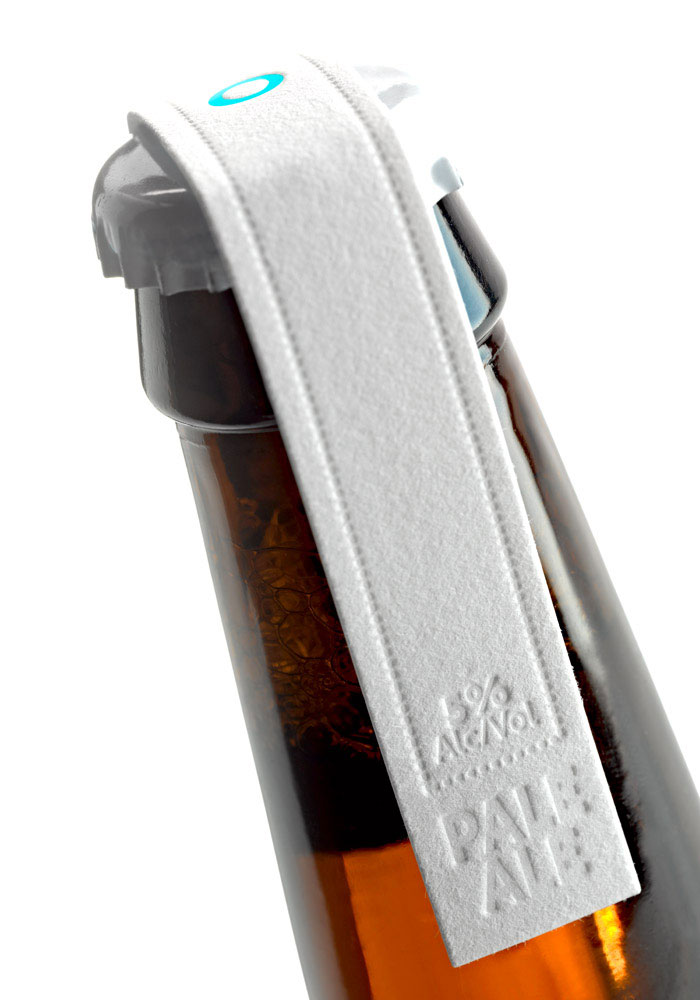
“The objective of the beer was to create a beer that not only encapsulated everything that we as an agency are about but to ‘create an impression’ with our current and prospect clients. We decided to do just that with the labels, deboss them to ‘create an impression’ on the thick stock through a local printing firm’s letterpress machine.
The bottle case’s were lovingly crafted by our very own Studio Manager (Master Brewer), Peter Bradley who is a genius when it comes to making anything from native Australian wood. He spent weeks producing a number of boxes which in turn created massive impact when they were distributed to our clients.
So many of our client briefs of recent are requiring us to engage the ‘five senses’ when defining our creative approach to the design briefs. Tactility or touch was key to this self initiated brief and the label demonstrates that the sense of touch is also vital when considering the path to purchase for consumers. Executed well tactility can add perceived value and indeed add to the overall brand experience.
The 5% Pale Ale is perfect for a late spring session anticipating the warm summer months just around the corner…”
Designed by: Mark Grey – Equator Design Consultants (AUS, UK, US, IRE)


Featured on Package Inspiration