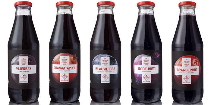
Based on the growing interest in healthy foods, Schulp asked PROUDdesign to develop a design concept for their 100% pure and organic fruit and vegetable juices. So far these juices were integrated in the general fruit juice range, and as such not distinctive enough to attract attention. The design concept should clearly reflect the healing strength of nature thanks to 100% pure, organic juices.
The agency created ‘Eerst Hulp Van Schulp’ (literally: first aid from Schulp). So you instantly recognize that these juices are here to support your health.
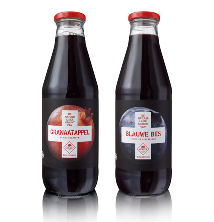
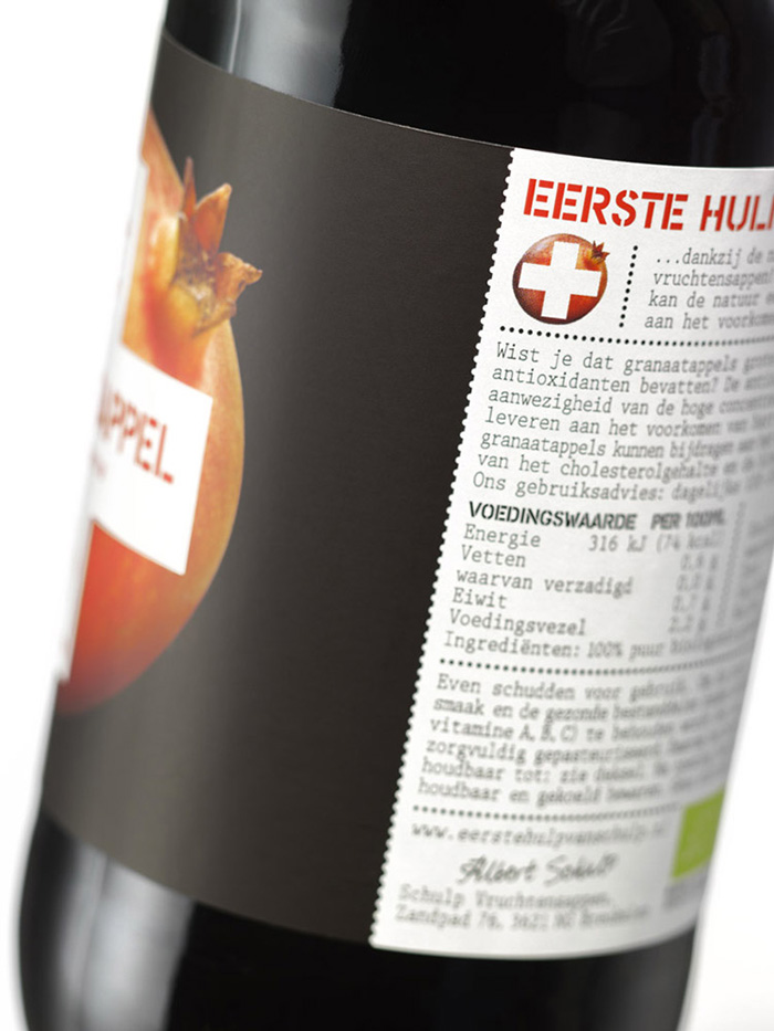
Simple, strong photography of the fruits and vegetables are covered by a strong, iconic graphic health symbol, the cross. The variant names are all in red, using a stencil/crate letter with their Latin, scientific names underneath. The matte paper labels on the bottles are black for strong contrast with the photography and to blend in with the dark juices. The red cap is there to signal ‘watch out’.
Designed by: PROUDdesign, Netherlands.


Featured on Package Inspiration
We are young team which works to inspire packaging designers every day! Our team select the best packaging of today and shares with you.
