Brief:
The brief for this project was is to create a brand as well as a graphic solution for a new range of fresh bread packaging.
Summary/Concept and benefit:
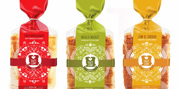
Eazyloaf is a easy-to-carry, perfect in size fresh bread range specially designed for students’ specific needs and unique lifestyles. As a student I know that most students never finish an entire loaf of bread and it usually ends up in the trash because it has gone stale or mouldy. The result is that students tend to stop buying bread. I have decided to focus on this gap in the market. To address this problem, I decided so create a smaller loaf that is about half the size of a regular loaf. This way, there is a better chance that the bread won’t go bad before it is finished. I did further research on students needs, lifestyles and activities and decided to focus on three main activities in order to position Eazyloaf as part of the target audience’s lifestyle.
These are: Sport (active); Work and Fun (play/party). In each category I identified specific needs of students associated with the activity, for example for studying and working late one needs energy and concentration and that little bit of extra brain power.
Bread range:
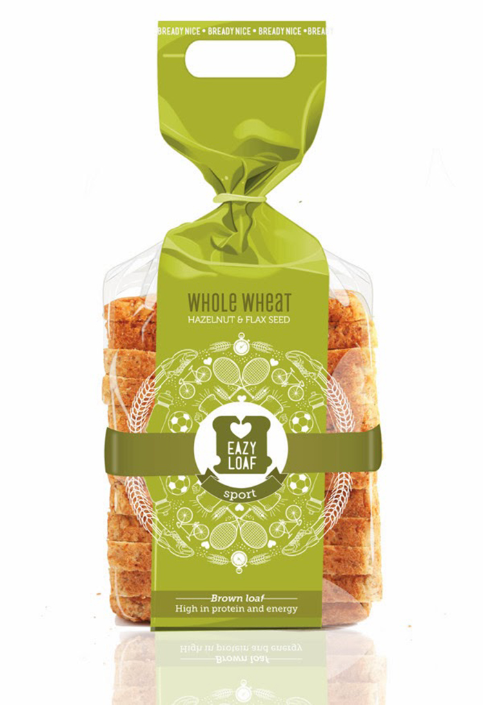
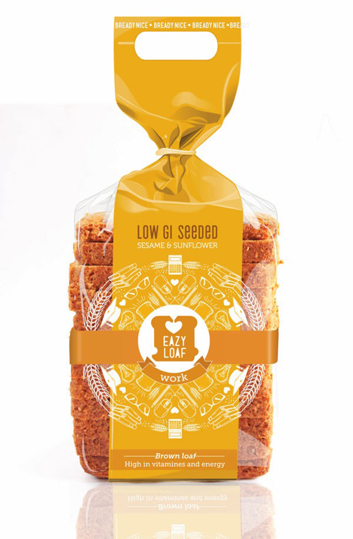
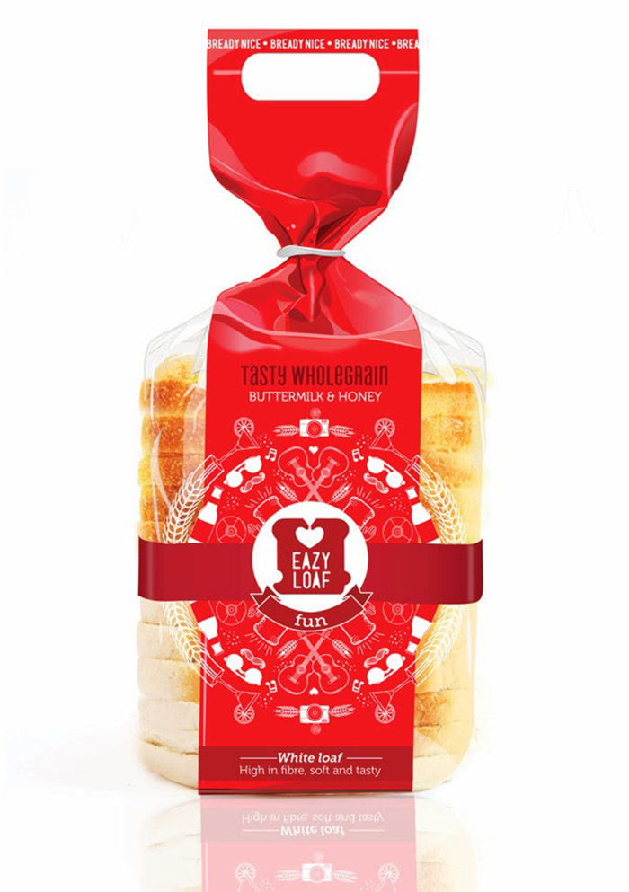
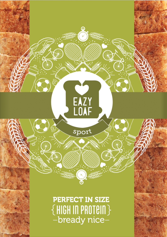
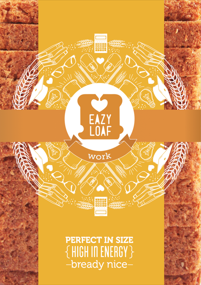
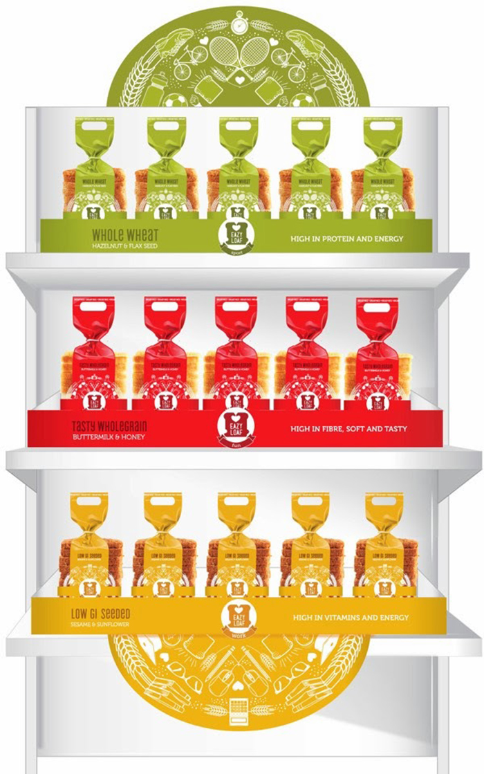
Sport: a Wholewheat bread- extra protein and energy for active students that does sport or other training Work: a Low GI bread with vitamins and energy for that extra brainpower
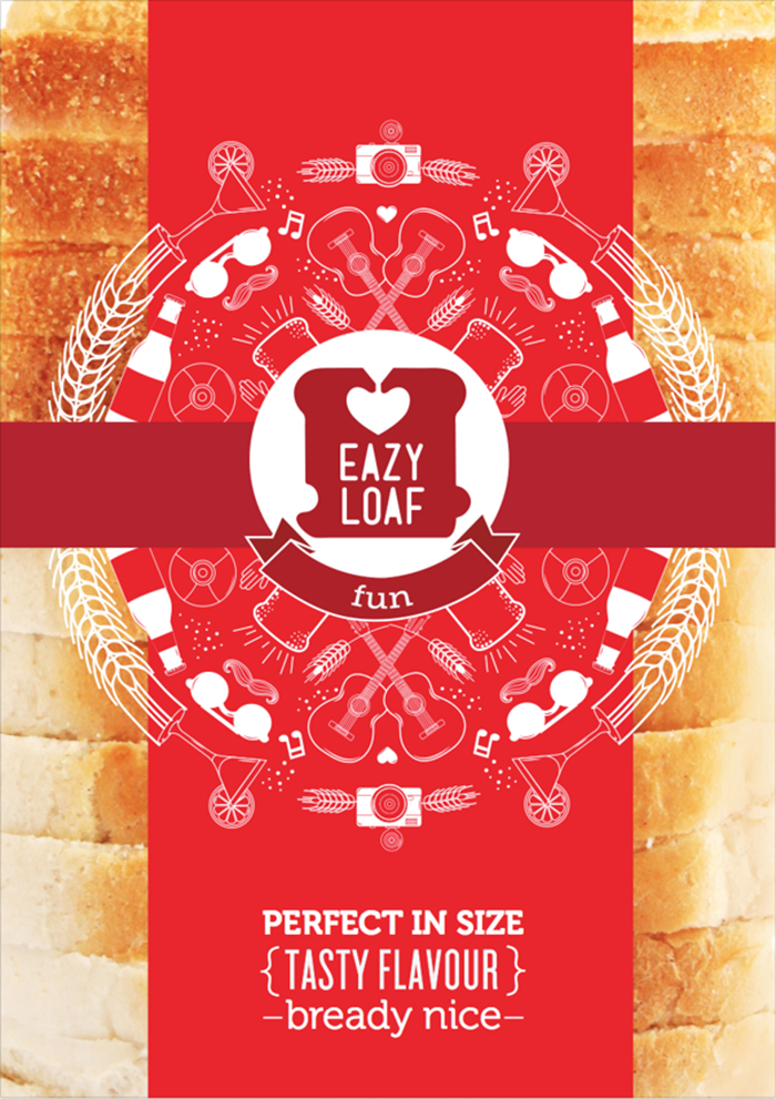
Fun: a Wholegrain loaf that’s high in fibre and has a yummy flavour
Logo:
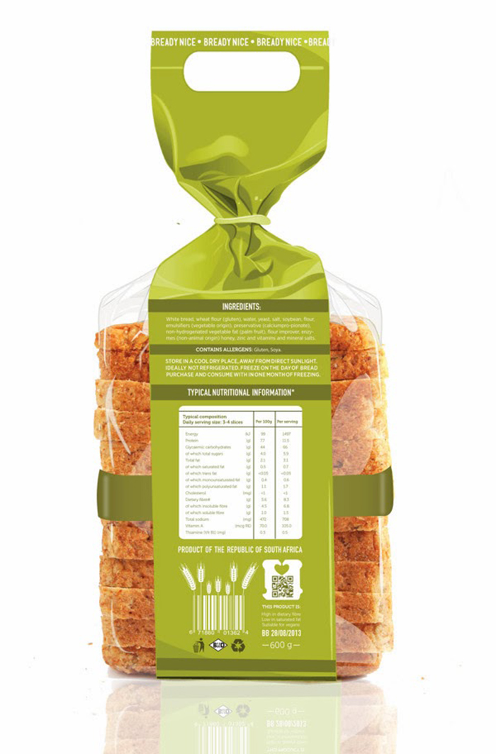
The Eazyloaf logo was inspired by the shape of the iconic plastic bread tag that is used to seal bread bags. The shape is a combination of the bread tag and the shape of a bread slice as well as a heart shape to indicate the health aspect of the bread. Design: The dominant graphic on the packaging is a circular crest pattern done in a vector icon style that is light, fresh and modern. The vector icons illustrates and indicates the activities and objects associated with each specific lifestyle category. The sides of the bread are see-through allowing the consumer to see the contents and be reassured of the product’s freshness.The design is new and exciting and will stand out from its competitors.
Colour
The colours I choose for my bread packaging range is yellow, green and red. Research showed that these colours are very appetizing and thus is it ideal for food packaging. The colours are young, fresh and vibrant which relates to students and will have good shelf impact that will attract students. The three colours are also used to differentiate between the Wholewheat, Low GI and Wholegrain loaf.
Designer: Carli Herbst, South Africa.


Featured on Package Inspiration