
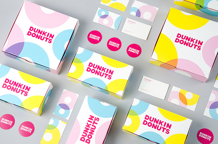
We have created a new visual identity and packaging for Dunkin Donuts. With an expression that communicates fun, simple and playful we have expanded Dunkin Donuts already existing target group.
The new design goes back to the basics. Bright colors, geometric shapes and a simplified logo makes the communication straightforward and easy to comprehend. For recognition we have chosen to use a bright pink as a primary color. As secondary colors we have worked with blue, pink and yellow. They are used together to create a pattern with overprint.
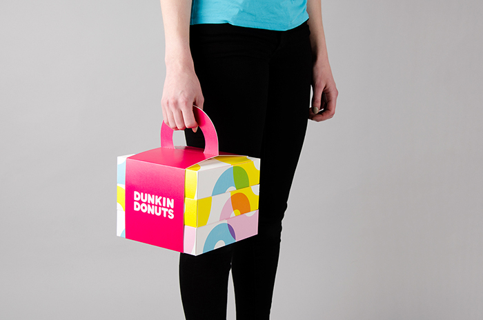
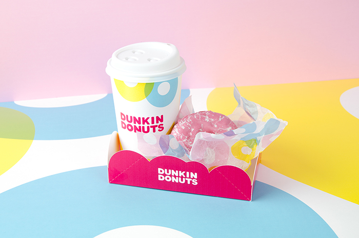
The new packaging is user friendly and fun. The boxes with four donuts can be stacked on top of each other and together with the donut shaped handle you can easily bring twelve donuts with you. The mug and donut holder is perfect for bringing your beverage and donut on the go.
Designed by: Sara Knipström, Sweden.


Featured on Package Inspiration
We are young team which works to inspire packaging designers every day! Our team select the best packaging of today and shares with you.
