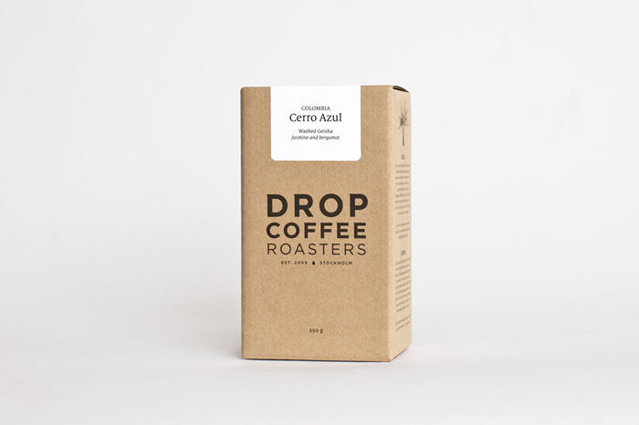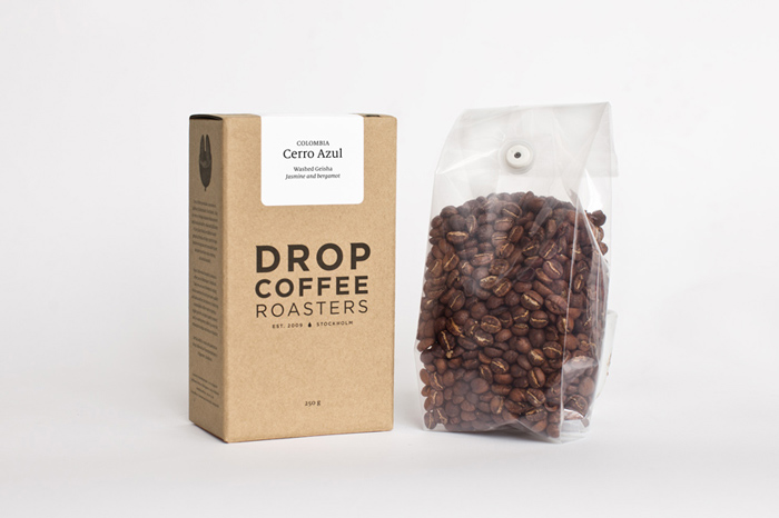
Swedish coffee roasting company, Drop Coffee Roasters, puts a unique spin on their coffee packaging with the help of designer Simon Ålander.
The most common packaging for coffee found in the market today are: pouches and tin cans. Drop Coffee Roasters uses the combination of a cardboard box and a glassine pouch to distribute/transport their coffee. This type of packaging grew from Drop Coffee Roasters’s need to create a packaging that was both functional and appealing to the consumer. “The design of most coffee packaging is made to be good for the producers and the industry. Not the consumer. We had a strong feeling that we had to give the buyer a feeling of food production security on the one hand and a small roastery craftmanship on the other.”
With the emergence of the third wave coffee culture, more coffee drinkers are willing to spend a bit more for a bag of beans. A regular 12 oz. bag of specialty coffee can range from 15-25 USD. But for those who aren’t willing to spend that amount, Drop Coffee Roasters wants them to believe it is worth the extra dollar. Drop Coffee Roasters sells their coffee 120 SEK per box, which is around 18.2 USD. “We want the [consumer] to feel the packaging is reflective of the value of the coffee. If we fail we will only sell our coffee to people who have already tried the beans and know its value. It’s a balance because the industry tought everyone that coffee is cheap. We want people to understand that coffee can also be worth more money.”
Another purpose for the redesign is functionality. “With the box design–inspired from old coffee metal boxes and the square coffee package–we are able to display the coffee on the shelf without the bottom ones getting damaged and the bags from falling.” The labeling for the box is equally as important. Not only did the labels serve as a space to inform consumers about the company, but it also tells people what type of coffee it is, the tasting notes, its origins, producer, altitude, etc. “We change the language on the labels depending if we ship outside Sweden or within. That’s why we choose to keep the label simple, focusing on the farm/farmer/coop. They are the real heroes in coffee–we are just trying to transport their hard work to the end consumer.”
The box design is simple but elegant. It definitely elevates the consumer’s perception of cost. The wrap-around illustration on the back panel gives the packaging that personable touch that Drop Coffee Roasters stated about the farm/farmers/coop being the heroes in the coffee making process.
Designed by Simon Ålander, Stockholm
Photographer: Alexander Ruas


Featured on Package Inspiration