
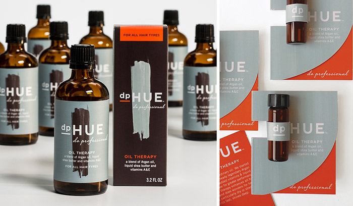
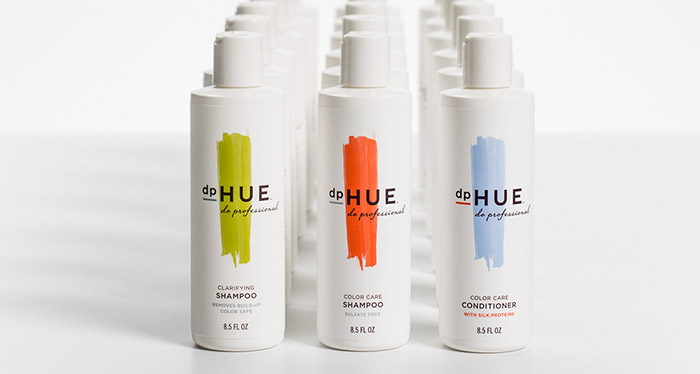
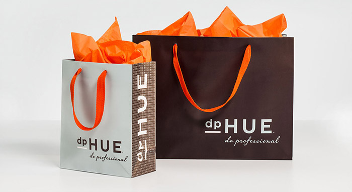
dpHUE Do Professional, Hair Color dpHUE is an innovative, new retail beauty concept that provides professional hair color, color consultation and step-by-step education to customers for DIY hair color application. This is not drugstore boxed color! WDW helped to define how this new concept would be communicated. It is vital that all aspects of the brand, from the name to the identity, to the packaging of the color kits and the haircare products, to the look and feel of the in-store brand, reinforce professional quality and sophistication with easy, foolproof application and a bit of style, of course. The customer should feel that coloring their hair at home is not a sacrifice of the salon quality or experience. The visual language that WDW developed plays out across a wide variety of products and applications; this is a small sampling.
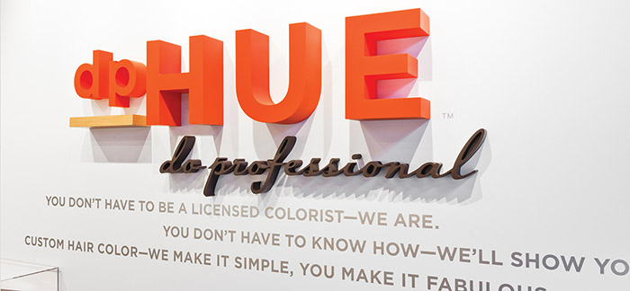
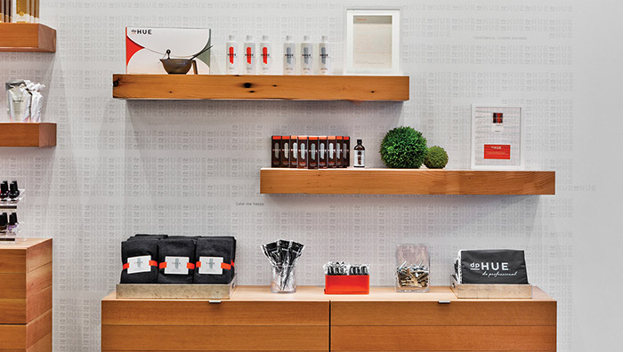
WDW had the pleasure of working with Snow Kreilich Architects on bringing the brand vision into the retail environments. The grid of hair color product behind the cash-wrap creates a central focal point and reinforces the linear details. The slab shelf fixture replicates the bold underline in the logo.
Designed by: Werner Design Werks, USA.



Featured on Package Inspiration