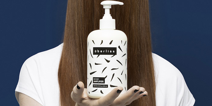
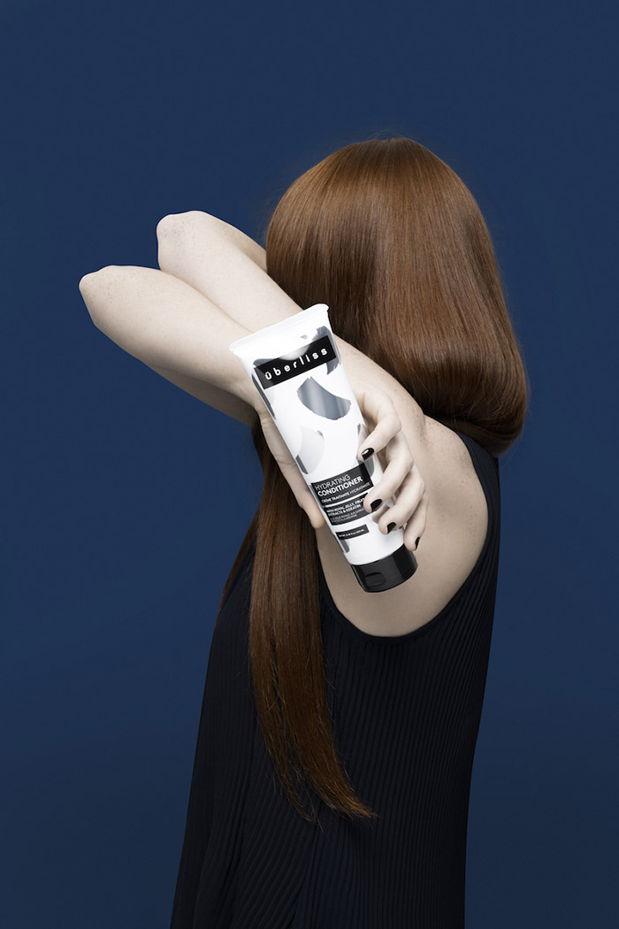
NYC-based, Dutch design firm FormNation completed the visual design rebrand for their long-time client, hair care brand Uberliss. Uberliss requested a rebrand to feature a new look that is both sophisticated and upscale, suited for the most prestigious salons.
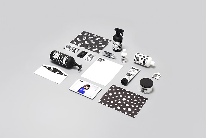
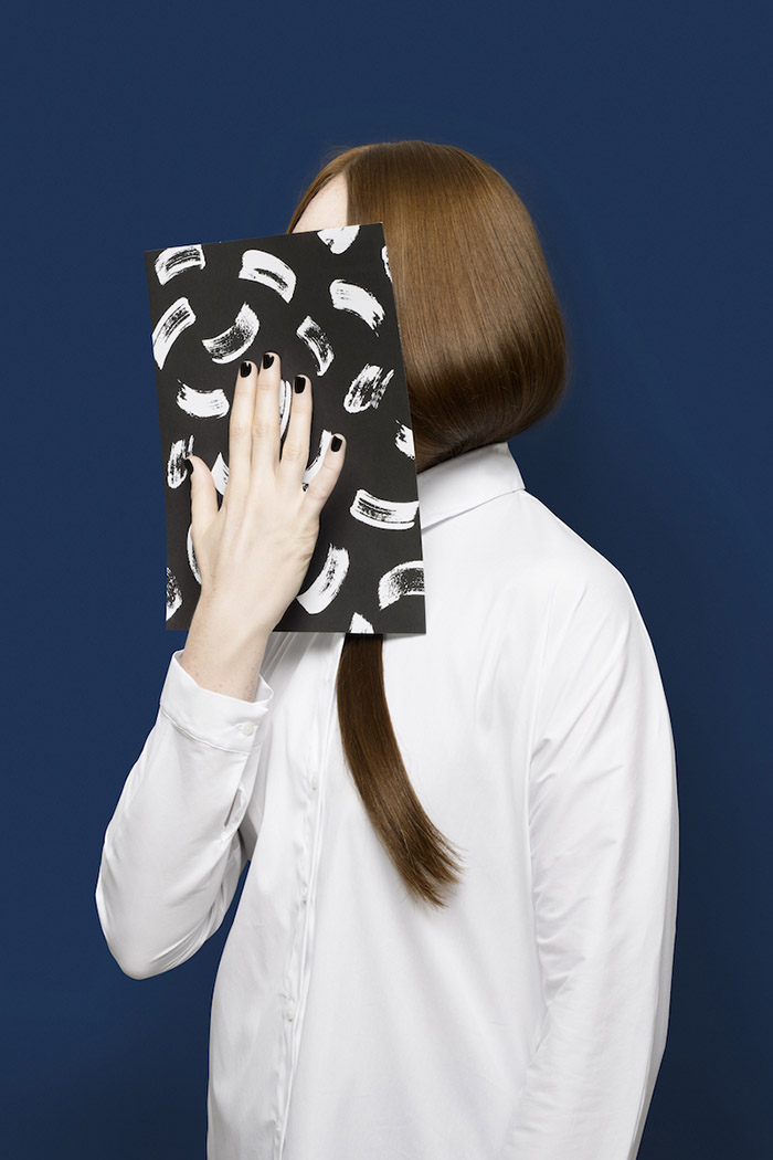
The product market is so saturated that brands need to differentiate themselves in more creative ways. So FormNation came up with a new design process that incorporates hand-drawn artwork and fashion-forward design to create something non-traditional for Uberliss.
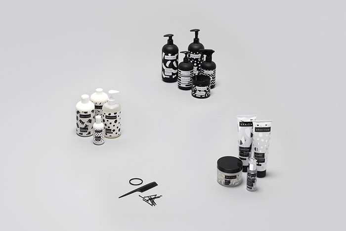
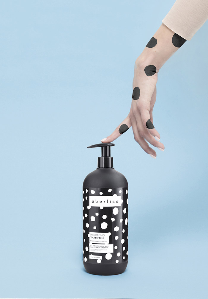
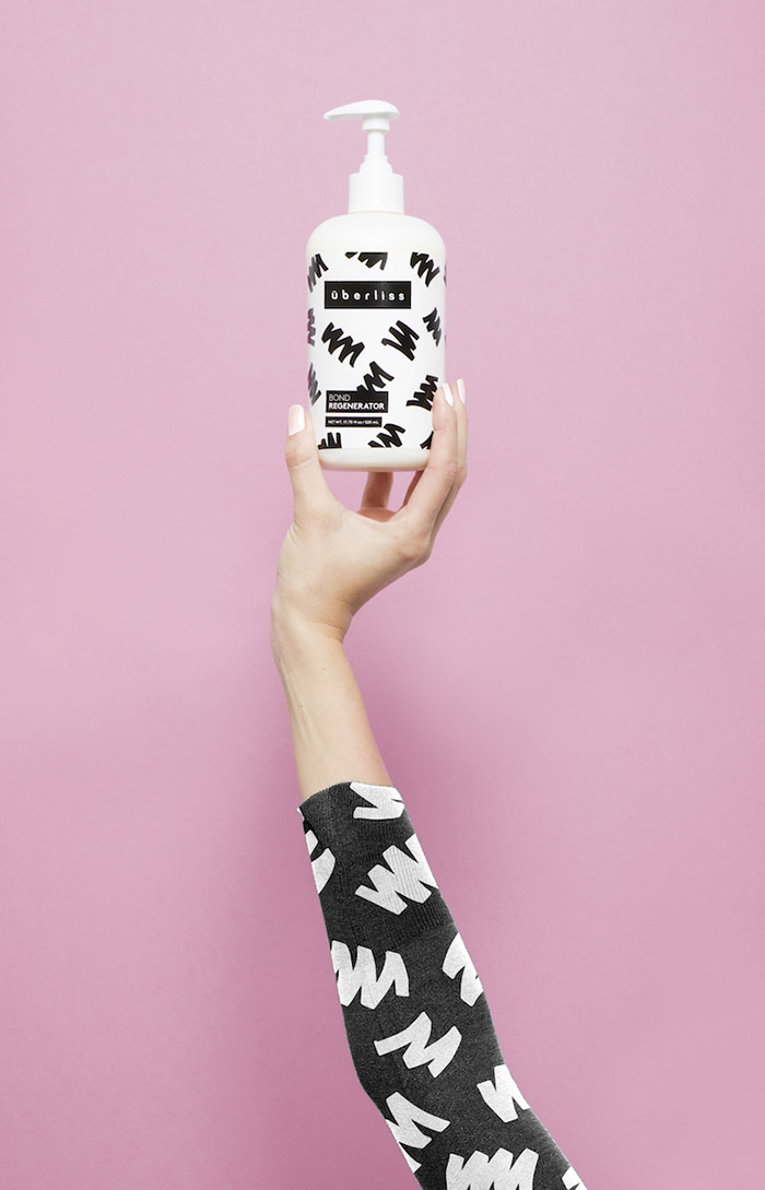
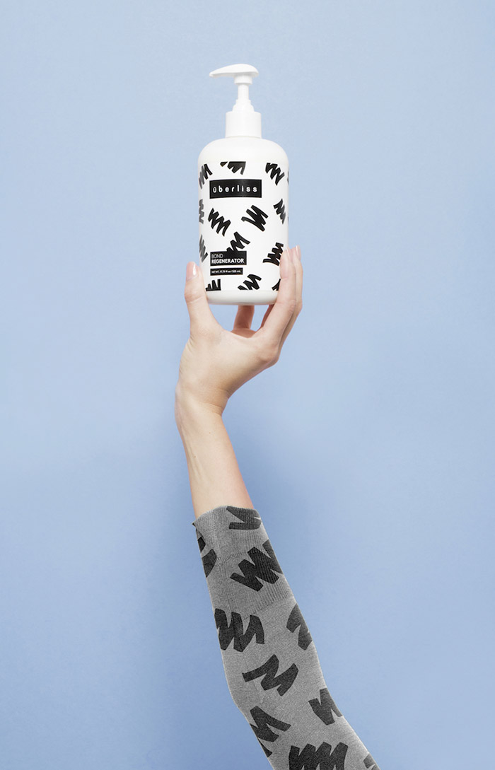
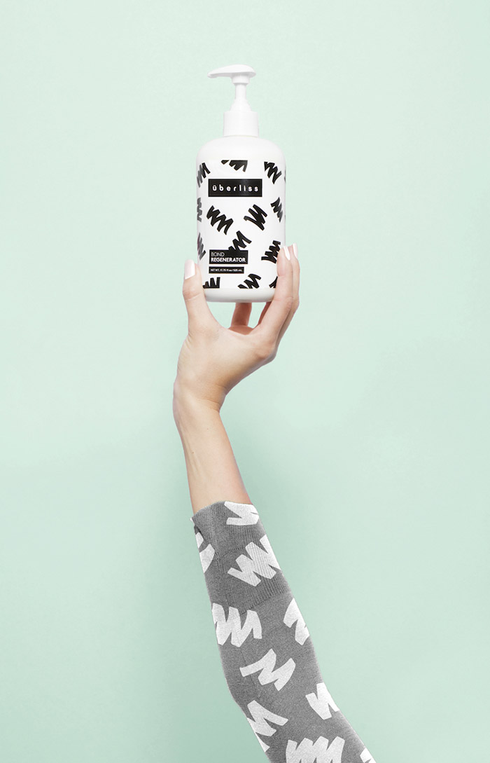
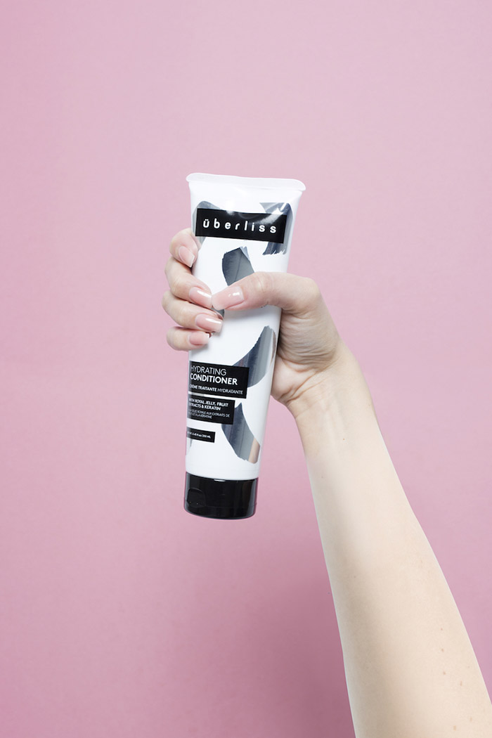
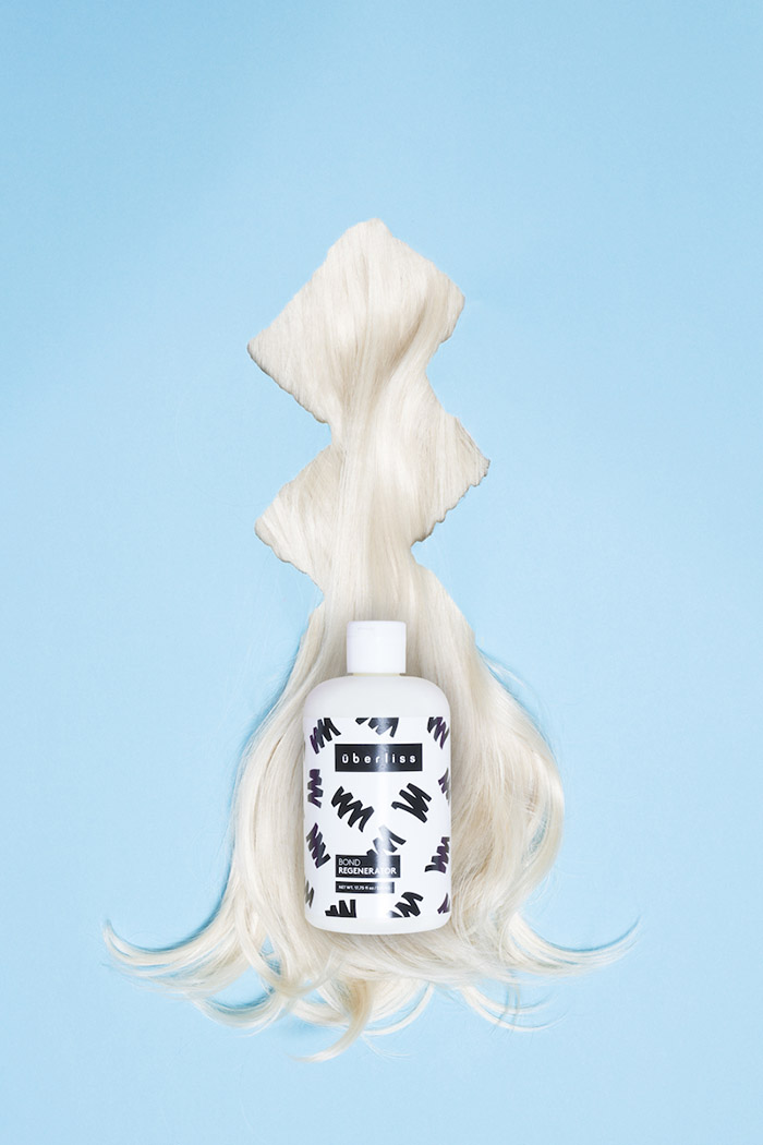
The design included hand-drawn patterns for each ingredient based on what each product does with our hair – straightens, curls, dyes, washes, conditions.
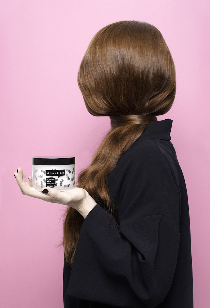
FormNation divided the design into two lines: black bottles for the salons (UV proof) and white bottles for the consumer.
They created a top layer with information blocks and a layer underneath for graphics that can change with the trends based upon the playfulness of the brand.
Designed by: FormNation, USA.
Photographer: Lisa Klappe





Featured on Package Inspiration