Dash | Espresso Packaging
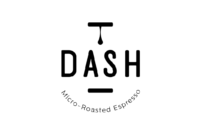
Dassyras, a family-owned coffee roaster founded in 1987, commissioned us to create and develop the name, logo and packaging for a new espresso brand. The name needed to be short, good-sounding, easy to remember and somehow connected to the family business name. So “DASH” fulfilled all three criteria and sounded a lot like Dassyras. DASH was placed in between two dashes to indicate a pause/break. Just like em dashes, which are used to indicate a break in sentence. Meanwhile a coffee drop stands still, creating the impression that it will fall any minute.
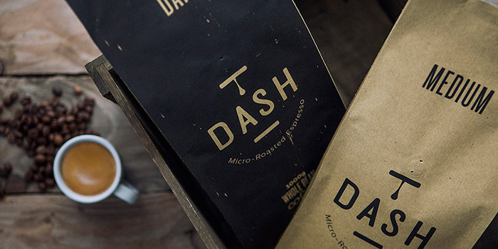
When it came to designing the packaging, we wanted something as crafted as the product itself. Different colors on packaging (kraft and slightly faded black) indicate the type of coffee roasting; kraft for medium-roasted and black for dark roasted respectively.
To convey the brand’s authentic and micro-roasting personality, we designed and printed their business cards on kraft paper and made by hand, one by one, Dash’s wood labels with the logo woodburned into them.
Designed by: S & Team, Greece.


Featured on Package Inspiration