Creative Agency: Left Graphic
Designer: Lefteris Panagoulopoulos
Photographer: Pavlos Kapoglou
Client: Critida Location: Heraklion, Greece
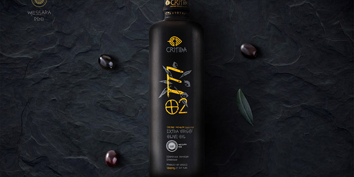
Packaging Contents: Olive oil
Packaging Materials: Clay bottles, silkscreen
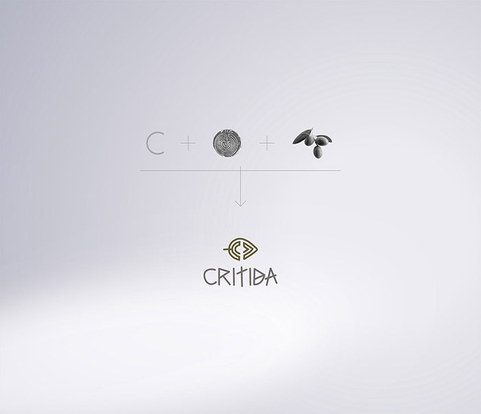
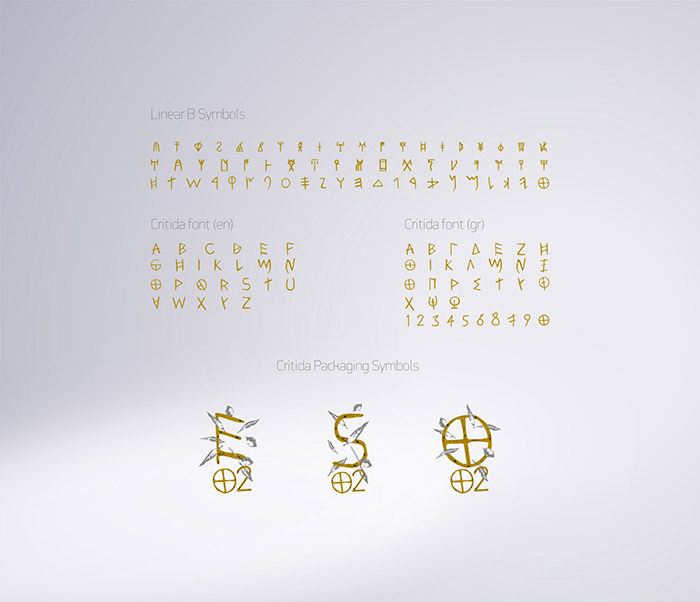
Critida asked us to redesign its logo, visual communication and all of the packages. He asked the new designs to be elegant, simple, and above all, to mark their place of origin. Crete. The whole concept was based on the Cretan – Minoan culture, the history, and the Cretan tradition to produce olive oil for thousands years. We designed the logo in that direction including the Minoan labyrinth, the form of the olive fruit, and the first letter of the word Critida. Then we designed a font by analyzing symbols of Linear B (Minoan writing). From the Minoan era until the present, the oil was kept in clay pots. So we were led to the use of clay bottles. The illustration of the symbols of each product consists a complex of raw material (leaves and olive fruits) and the first letter of the product name. The design was done by the method of engraving on linoleum to be able to attribute the sense of the etched symbols of the Minoan era. Olive oil in his first appearance in food fairs, such as the Terraolivo Jerusalem-Israel 2016 won Best Award Packaging Design award for the new look!


Featured on Package Inspiration
We are young team which works to inspire packaging designers every day! Our team select the best packaging of today and shares with you.

