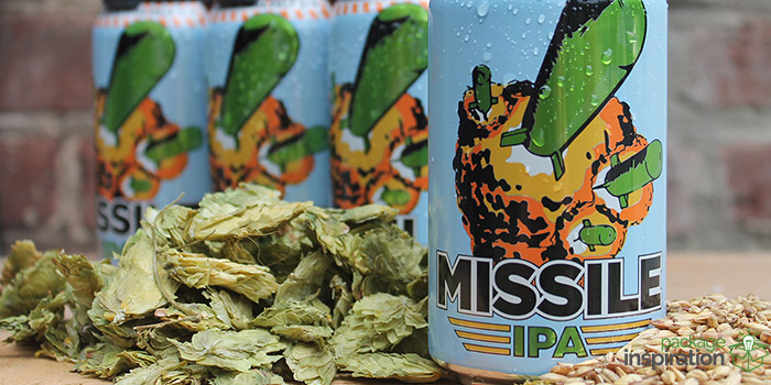
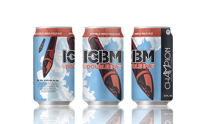
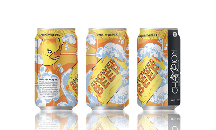
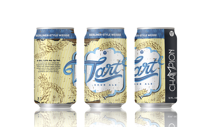
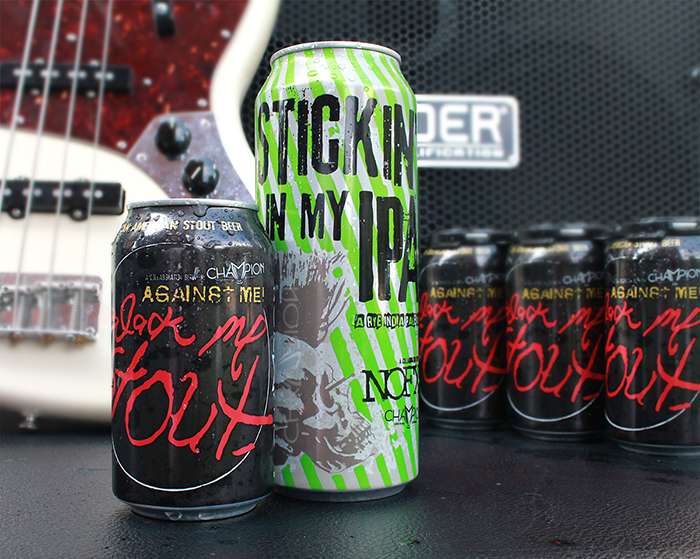
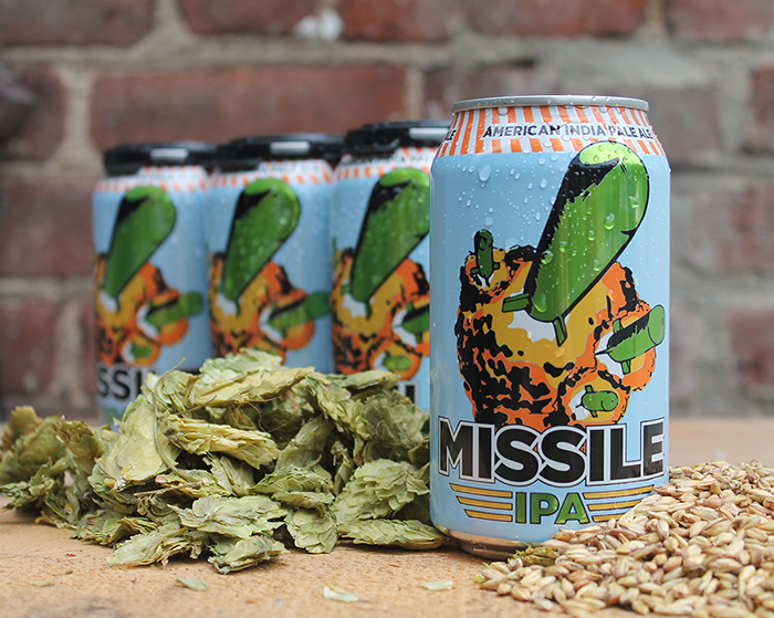
Collaborating on brewing recipes with music icons such as Fat Wreck Chords, NoFX, The Hold Steady, and Against Me!, Champion Brewing Company has dived head first into the national beer market. Designed by Watermark Design, the main line of cans features a colorful illustrative style that is approachable while maintaining their bold individualism.
In the wake of a new website refresh, Champion has gained notoriety on the shelf as they expand to several states across the South. Their rough hewn, hand-drawn illustrative style is reminiscent of the DIY methodology of the American punk scene. The band series are playful typographic studies that reflect the band’s personality and established brand identities. All packaging is done in-house on a Wild Goose Engineering 250 canning line, with a unique modification for 24-ounce ‘bomber cans’. Champion Brewing Company’s core philosophies of tenacity, innovation, and handmade production within the American beer market embraces illustration and a love of craftsmanship.
“The mission of Champion Brewing Company is to create and share beers that move us in the same way our favorite records do. We are obsessed with creating the highest quality beer through expertise and creativity. Our crew has a sincere passion for what we do and we’re thrilled to share it with the beer community. We’re driven by punk rock values and a fierce commitment to independence and innovation. The best beer we ever make will be the next one.”
THINK LIKE A CHAMPION, DRINK LIKE A CHAMPION.
Designed by: Watermark Design, USA.




Featured on Package Inspiration
 Alcoholic Beverages, Beer & Wine
Budweiser #RAISEABUD campaign and limited edition packaging design for Labor Day 2021