Design by: Anna Meleshina
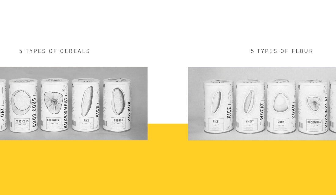
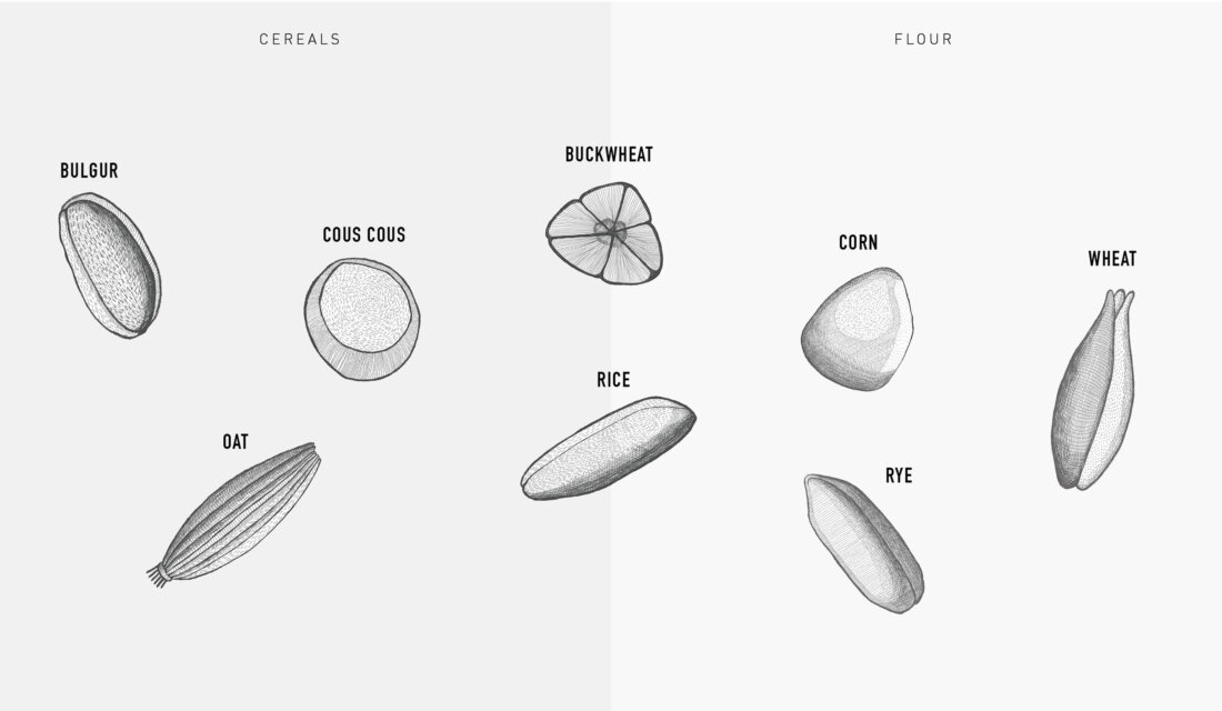
Package designs for cereals and flour. Five jars in each line for now.
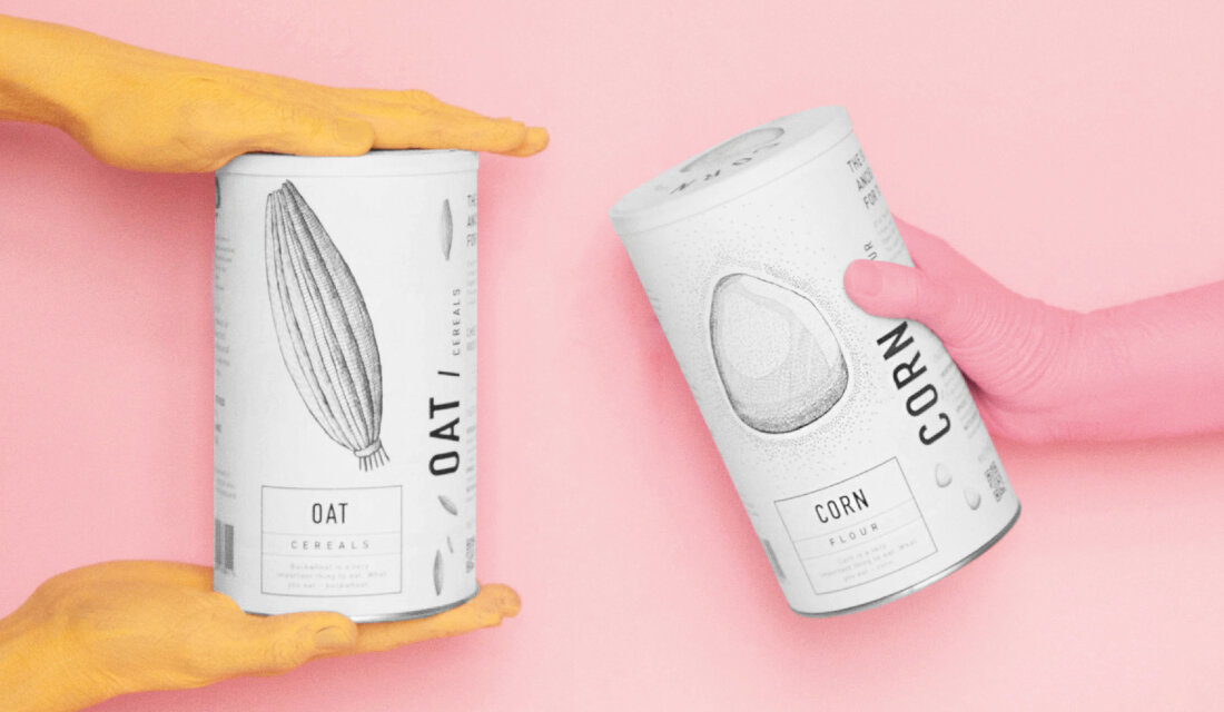
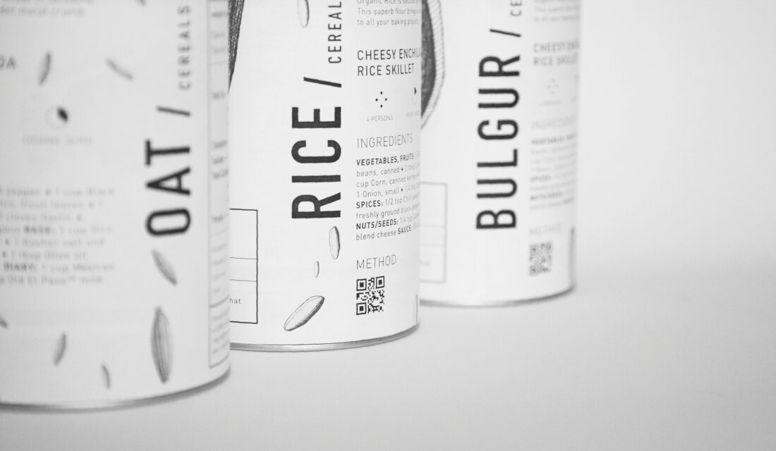
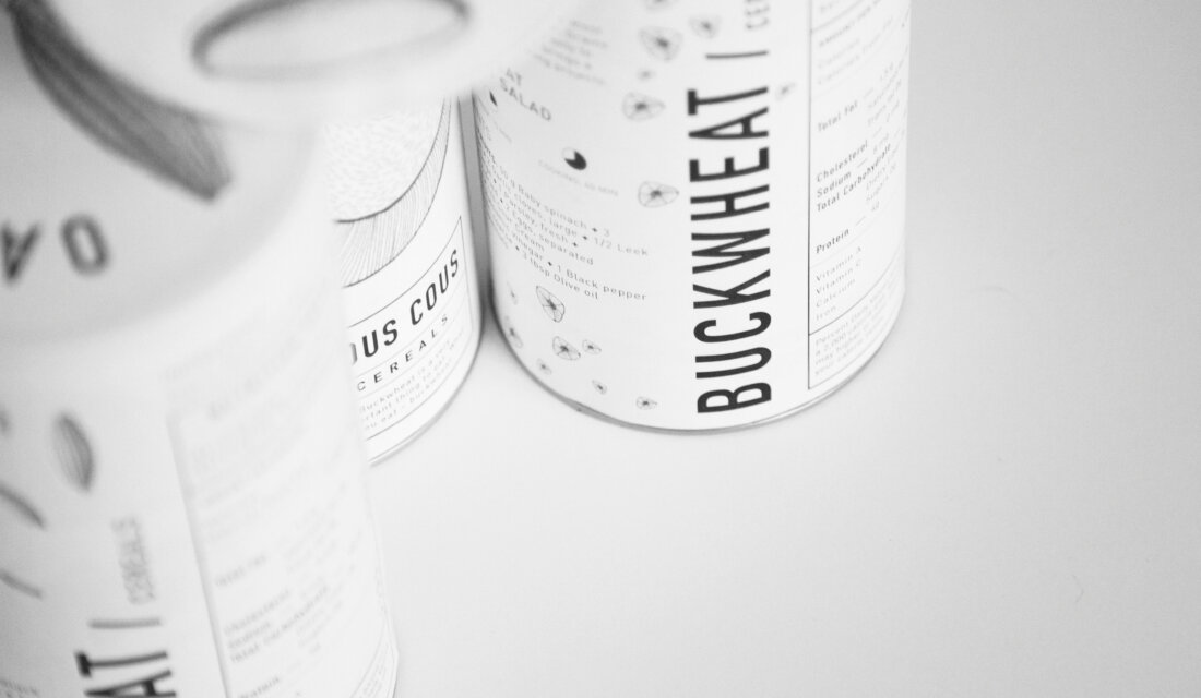
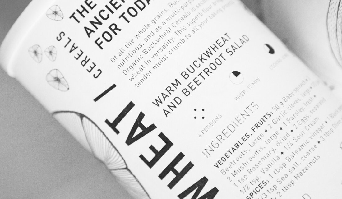
The whole idea was to keep the simplicity and to create the surface of the can informative enough for the customer. Even if merchendisers wouldn’t care how to put the product on the shelf customers hopefully would be able to see vertical text which will help to indicate the type of the product they will need to.
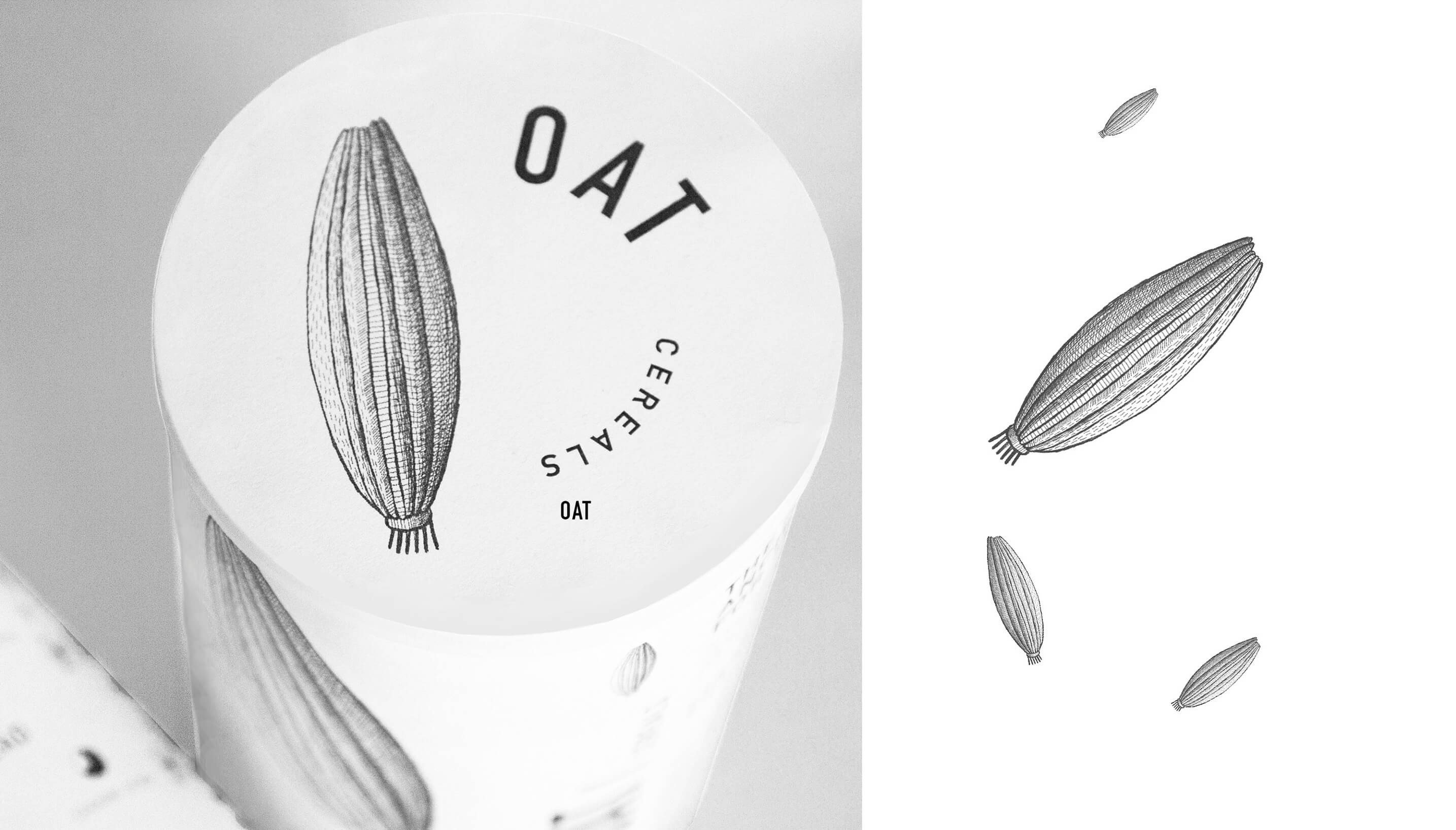
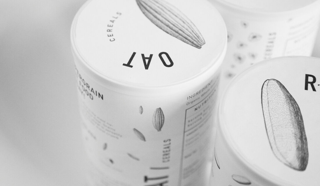
Illustration on the front of the jar represents the content. chose to zoom in each type of grain, to make it bigger and more solid also it seems even more unexpected to observe each grain in more detailed view.
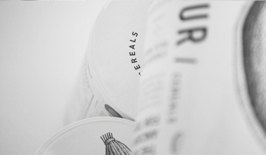
I’ve also had an idea of putting the grain type title on the top of the jar. The reason was that again and again I was thinking about functionality of the product. Some people keep jars in the shelves and see the package from the flank and others keep them inside the drawer in the bottom part of the kitchen. So if you open the drawer you will see the tag on the top and easily find the cereal or flour you were searching for.
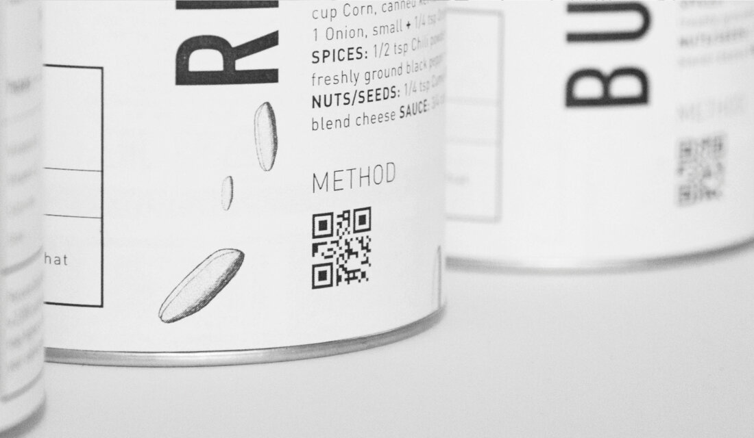
On the backside of the jar there is a list of products you need for example to cook a nice healthy food using cerals or flour. Under the list there is a QR-code, scanning it and following a link you will be able to find a proper recipe.
Featured on Package Inspiration