Designed by: Abracadabra Design, Brasil.
Culture to see, to feel, and to eat
Cardeal is a food company especialized in products (cookies and candies) made of cashew nuts, an abundant fruit from northeast of Brazil and part of the food culture. This culture is beyond the gastronomy aspects and is part of the popular artistic imagery, as it is present in art expressions, music and in popular celebrations.
So, it’s natural for us to imagine the Cardeal packages as an expression of a nation’s cultural wealth. Culture inside and outside of the packaging. Culture to see, to feel, and to eat. Since the beginning, our purpose was to conquer people by emotion. To add cultural aspects and manual techniques is an important part of our job, which we call here “soul made design”.
Like happen with so many other microproducers, the packaging is the main contact point of the brand with the outside world. It’s the principal communication platform, and because that, it has to be singular and special. It must carry stories and emotion.
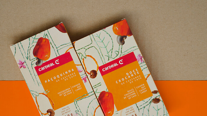
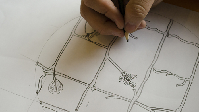
With the creative concept in mind (“Culture to see, to feel, and to eat”), we chose the embroidery, a common technique in the region, as visual language. All the packaging illustrations were drawn in fabric and manually embroidered, one by one, by our creation team, that was emotionally involved in the process, interested in learning the technique.
The illustrations made in embroidery gave the packaging a sophisticated and handmade look. A delicate, handmade touch. The packaging are full of tradition, history, and, at the same time, contemporary and universal. The new graphic project of the packaging was part of a construction process of Cardeal’s new visual identity and brand positioning, that also resulted in its logotype change. With the new visual identity and the new packaging, the brand is preparing to conquer markets outside Brazil as well.

Featured on Package Inspiration