Designed by: Molto Bureau, Ukraine.
Buco Coffee Manufacture is a Ukrainian coffee manufacturer that imports coffee from various countries, roasts and sells it since 2015. The brand has two lines: coffee beans for HoReCa sector and ground coffee for retail. The brand has recently opened its own coffeehouse chain in Chernivtsi, developing the market and overall level of coffee culture in the city.
For launching the product in 2015 Buco used a cartoon owl as the main brand image. For several years the brand has expanded and required substantial changes. Together with change of positioning and target audience expansion it was necessary to reconceive the visual style of the brand.
Molto Bureau rebranded Buco, having developed strategic platform of the brand, logo and visual identity, and redesigned two lines of coffee. To keep loyal audience, it was decided not to refuse from the owl image but to reborn it into the new, stronger brand image. Buco brand had to declare its expertise and show that they are genuine connoisseurs of coffee culture. A prestigious night bird came to take place of a weird owl.
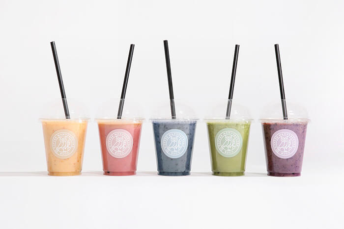
The renewed owl was endowed with a power of the guardian. A little bit magical, with a coffee branch in claws, the owl came to the defense of the most valuable coffee beans. Two versions of the logo were designed for the brand: main logo encircled for use on packaging, clothes, stickers and other key elements of communication, and also more minimalistic logo – the owl’s head – for use in small sizes and on the back of packaging. The brand received the new color palette. Black – the color of coffee and night – was chosen as the main color. Auxiliary color palette consists of five colors used to differentiate various SKU of coffee beans for HoReCa sector, volumes of cups, tastes of smoothies and other products. A branch of coffee, which is a part of the main logo, became an additional identity element.


Featured on Package Inspiration