Agency: Robot Food
–
Description:
Robot Food Create Global Design Refresh for Brooklyn Brewery, Building on the Legacy of Milton Glaser
Leeds-based strategic branding agency Robot Food has created a global design refresh for Brooklyn Brewery, creating consistency across the legacy brand’s range while retaining its iconic Milton Glaser-designed logo.
Brooklyn Brewery (which is distributed and marketed by Carlsberg Group in many markets globally) brought in Robot Food on the strength of its strategic approach and work with craft beer brands like Vocation, as well as its previous projects as part of Carlsberg’s global roster.
Robot Food was briefed to create more consistency across the range of different packs and variants and form a bolder, more impactful brand experience across all touchpoints, ranging from can and bottle designs to boxes, beer taps, glasses and more.
Modernising an icon
‘I Love NY’ designer Milton Glaser designed The Brooklyn Brewery logo when the brand was founded in 1981. “This was a great opportunity to treat a brand with ultimate respect, where we’re not trying to change anything, we’re just trying to enhance what has grown over time,” says Robot Food creative director Ben Brears. “It’s not about making it more mainstream or palatable, it’s about building on the Brooklyn group’s powerful brand and creating even stronger visual recognition.
“You’ve got to treat the ‘B’ icon with respect: it’s a globally recognised symbol.”
Robot Food’s strategy centred on creating cohesiveness throughout the ranges, and ensuring that the brand’s key icon was being used as effectively as possible. Glaser’s hand drawn ‘B’ is deliberately untouched – out of respect for the late designer who died in 2020 – but the surrounding type within the round logo lockup spelling out ‘Brooklyn Brewery’ was subtly tweaked in collaboration with typographer Rob Clarke. The redrawn typography better fits the curve of the circular logo, for a modernised, refined brand mark more suited to digital applications.
“When it was designed, it was typeset in a way that we wouldn’t use in the 21st century, so it’s about building upon what they had, using today’s techniques,” says Simon Forster, Robot Food founder and executive creative director.
“We’ve not changed the feel of it, just the legibility and impact. The clarity makes everything sing, and you end up with a more impactful, more consistent suite of brand assets that’s still proudly and recognisably Brooklyn Brewery, but with wiggle room to have fun.”
Creating one cohesive beer “family”
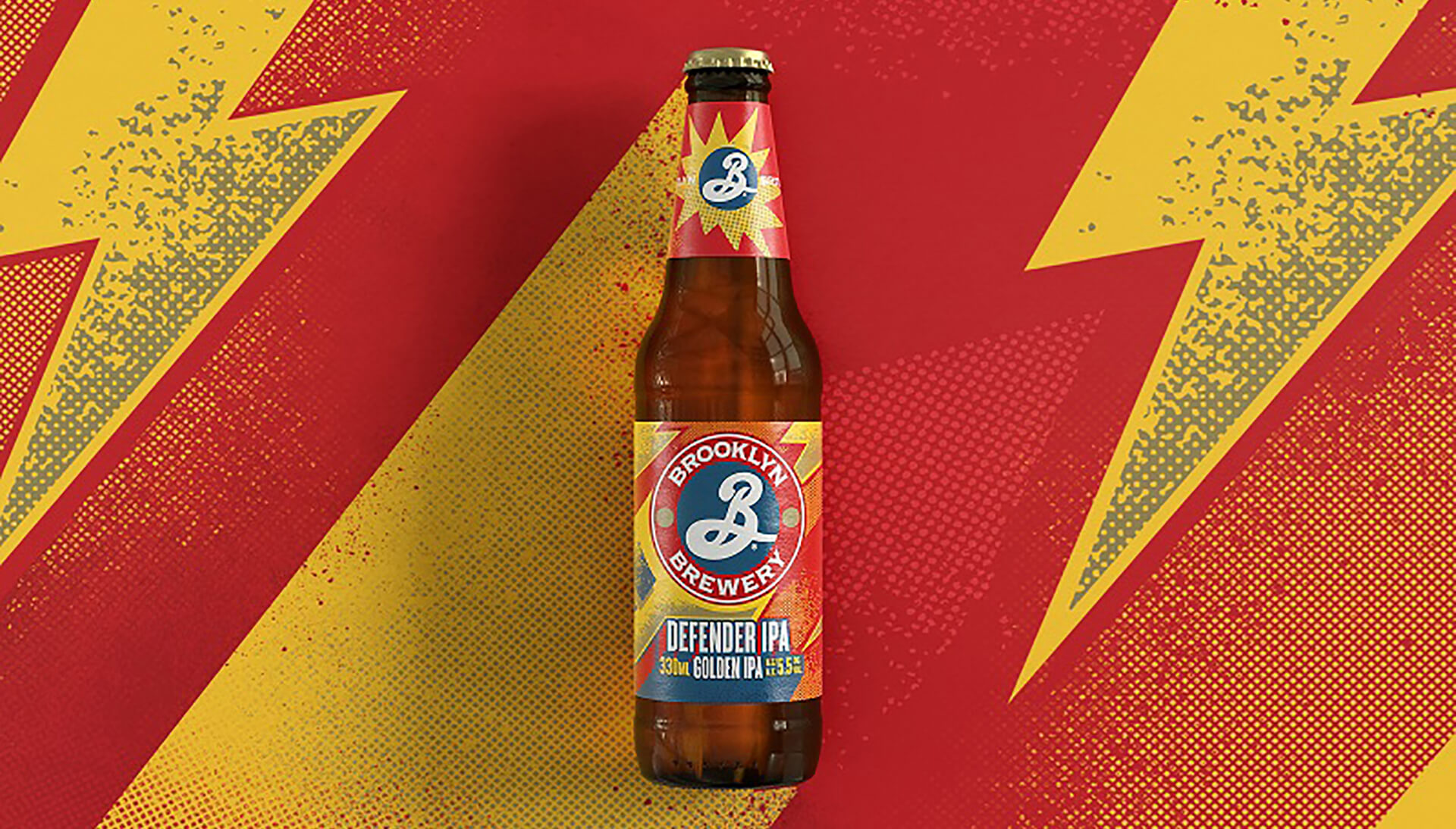
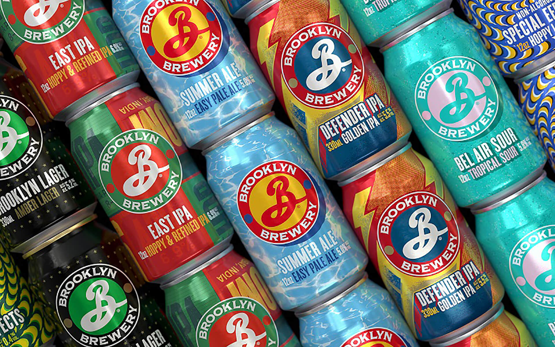
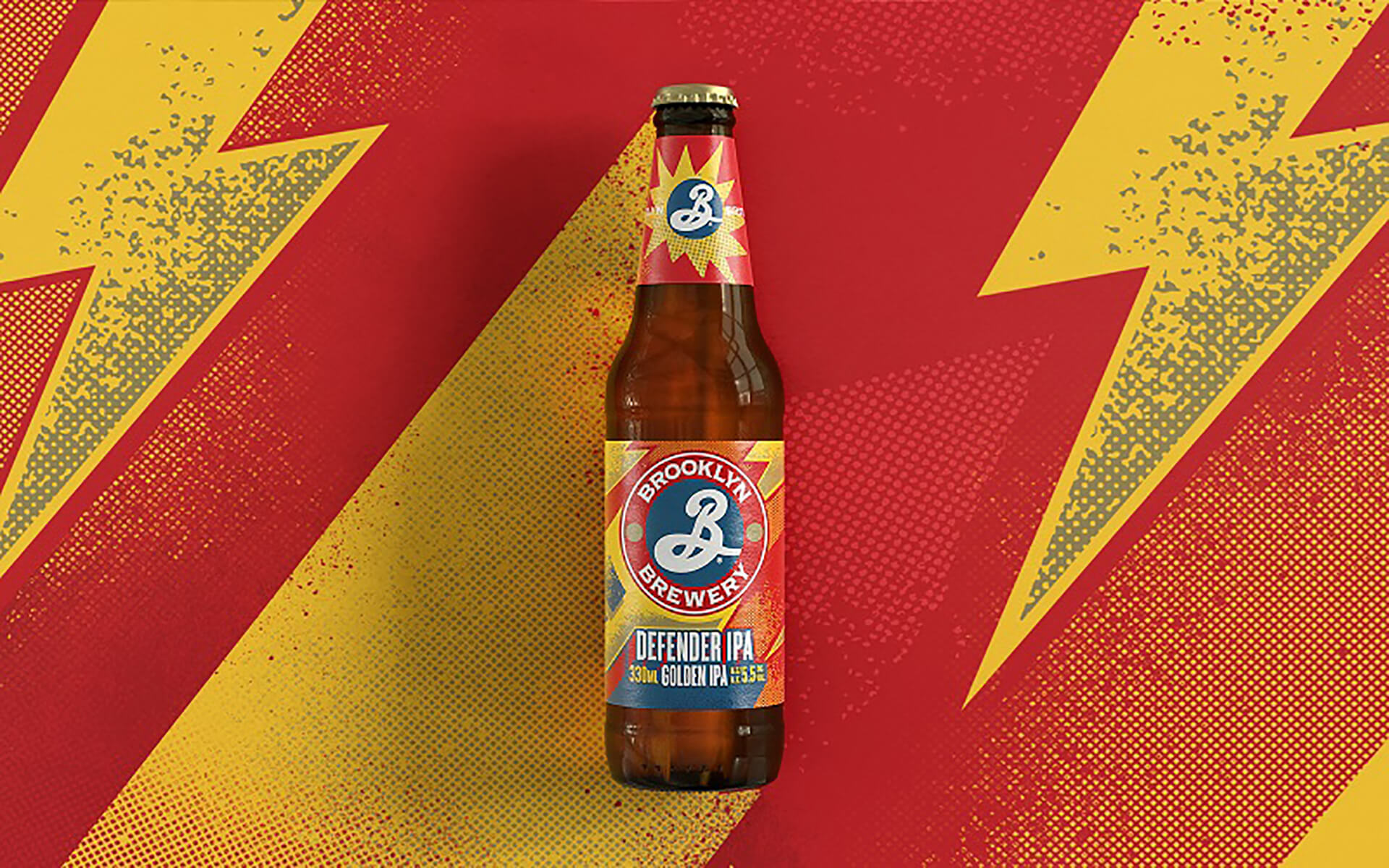
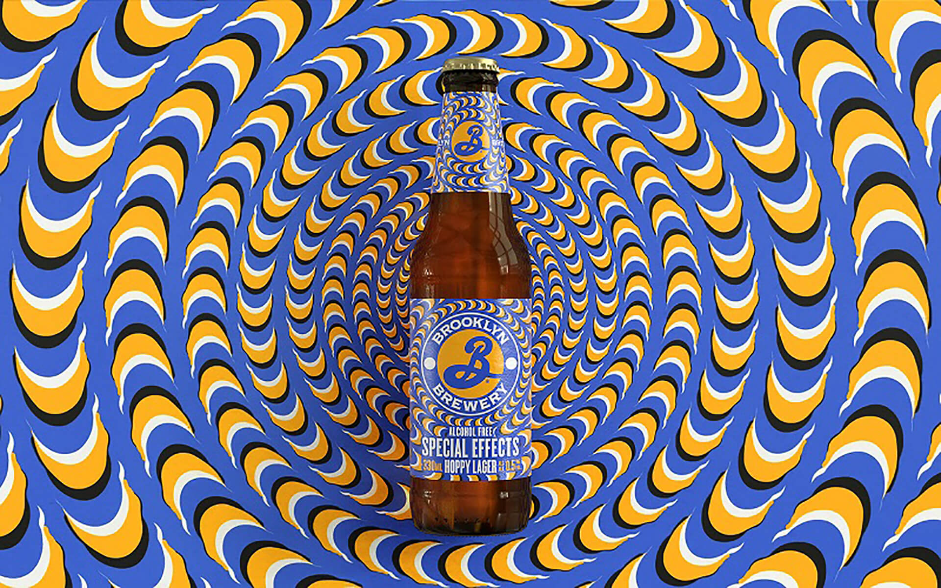
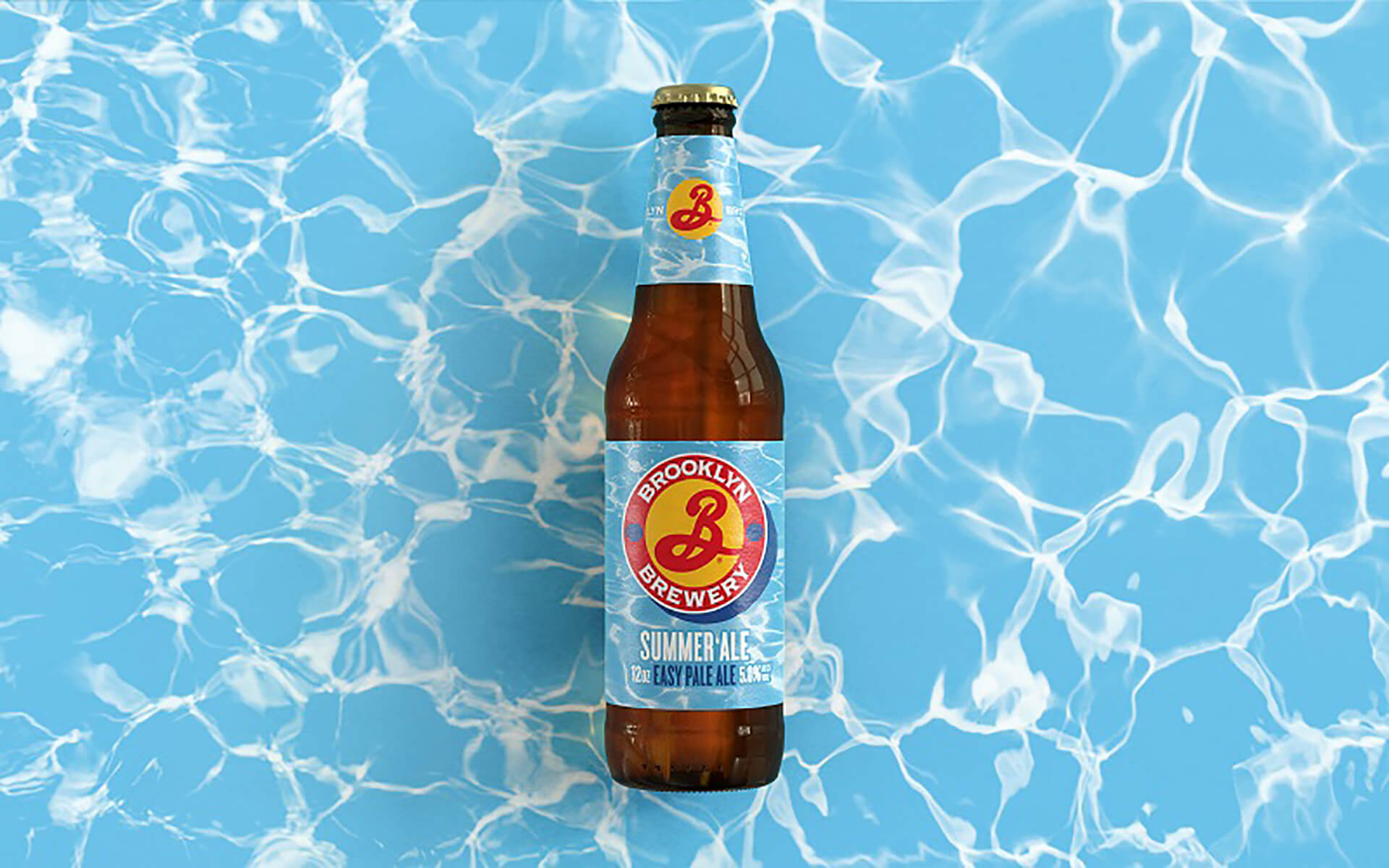
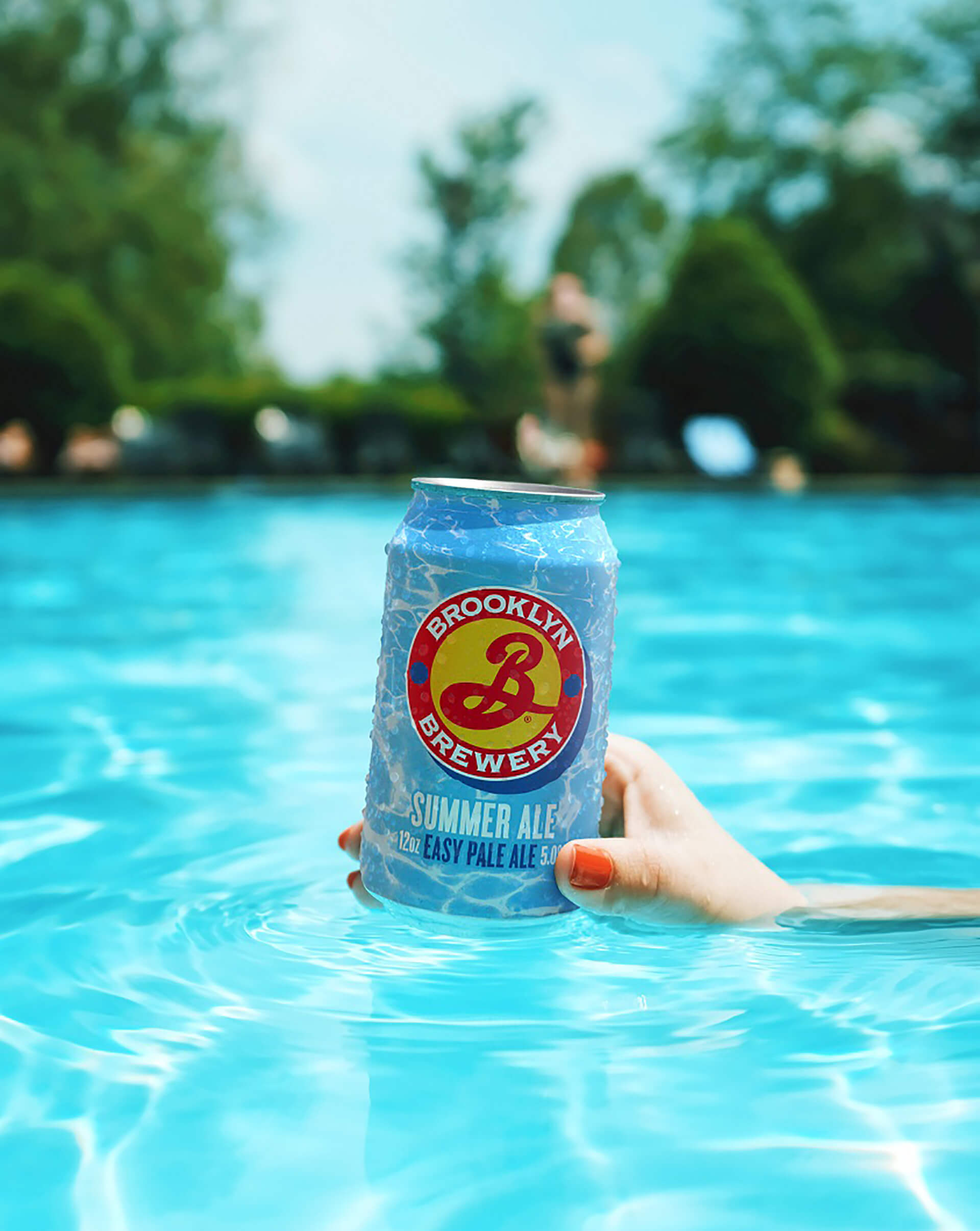
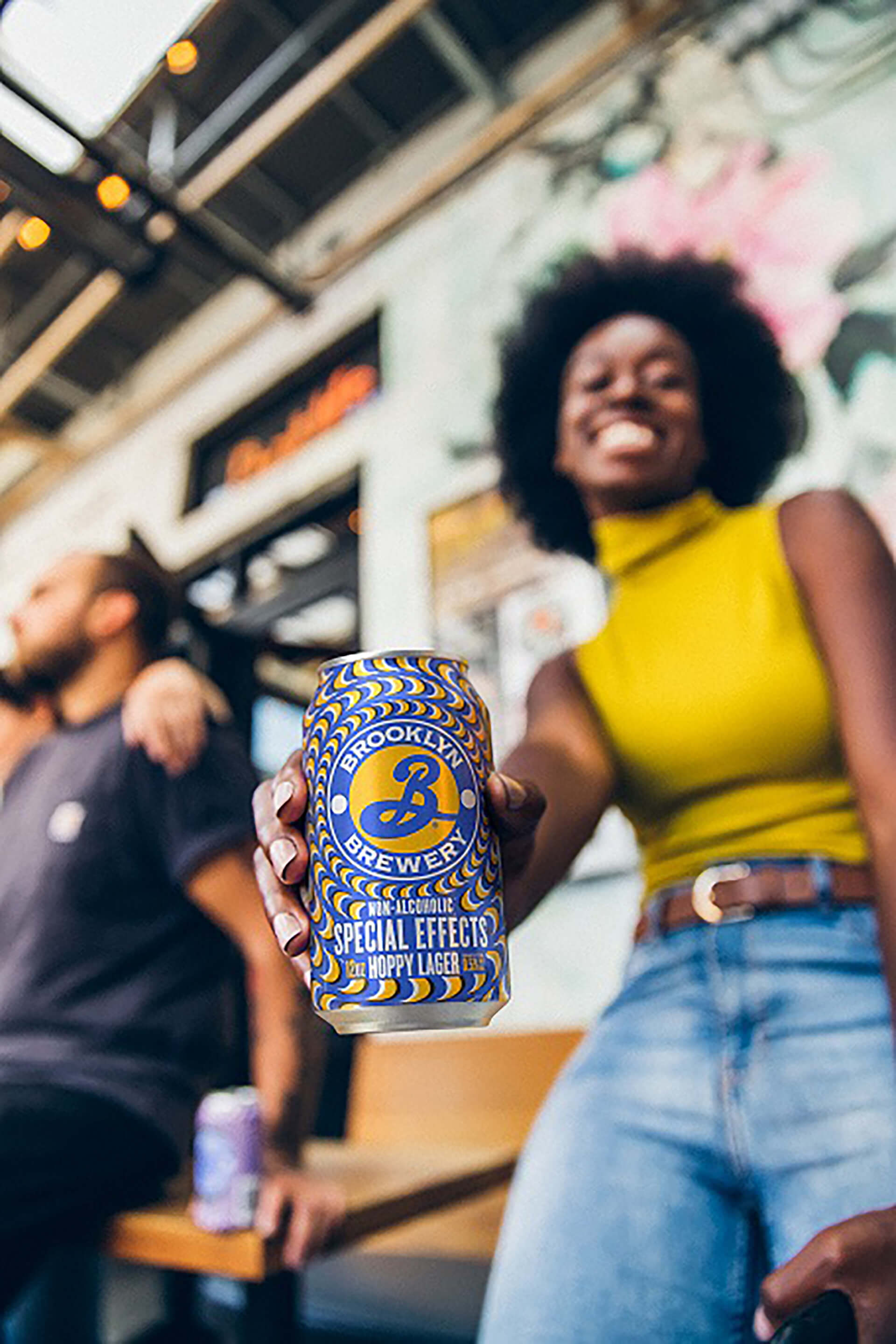
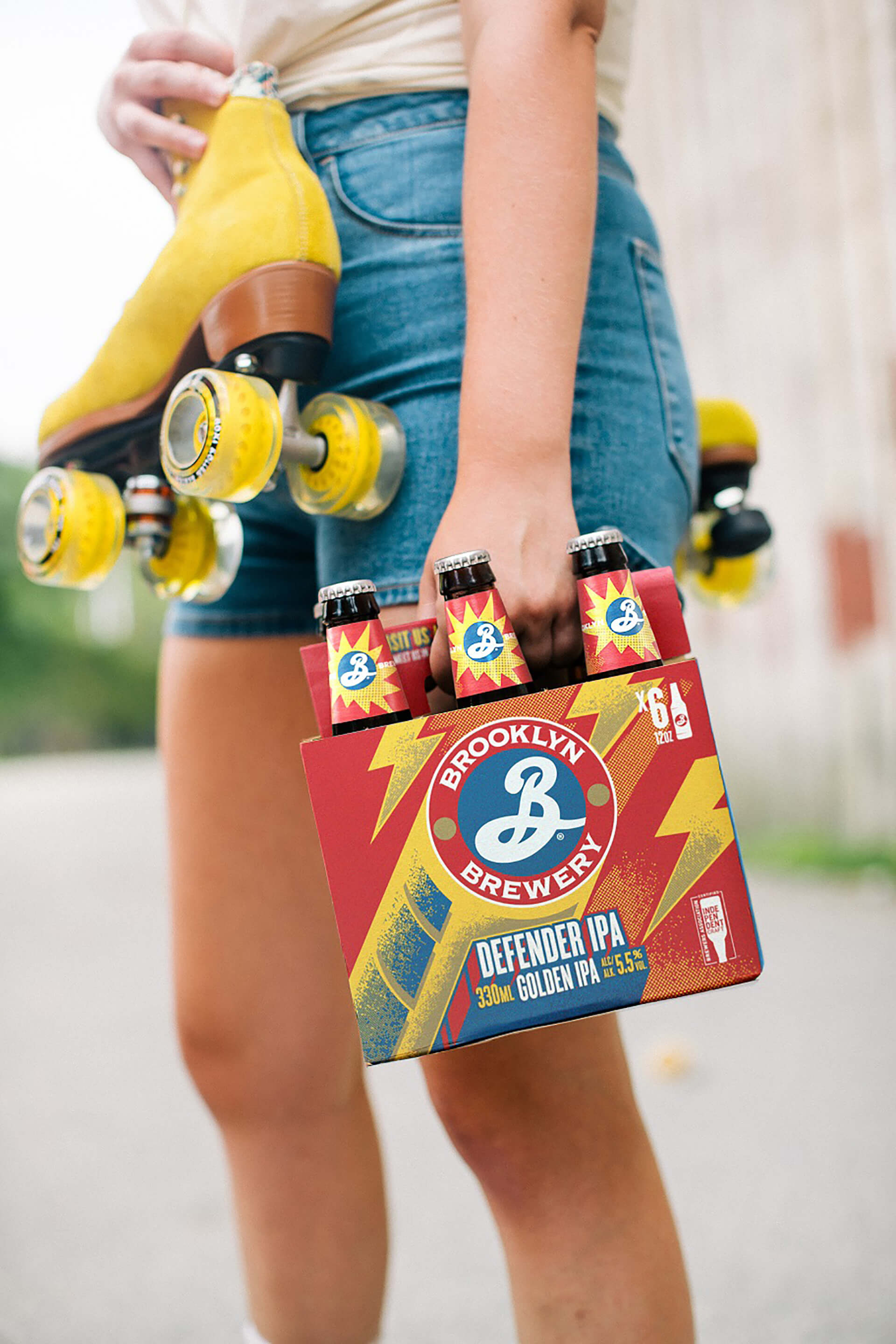
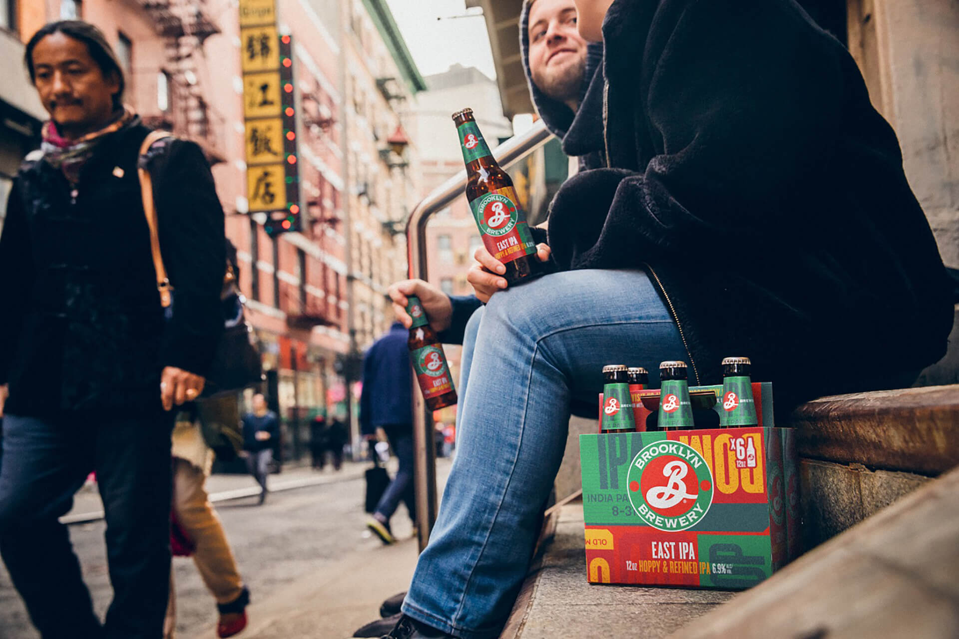
While the logo has stood the test of time, one of its main issues was that it was designed for a limited range that has now expanded way beyond just Brooklyn Lager. Brooklyn Lager still makes up around 50% of Brooklyn Brewery’s sales, but over the years numerous sub brands have been introduced including the Defender IPA, Summer Ale, the Stonewall Inn IPA and the non-alcoholic Special Effects IPA.
With these numerous variants and the gradual introduction of packaging formats such as cans of various sizes, limited-edition corked bottles and boxed multipacks, the main issue was inconsistencies across the range.
“Brooklyn’s brand assets were being used in different ways across different touchpoints, making it difficult for consumers to join the dots and recognise the brand instantly,” says Dave Timothy, Robot Food managing director. “This was creating a huge commercial barrier to sales, so it was our ambition from the start to create a united identity where all brand communications sing off the same hymn sheet.”
The tens of logo variants in play previously have been reduced to two options, with a secondary logo created for bottle neck labels and areas of restricted space.
Cleaner, bolder Brooklyn
The new cleaner, bolder identity is now bigger on pack, with a set space for the descriptor in a branded font leaving room for playful, varied sub-brand personalities, such as the Summer Ale’s dropped shadow mimicking a floating shield. This new consistency future-proofs the brand for potential new additions to the range that can easily sit within the overarching design system.
“We removed a lot of superfluous clutter to create more room around it,” says Brears. “We’ve essentially consolidated their logo usage, so the biggest change is it now consistently says ‘Brooklyn Brewery’ across everything, which wasn’t present before.”
Within the individual variants, Robot Food decided to retain and enhance many of the distinctive design elements that give each beer its character, such as the rainbows for the Stonewall Inn IPA.
“Improving a classic with respectfulness is the pinnacle of design to me,” says Forster. “You could only give this project to an agency that’s very strong strategically, because there’s a lot of design decisions to carefully guide the client through. It’s all too easy to fuck up an icon.”
The new designs are currently rolling out globally.
![]()
![]()
Featured on Package Inspiration
We are young team which works to inspire packaging designers every day! Our team select the best packaging of today and shares with you.
