Agency: Bold Brands
–
Description:
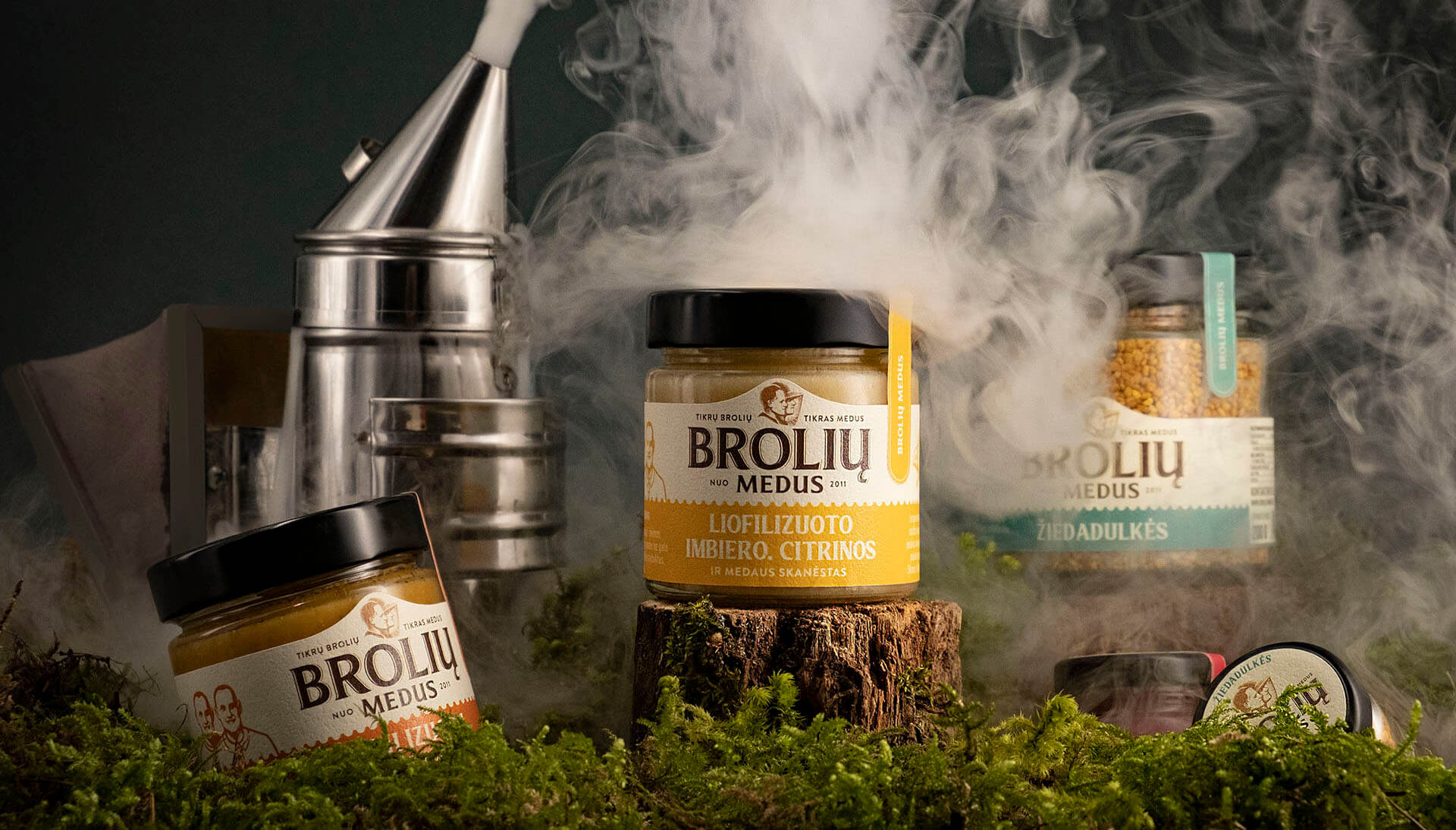
“Broliu Medus” is the brand which needs no artificial identity or brand persona. The name literally translates as Brothers’ Honey and is actually owned by down to earth twin brothers from small town in Lithuania. These two young people are well educated knows everything about bees and sells highest quality honey and desserts there is. Despite being high quality product produced by two twin brothers, packaging label did not communicate any of this information to a customer. In addition brothers were ready to expand product line and that means something had to be done.
And there were quite a few things to do here. First task was to create logotype that reveals the the brand owners and speaks on their behalf. Second one was to keep brand recognised throughout the whole product line but give distinct features to each individual product. And of course select a label material that would be high quality enough to ensure customer that the product inside is top of the range.
All that came up to be is a result of great teamwork and total trust from this client. Logotype was created using actual brand owners’ portraits – and slogan which translates as REAL BROTHERS’ – REAL HONEY, that clearly coveys the message that was intended. To make the message even stronger we added short thank you letter on the label. Top half of the label is dedicated to branding and lower half is colour coded to each individual product which helps to identify the product. In addition every product got a pleasing illustration of the blossoms which honey was gathered from. Lid sticker serves as additional branding space as well as seal ensuring customer that product wasn’t tampered with. Overall packaging got a distinct vintage vibe look which communicates about deep beekeeping traditions with a touch of modern energetic approach to this field, helping the product standout from its competitors and build brand awareness.
