
Designed by: Brandon, United Kingdom.
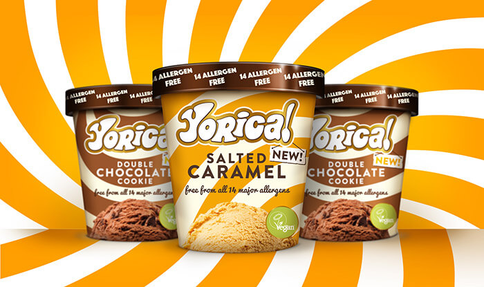
Yorica!, London’s premier ‘free-from’ ice-cream parlour, launches into the retail trade, with a striking new brand identity by design consultancy Brandon.
Yorica!, which first opened in 2016 selling delicious ice-creams that are free from all 14 major allergens, has now made the shift from gelateria into the supermarket retail trade. The team at Brandon was tasked with creating a new identity and packaging design that would evolve the much-loved and trusted brand and set it up for this new adventure.
From parlour to pot
Yorica! has a very distinctive 1960s-inspired free-spirit identity that has proved hugely successful in its two London parlours, but it was felt that the demands of the supermarket space – including a limited consumer ‘dwell’ time and cluttered competitor shelf – required a brand refresh to ensure it stood out on the shelf.
To maintain brand familiarity and trust – essential in the allergen-free and vegan sectors – Brandon took some of the existing assets and amplified them to create a simple yet iconic brand identity that translates the Yorica! story to the retail trade.
To further elevate the sense of trust and quality, graphic cues, including gold halos around the brand mark and Vegan Society symbol, have been added, and the ‘14 Allergen Free’ message appears clearly and simply on the lid.
The graphic impact on pack has also been dialled up. Swirls from the original parlour livery have been evolved and made larger, with colourways that now represent the flavour within. The logotype has been contemporised and premiumised with a black keyline that ‘lifts’ it off pack and sets it apart from other brands.
Brandon also sought to communicate that while the products may lack ingredients like dairy, nuts and eggs, they are not short on flavour. The image of a single scoop taps into the appetite appeal that compels consumers on an emotional level, as well as adding further product clarity.
What’s the scoop?
Richard Taylor says: “Yorica! has a devoted following that love it, and we were extremely careful to respect that. We’ve taken the brand on a journey, while elevating the product for the retail trade, driving stronger premium cues and disrupting with a patter than stands out like a sore thumb. It was critical that we disrupt in such a competitive and noisy ice-cream aisle.
“We’ve achieved the best possible result by being sensitive to what the Yorica! team has worked so hard to achieve, while using our unique brand refresh expertise. In so doing, we’ve given Yorica! a new iconic asset that sets it up for success.”
Simon Foster, Group Managing Director at Yorica!, says: “Brandon has come up with an exciting new brand identity that will help us to take Yorica! to the next stage of its life without losing sight of who we are and what we stand for. Yorica! is now ready for a wider audience outside of London. The design is both simple and iconic, and, most importantly, easy for people to understand at speed towards the end of a busy shop.”
Yorica! is currently available at www.ocado.com in Salted Caramel and Double Chocolate Cookie (£4.50). There are plans to roll out the range, with more flavours, to further supermarkets in 2019.
_________________________________________________________________________________
About Brandon
Brandon is a brand design consultancy that helps established iconic FMCG brands navigate today’s world. Brandon develops brand strategy, innovates and creates design that works to drive growth; making sure brands make a difference in people’s lives and stay relevant.
Follow Brandon at its website, on Instagram, Twitter and LinkedIn.

Featured on Package Inspiration
We are young team which works to inspire packaging designers every day! Our team select the best packaging of today and shares with you.
