Designed by: Biles Hendry, United Kingdom.
UK wine importer and producer Boutinot has just launched a new brand identity and packaging for its trio of Riojas, called Vega del Rayo, with design by Biles Hendry.
Branding and design agency Biles Hendry was tasked with taking Boutinot’s contemporary-style Rioja – made with grapes from the Carlos Serres vineyard in Haro – and giving it a fresh, ownable look to capture the provenance of the region, yet stand out from a busy sea of wines on shelf.
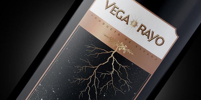
Lightning takes root
The open landscape of the Rioja region is well known for its changeable climate and dramatic thunder storms. The team at Biles Hendry discovered that these regular lightning strikes discharge nitrogen into the soil, thus fertilising it.
This connection between the weather and the wine generated the name Vega del Rayo (which translates roughly as open plains and lightning strikes) and the ‘double take’ design idea, depicting both the lightning fork and the vine root. The resulting label design reflects the quality of the product and signals a break from the traditional Rioja wine language of its direct competition.
Biles Hendry’s Founder and Creative Director, Anthony Biles, says: “We created an acute graphic idea: beautifully crafted and founded in a product truth. It hits that sweet spot between the contemporary and the traditional, appeals to the discerning modern drinker and stands out on a busy fixture.”
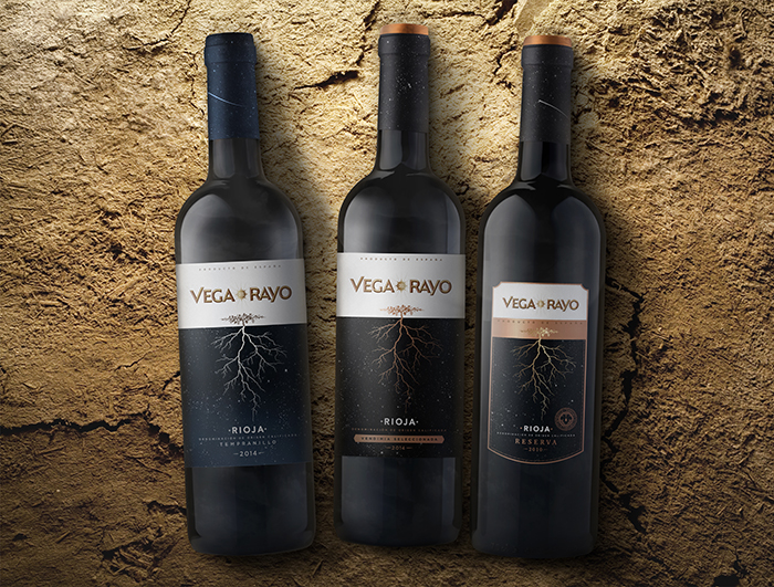
Three tiers
The different bottleneck and label designs, which denote the ‘good’ (Tempranillo), ‘better’ (Vendimia Seleccionada) and ‘best’ (Reserva) versions in the trio, employ subtle design variations to express the tiered price points (from around £9 to £12). As the purchaser scales the range, they find more gold detailing and, when they reach the Reserva, the label is significantly smaller with decorative edging – all premium cues used to demonstrate an increase in product quality.
Catherine Bewick, New Product Development and Innovation Manager at Boutinot, says: “The brief was to maintain Rioja’s heritage and deliver design that was unexpected, bringing the name to life with illustration and creating real standout on the retail shelf. Biles Hendry had the vision to tackle the brief without a purist wine category bias, while providing authenticity and attention to detail on the finishing touches of the print execution. The results exceeded all our expectations.”
The wine is available in independent wine shops and restaurants across the UK.

Featured on Package Inspiration