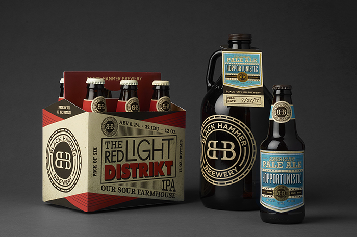
Designed by: Celina Oh, USA.
San Francisco’s Black Hammer Brewery opened their doors in August of 2015 by Jim Furman. They are owned and operated by “Burners”, or those who go to Burning Man, an event, a community, a global cultural movement based on 10 principles: Radical Inclusion, Gifting, Decommodification, Radical Self-Reliance, Radical Self-Expression, Communal Effort, Civic Responsibility, Leaving No Trace, Participation, and Immediacy. The “Black” in their name comes from “Black Rock City”, which is the name of the temporal city that is built in the Black Rock Desert during the event. Jim Furman’s Burning Man nickname is “Hammer”, as he is always building at the event. Innovative, Eclectic, Expressive are just a few words to explain Black Hammer Brewery. This sense of eclecticism, creative expression and camaraderie is what inspired the design of the beer labels as every brew is uniquely named and has a story behind it.
The shapes and designs of the labels create a sense of the beer’s individual personality. With a name like Hopportunistic, the label should convey a sense of the American Dream. Heavy type, subtle stars and stripes, and a shield-shaped label combine to project that sense of patriotism. It has accents of gold foil to hint at the riches of an opportunistic mindset. The Red Light Distrikt beer label took typographic and color inspiration from the signs one would see in a Red Light District. You might think the “k” was a mistake, but in fact it is taken from name of the music and art collective/non-profit at Burning Man known as the Distrikt. Chunky, funky, and dirty, this sour farmhouse IPA is sure to make an impression on the consumer, not only for sight, but for taste.

Featured on Package Inspiration