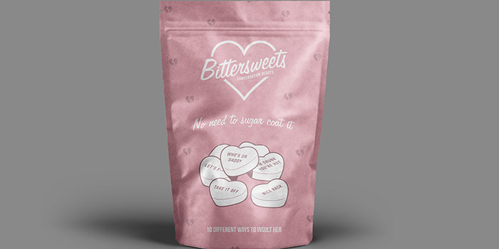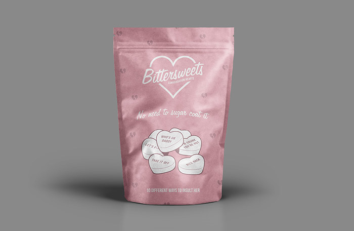
Bittersweets is a product branding and packaging concept developed for a student brief. The product was designed to be a humorous, not-so-romantic take on the retro candy Conversation Hearts. The products name was developed to convey the ill-mannered nature of the product, however it has been worked into a design that interprets a retro 1950s’ style. The slogan “no need to sugar coat it” was chosen as a way of summarising the products naughty message. The typographic choices for the logotype and the overall design was to create a vintage retro style with a modern influence, aiming to appeal to the young target audience. A constraint in the brief was that only two ink colours could be present, black and a Pantone colour swatch; the white packaging was used as a third colour. Pastel colours were chosen for the primary ink with black overlaid to create darker pastel hues. Overall, a moral conflict has been created with the choices in product name, visual style, and colour, adding to the humor of the product.
Designed by: Nicole Denton, Australia.


Featured on Package Inspiration