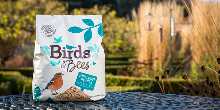
Birds & Bees unveils fresh packaging look, designed by B&B studio
High-end bird food brand Birds & Bees has partnered with design agency B&B studio. The award winning design agency has created the brand’s identity, packaging, website and print communications.
As a brand, Birds & Bees promises to help revive Britain’s diminishing bird and bee habitats; committing to plant one square foot of new wildflower meadow for every new customer who joins this year. The initiative is championed by wildlife expert Kate Humble and Countryside Farmer of the Year 2012, Rob Allan.
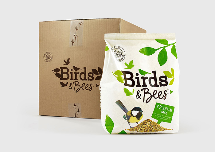
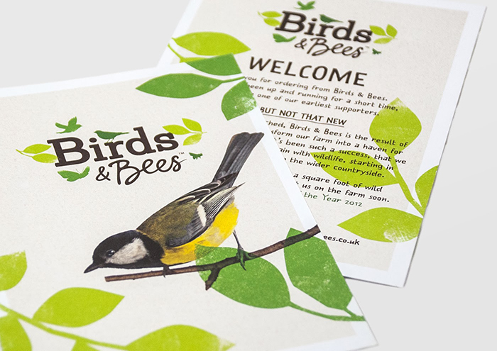
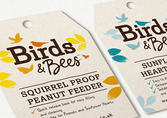
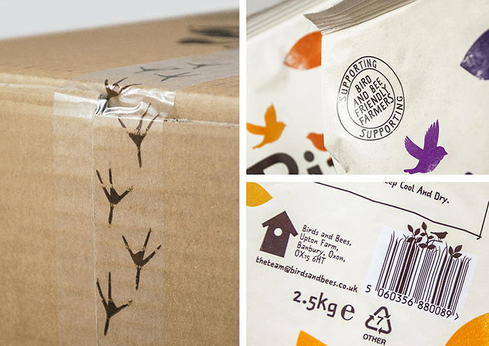
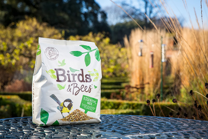
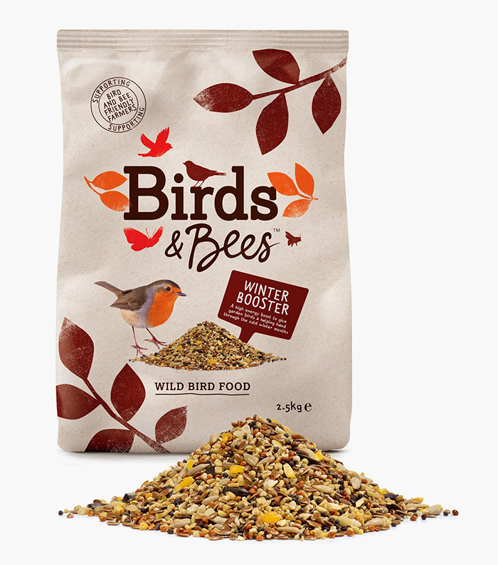
This positive outlook on Britain’s wildlife has helped shape and define the visual language of the brand, which spans across packaging, website and print communication. Silhouettes of garden birds and insects are used to suggest a proliferation of wildlife, all rendered in a stamp effect for a raw and natural feel, while the logo itself balances authoritative and friendly typography and a bee icon appears to draw out the word and act as a sign-off.
Shaun Bowen, B&B Creative Partner commented:
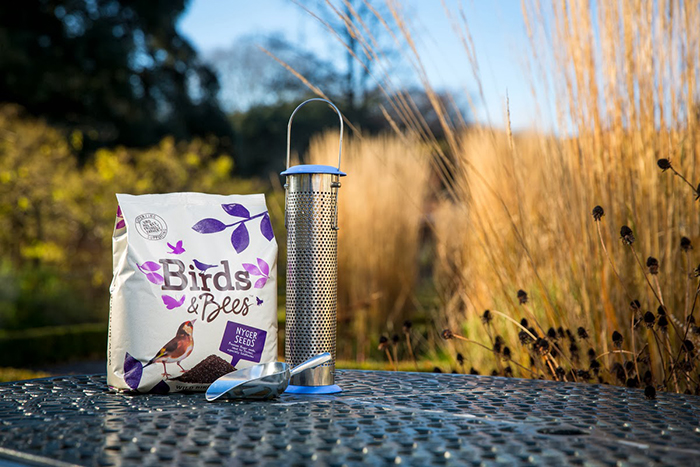
“The identity’s vibrant and dynamic look and feel reflects the brand’s broader mission to support local wildlife and help bring Britain’s gardens to life. In addition, the colour-coded packaging brings clarity and ease of navigation to what can be a complex category to shop.”
Birds & Bees’ extensive range of seed mixes, fat balls and other cereal-based products are sourced from British ‘bird & bee friendly’ farms. Farmers are paid a premium for their crop to ensure they can continue to invest in sustainable farming and help restore habitats for Britain’s wildlife. The range of seed mixes, straight seeds, mealworms and fat balls can be ordered direct from www.birdsandbees.co.uk
Agency: B&B Studio, United Kingdom.




Featured on Package Inspiration