Design by: Cowan, London
Billson’s brewery today reveals the launch of Billson’s Australian Dry Gin and Billson’s Beechworth Dry Gin, with strategy, brand and packaging design by independent, international design agency Cowan London.
The launch not only marks a new direction for one of Australia’s oldest drinks manufacturers, it is also an example of how a brand can stand out in a market as competitive as Australian gin.
Something old, something new
Since 2017, when they acquired the brewery in Beechworth, north-east Victoria, the new owners of Billson’s have been breathing fresh life into the site and its product range. Today’s launch of two craft gins follows a series of alcoholic and non-alcoholic launches, most recently small batch craft beers and heritage beers.
“It was so important to continue to grow the Billson’s brand and communicate our expertise,” says Billson’s Sales Manager, Darrian Field. “People will love our gins, made using Australian ingredients local to Beechworth and our Alpine spring water. We just need to encourage them to try it, and that’s where design comes in – it has to communicate a clear point of difference and deliver something unique and distinctive in the crowded gin space.”
Elizabeth Finn, Managing Director, Cowan London, says: “Many new to market gin designs are modern, so our strategy was to achieve stand out by focusing on the heritage and provenance of Billson’s, while giving it a modern twist. Together with the client we decided very early on that each of the Billson’s core products would not have any sub-branding and that Billson’s would lead proudly and prominently on the pack.”
Australian spirit
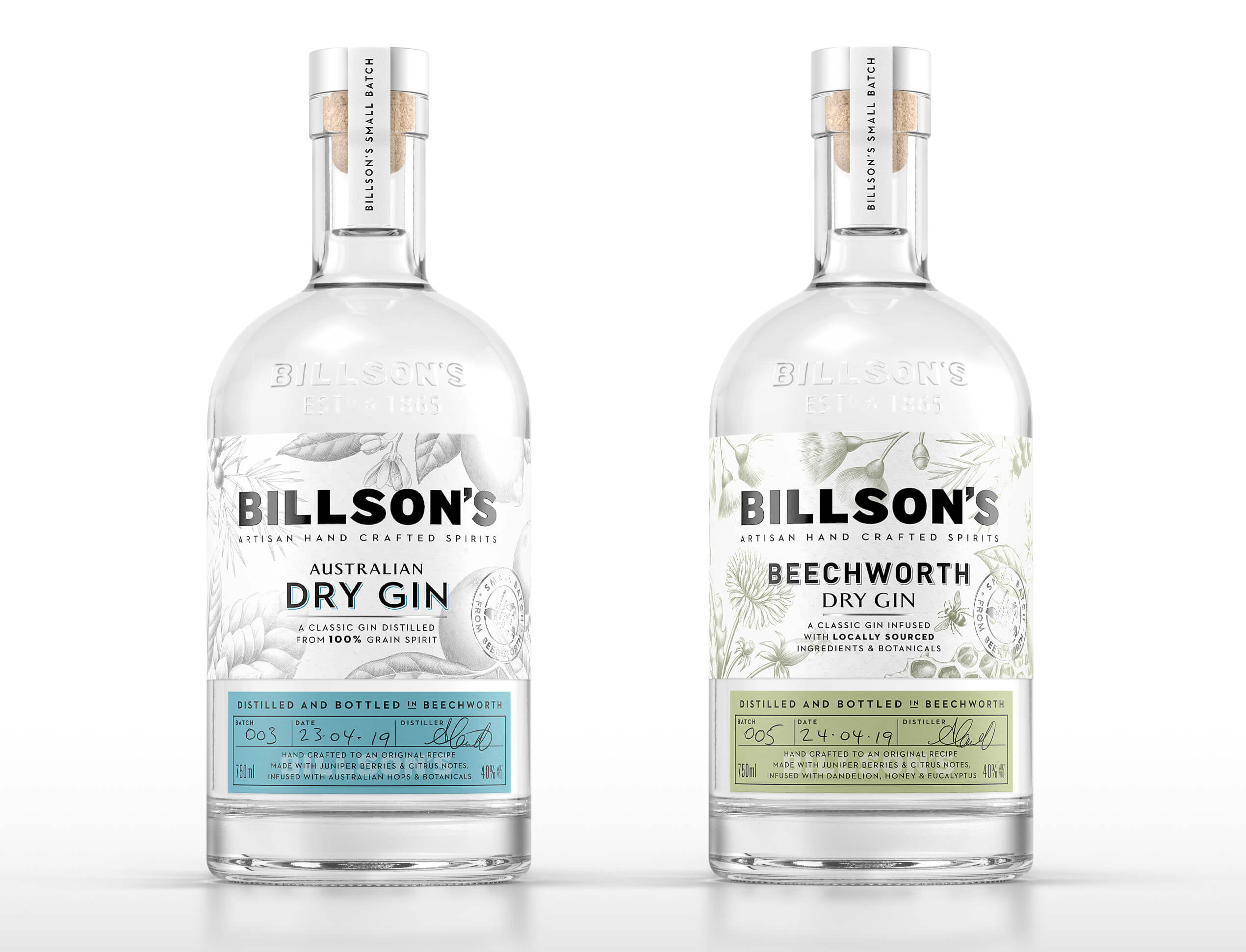
To entice consumers, communicating the botanicals in the gins was also important. Billson’s Australian Dry Gin is infused with Australian hops and botanicals while Billson’s Beechworth Dry Gin is infused with local honey, Australian eucalyptus, dandelion and turmeric. A simple syrup added after distillation gives the drink a distinctive yellow colour.
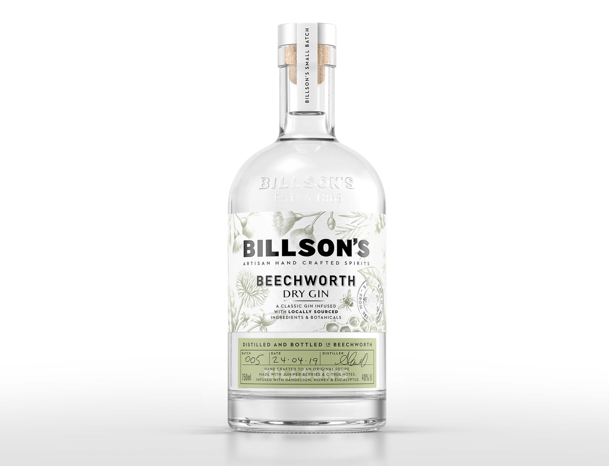
These botanicals are represented on the label with beautiful drawings. A traditional style of illustration complements the history of the brewery and confirms the brand’s credibility in the market. It’s a layered design that cleverly marries a contemporary, clean and pure look with heritage.
A cork stopper and simple tamper seal, all used in hand-finished bottle production, emphasise that this is a small batch product, and this is reinforced by the bottle shape, a raised Billson’s wordmark to give an embossed feel, and a handwritten footer and label.
Fresh and different
Cowan London, Creative Director, Samantha Dumont, says: “We wanted to ensure that the design for Billson’s gin had a sense of history to it, much like the brand overall, but was executed as a contemporary design.
“The limited colour palette suits the pure, elegant nature of gin, and the single hit of a rich vintage colour differentiates the two gins and makes the design feel fresh. The mix of typography, the bold confident Billson’s branding and sans-serif typography on the primary label, and the classically crafted secondary elements on the distiller’s secondary label, position this gin as a contemporary product but with a nod to the brewery’s history.”
Field adds: “Cowan London has been working with Billson’s on packaging design and branding for our soft drinks and craft beers. We wanted to continue the journey with them as we take our first steps into the spirits world. We look forward to working with Cowan London on further exciting launches.”


Featured on Package Inspiration