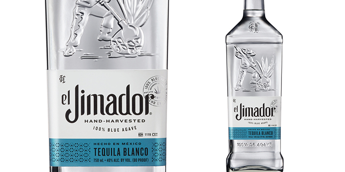
Since its introduction in 1994, el Jimador Tequila has become the top-selling tequila in Mexico. To accelerate growth in the United States, el Jimador needed to strengthen its brand expression to differentiate itself from over 1,300 tequila brands already competing in the market. Brown-Forman brought in Cue Design to redesign the el Jimador packaging to give them the look they needed.
“Our partners at Brown-Forman Design invited us to collaborate and help el Jimador tell a more compelling brand story that would grab the attention of energetic young adults in the U.S. market. A premium, 100% agave tequila with authentic credentials, el Jimador needed to retain the equity it had built over the years as Mexico’s most popular tequila, while finding new ways to increase its shelf presence and appeal. The first step was to refresh and refine the brand’s primary identity.”
“As the next step in el Jimador’s rebrand, we explored how the current expression and brand promise, ‘Rise to the Occasion’ could come to life in relevant ways. For el Jimador’s audience, how they work and play affirms who they are and what they bring to the party. These consumers are attracted to brands that add value through credibility, helping them earn the respect of their peers. In a world of many tequila choices, el Jimador brings something meaningful to the party, but the packaging was not projecting this sense of fun, energy and spirit.”
The el Jimador brand stands for living life with courage, passion and pride. These values are expressed in the evolved visual identity, which strikes just the right balance of familiarity and uniqueness. The redesigned bottle is sleeker, with more pronounced shoulders and base, giving it a modern silhouette. An embossed monogram of Casa Herradura serves as an elegant nod to the historic distillery where el Jimador is produced. The name el Jimador honors the men who harvest the locally grown agave with great pride and care. An embossed illustration of the iconic jimador represents the hard work and dedication to craftsmanship displayed by the master agave harvesters. El Jimador’s brand language system incorporates identity, color, typography and iconography to tell a more complete brand story. The new label is smaller and more streamlined, with a refined wordmark. The brand seal incorporates the product’s attributes into a mark of authenticity, and metallic colors differentiate blanco, reposado and añejo expressions. With a motif of agave plants and coas (traditional harvesting tools), the brand pattern reflects el Jimador’s hand-harvested product story.
Featured on Package Inspiration