Our goal was to create new Barbeque seasonings line, all the way from the name to packaging design.
BBQ MASTER Finest Spices – It’s a clear name, which also indicates quality and what it will be used for. Moreover, it also suits well to the product that will not receive further marketing support.
The designs of most seasonings in the market are complex and unclear. We, on the other hand, decided to convey a clear and “tasteful“ message.
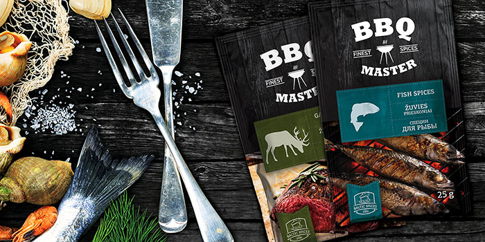
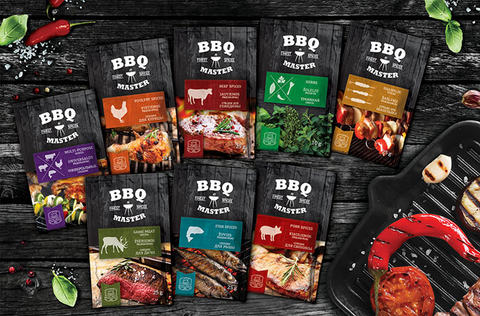
The logo design indicates the essence of the product, the level of quality and the purpose of use. A significant part of the packaging was dedicated for the icon which demonstrates what this product should be used for, thus the consumer can easily find the product he needs, regardless the language he speaks or the country where he makes the purchase.
In the bottom area, we decided to reveal the idea that seasonings make food taste better, therefore we chose to use an example of well-served meal.
We decided to use the background of burnt wood texture that perfectly enhances the Barbeque emotion and provides contrast to the packaging.
All project aims and goals were successfully met – the packaging design is clear, appealing and “tasty”.
Designed by: Moon Troops – Creative Agency, Lithuania, Kaunas.

Featured on Package Inspiration